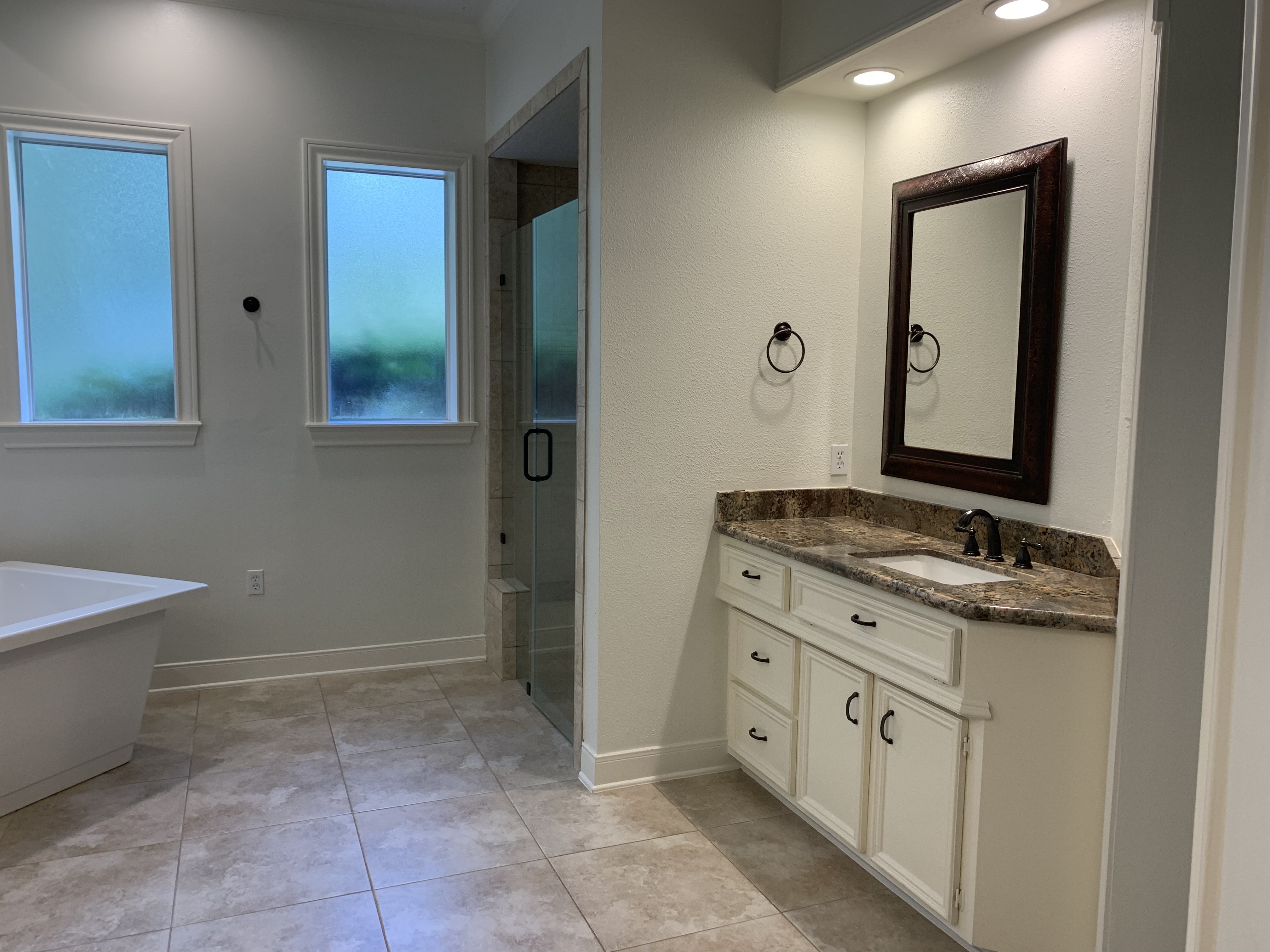
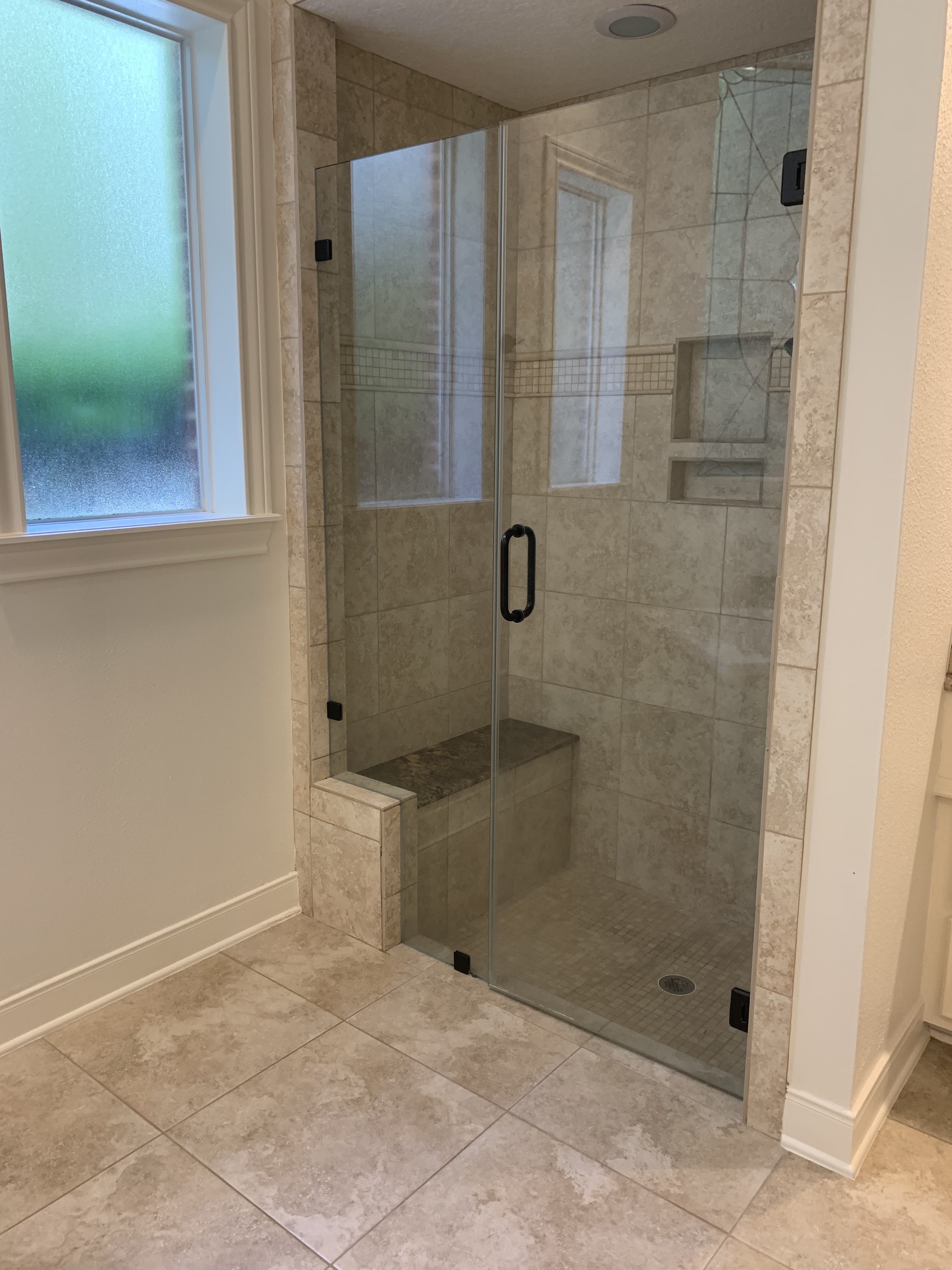
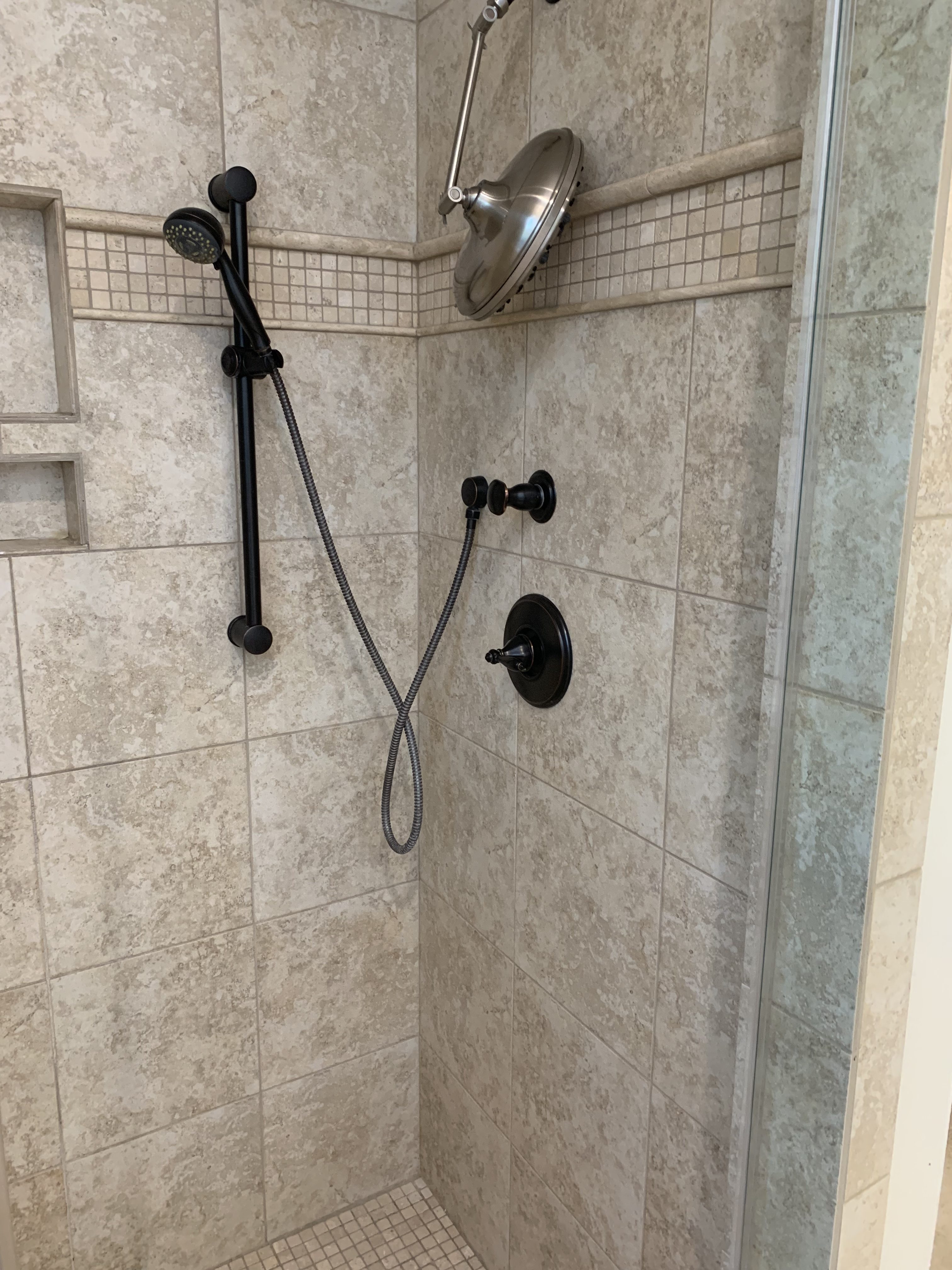
Hi friends and happy Monday! I hope you had a great weekend! Ours was awesome! My brother has been in town, so we’ve had lots of family time and rest time. School starts on Tuesday for us, so we have been trying to enjoy the last few days of summer. In true Ashley fashion, why not add more chaos to an already crazy week! Demo on our master bathroom starts today and I am so excited for this project! Its been a LONG time coming. This house was built in the 1980s and has such a great bones, but a lot of it needed an update. We originally planned to redo this bathroom when we renovated the kitchen and the rest of the downstairs, but we kept feeling like it was going to be too much to be without the kitchen and the master bathroom, so we put it off. But, we finally decided to give our master bathroom a little facelift. My original plans for this space included, basically completely gutting it, but we have actually realized that it works well for us as it is. It’s just not our decor style, nor does it flow with the rest of the house. Since the rest of the downstairs has been renovated, so it makes sense to renovate this space to make it flow with the rest of the house. The bathroom is pretty significant size wise and really is a nice space. Other than the finishes not being our style, it’s great! So, today, we start the process of making it more “us,” more light, more bright, more airy. It’s funny because I have designed this space like 4 times since we originally looked at this house! I’m super excited to see how it turns out with the finishes we chose. Take a peek at the before photos below (I want to clarify again, that the bathroom is great, but just not our decor style) and our plans for the space, at the end of this post.
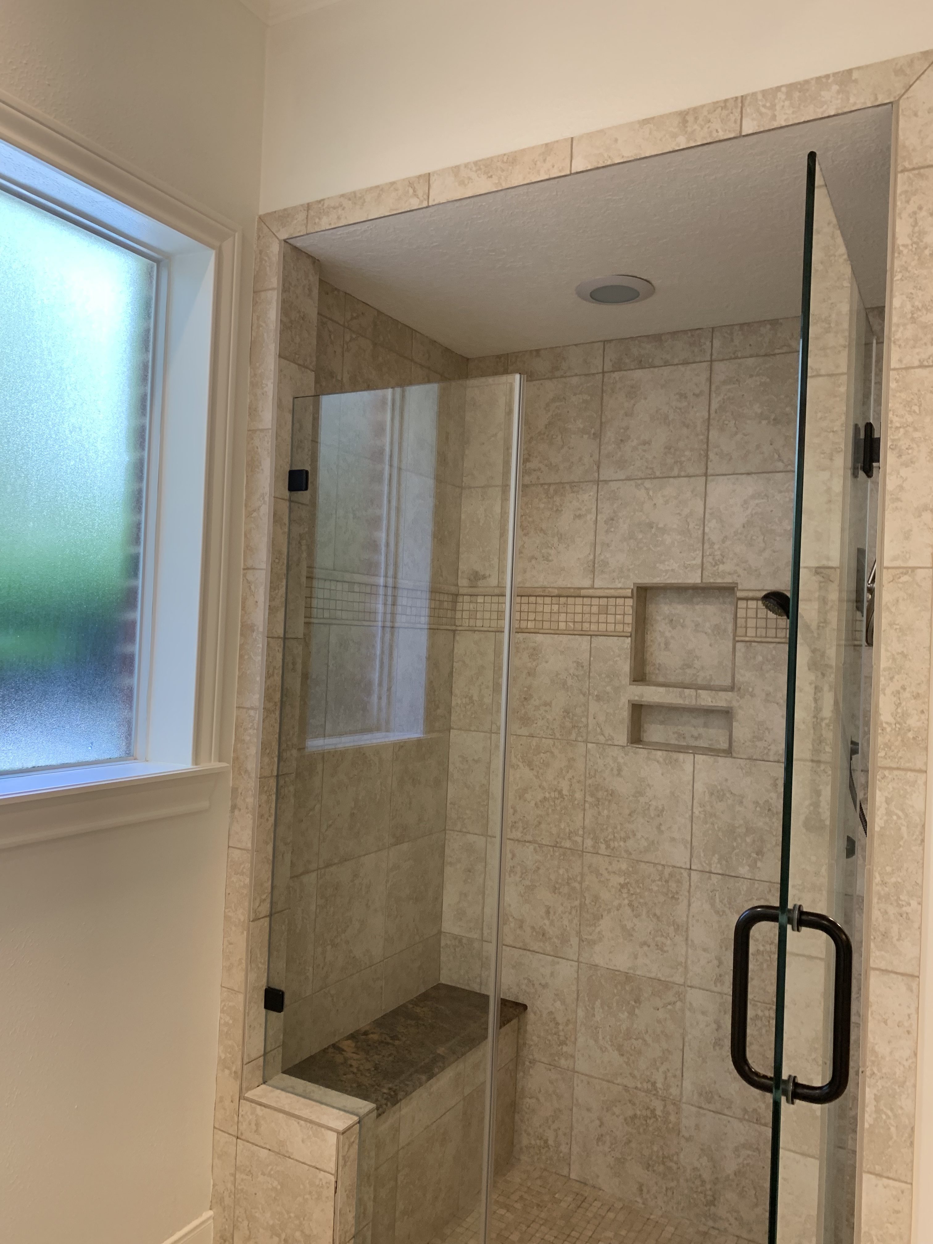
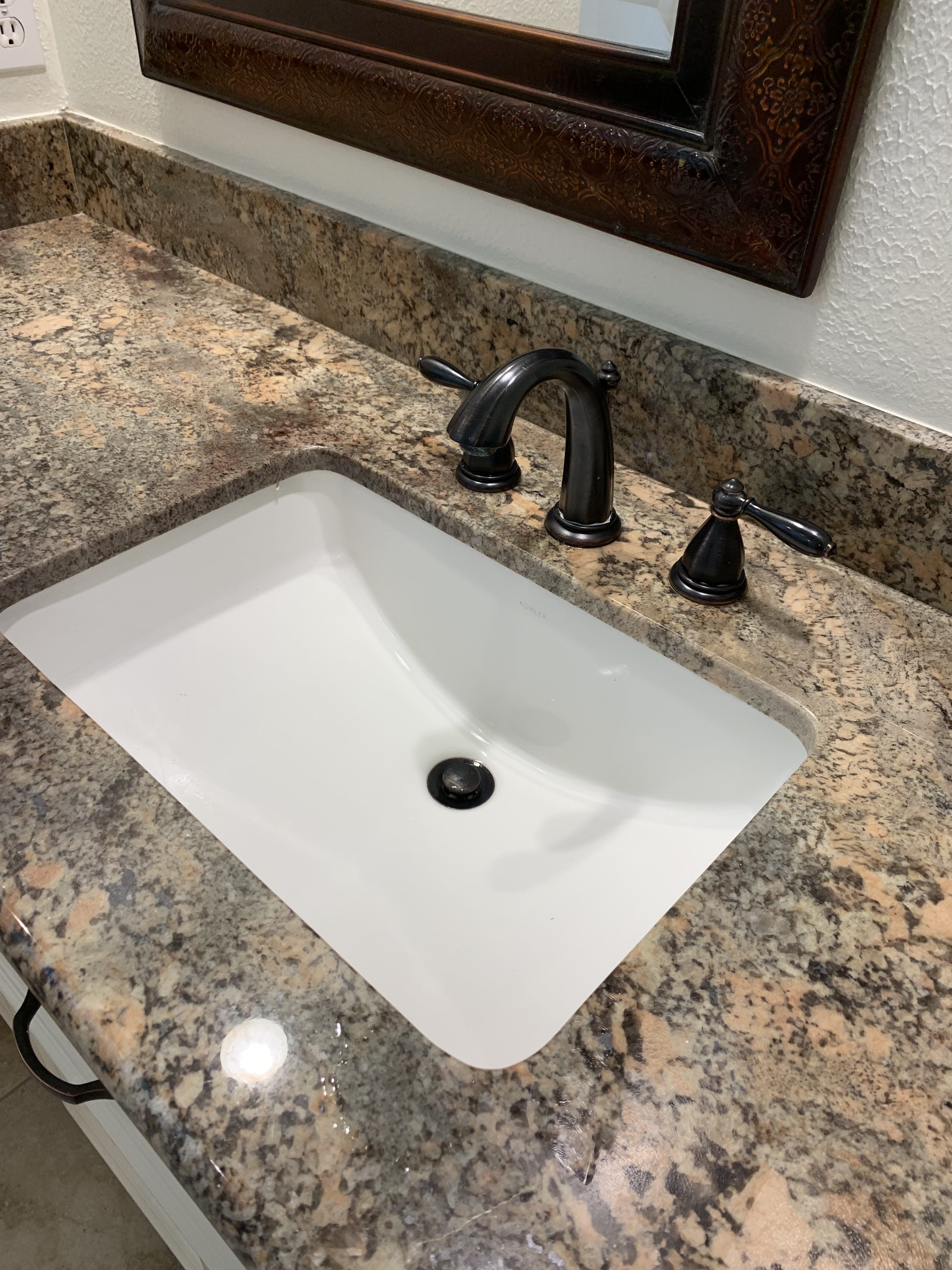
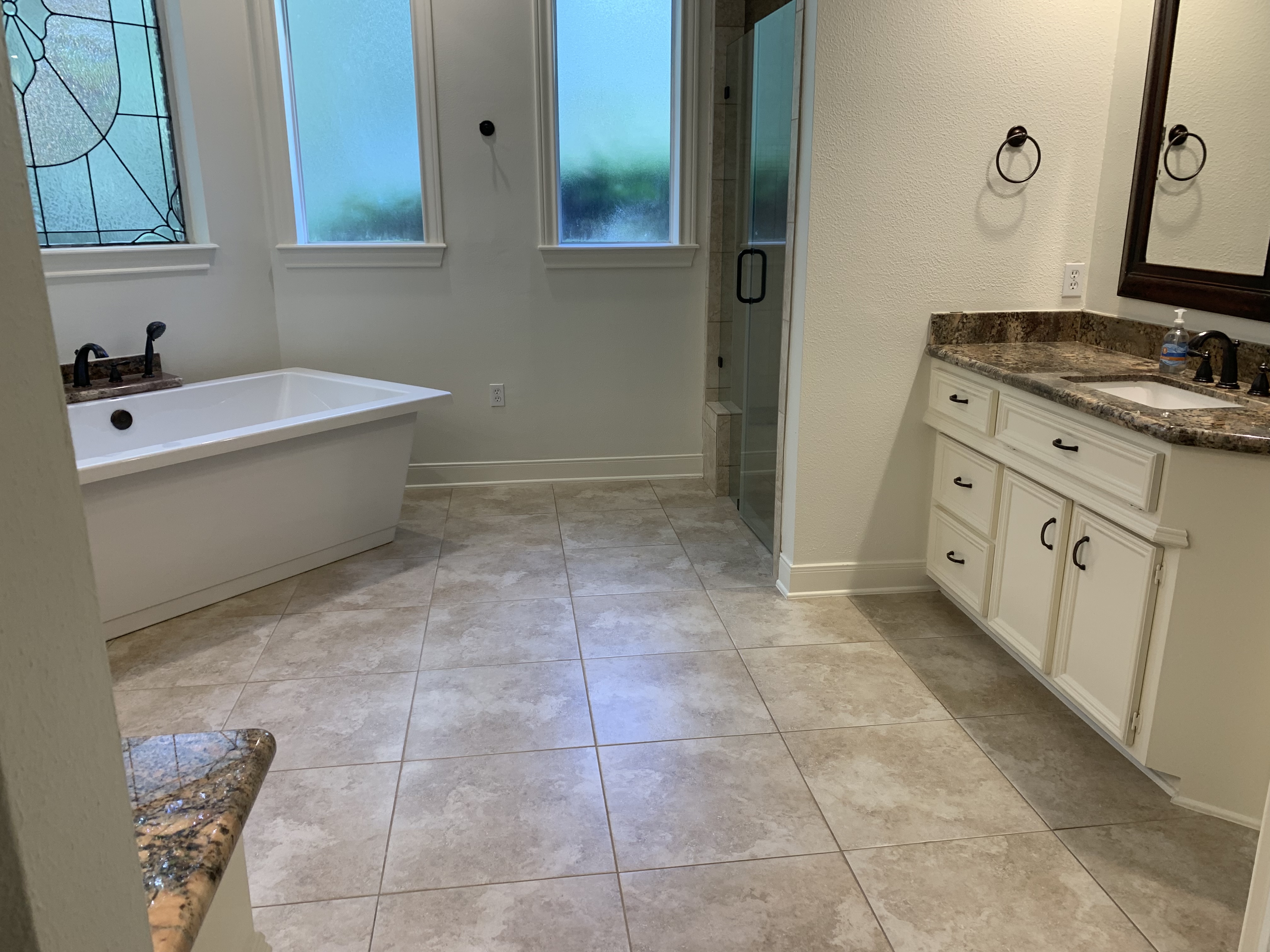
Master Bathroom Renovation Before
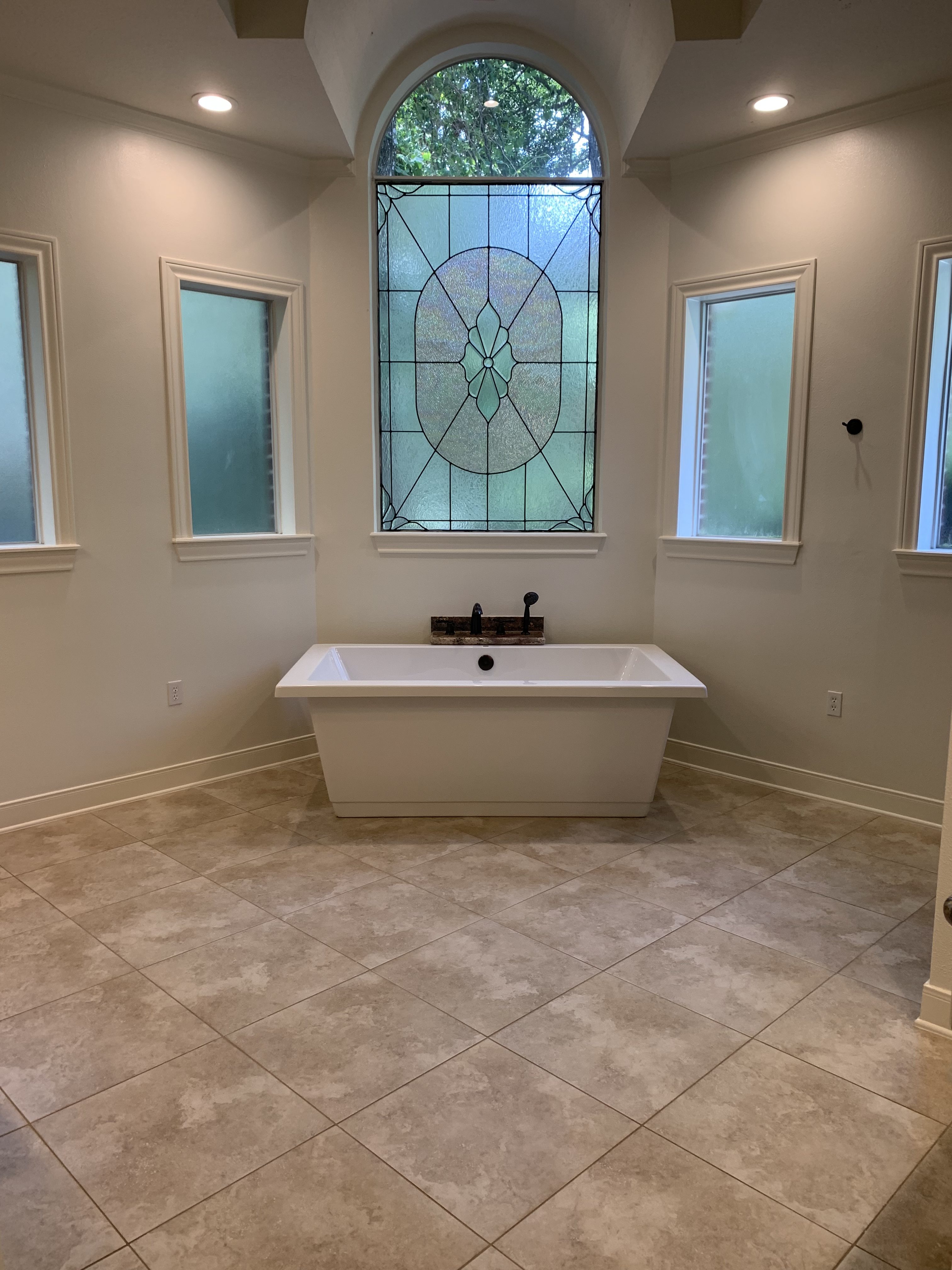
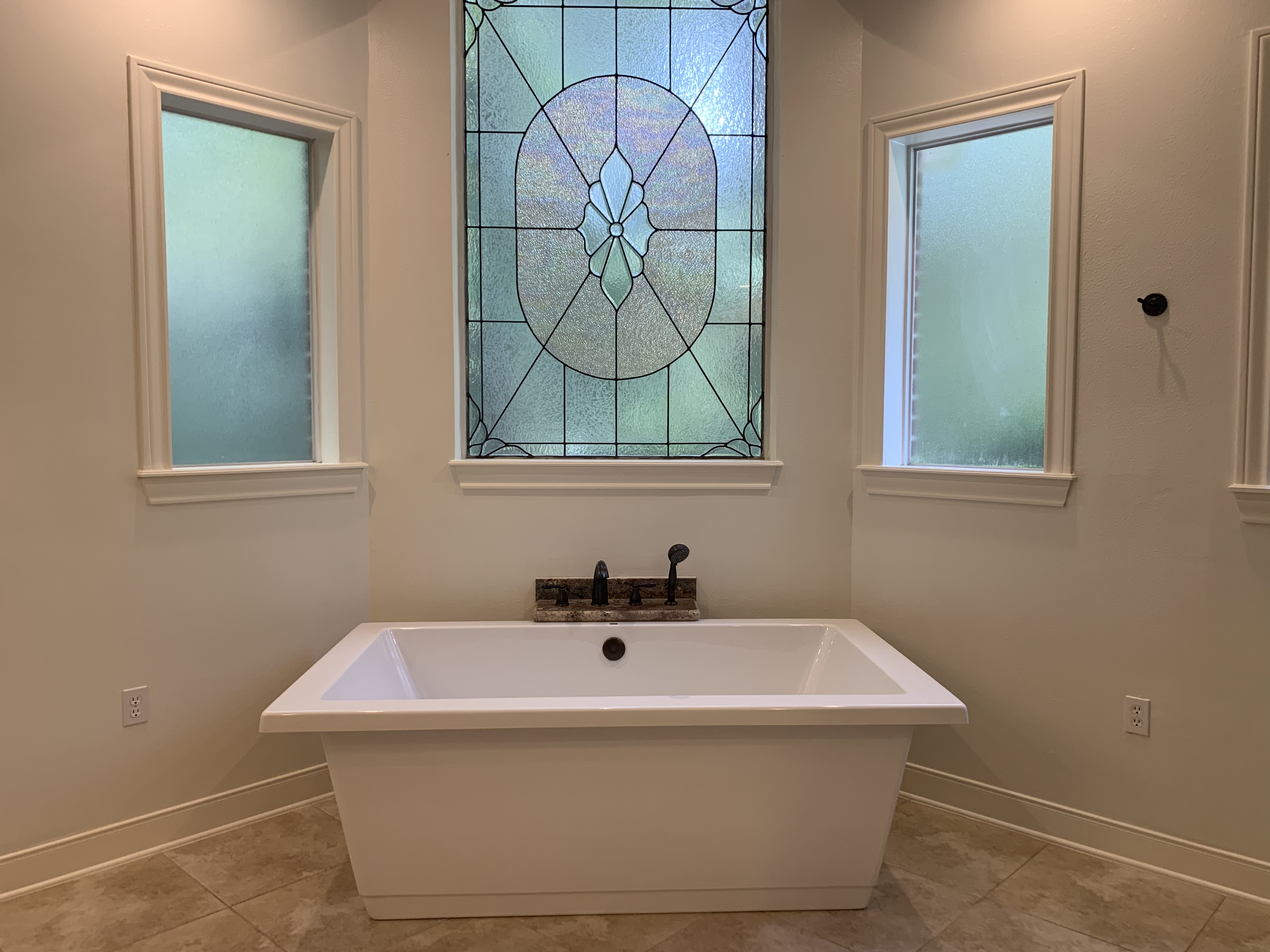
The window situation is great! We have so much bright light coming through. I originally thought we would replace the stained glass window, but, it’s actually grown on me and I like the character of it. I love that it is part of the original house, I feel like it’s just keeping a bit of the history from this place. That bathtub is large and in charge. It was here when we moved in!
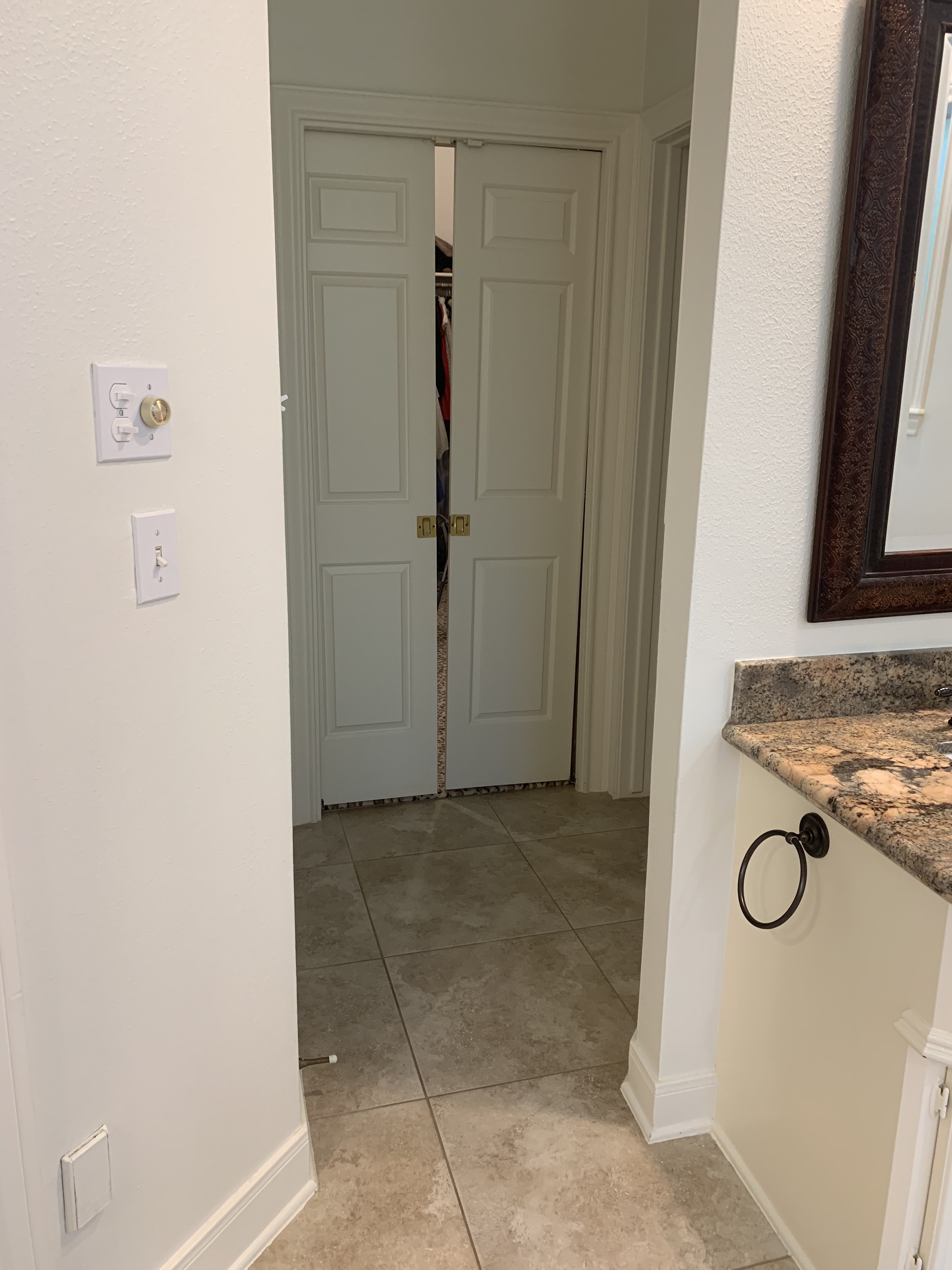
These are the doors to our closet and to the right is the toilet area. To the left is a linen closet.
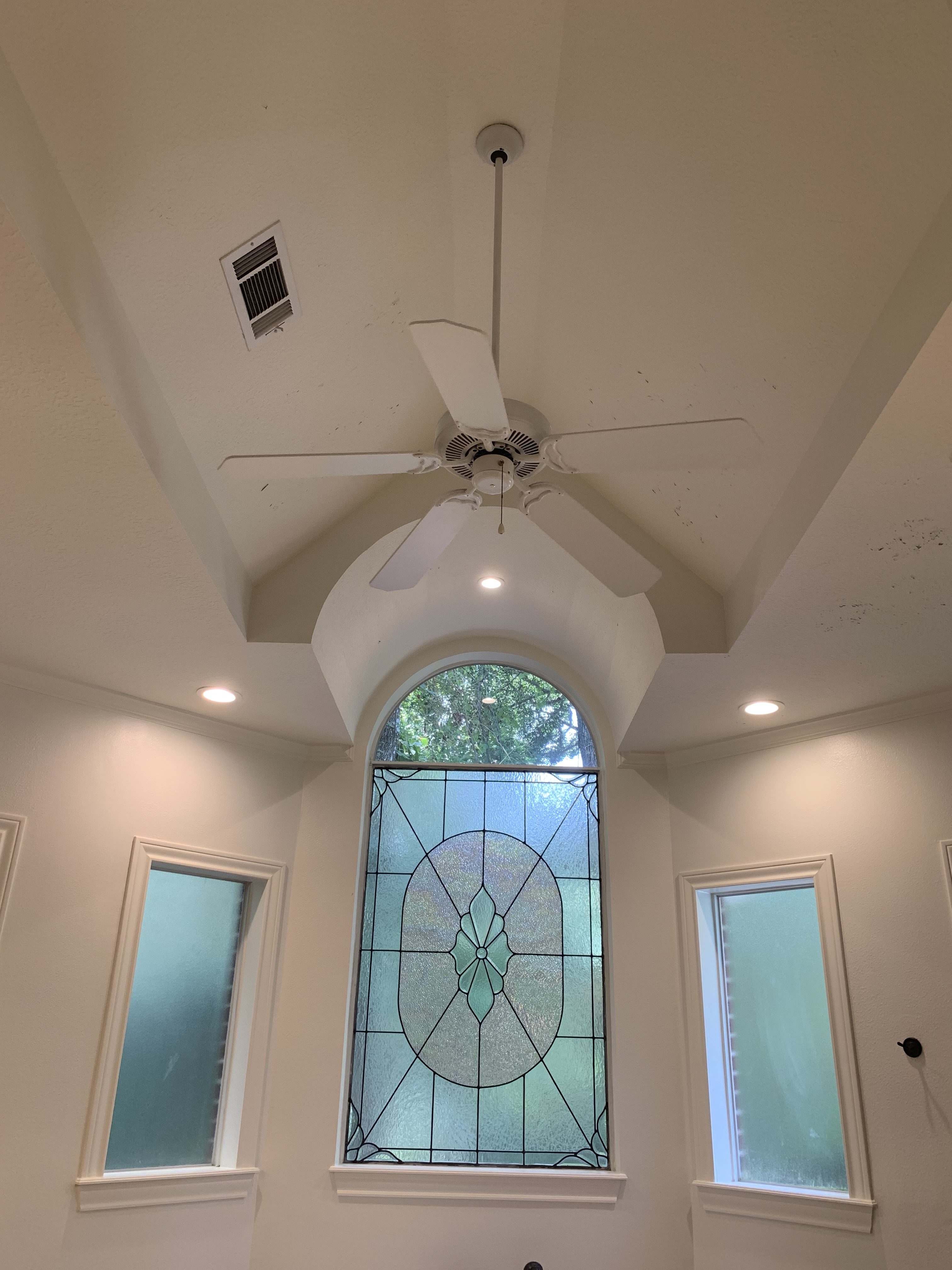
I am so excited for the plans for this ceiling. We’ve had these plans for it since we first looked at the house all those years ago!!
Here we go!!!

Master Bathroom Plans
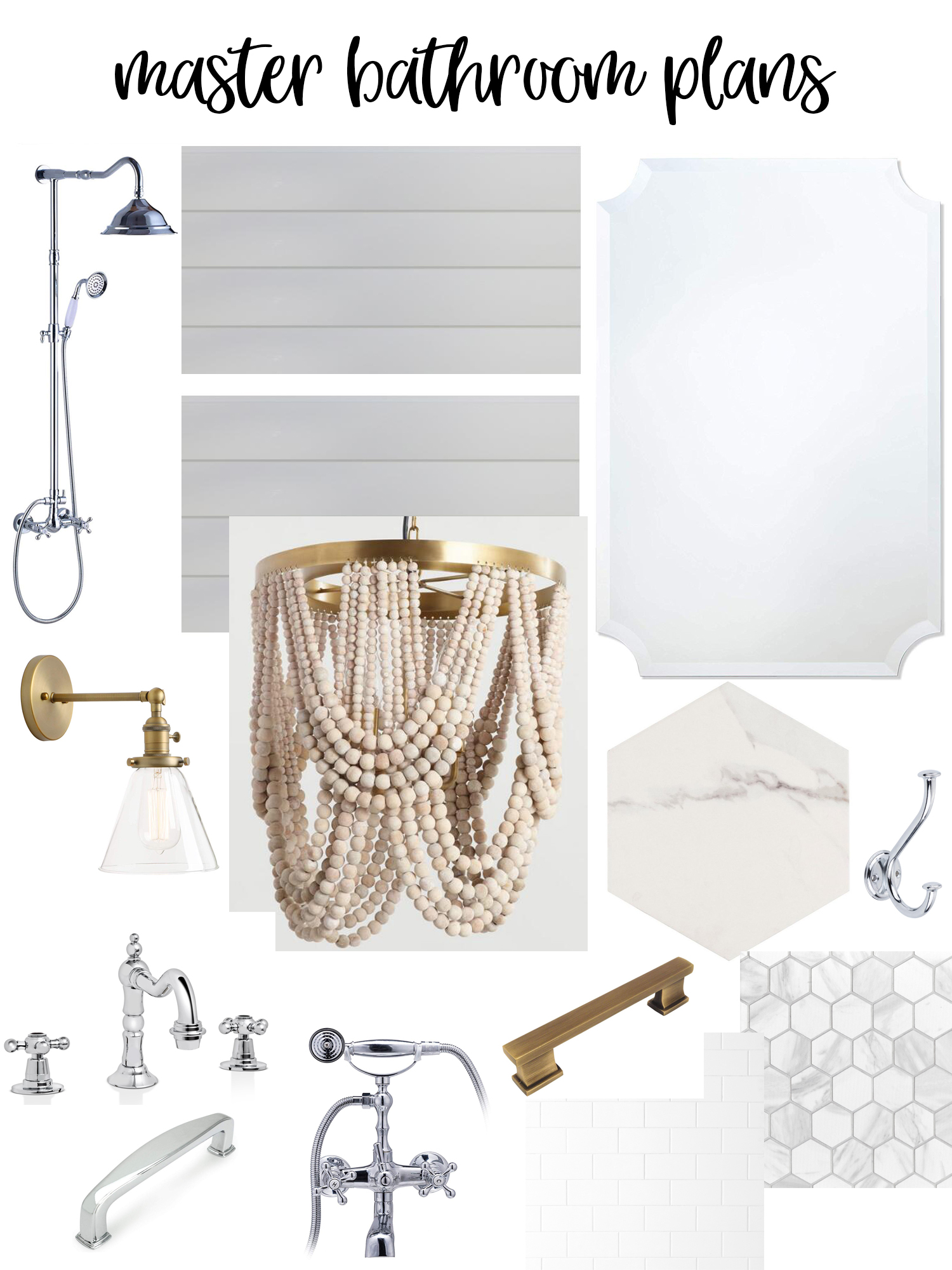
SHOWER FAUCET // SHIPLAP // MIRRORS
SCONCES // CHANDELIER // SIMILAR FLOOR TILE
SINK FAUCETS // BATHTUB FAUCET // DRAWER PULLS
DRAWER PULLS // SUBWAY TILE // HEXAGON TILE
I love the look of polished chrome and/or brass in bathrooms and as much as I love brass, I knew I had to mix both metals into this space (like our laundry room). I just love the fun of mixing metals. It’s really unexpected and such a great way to add a lot of dimension to a space. I loved these frameless mirrors that I found and as with most of the fixtures, they were a great price! I am obsessed with the chandelier and can’t wait to see it up! I loved the brass pop in it! You know how much we love beaded chandeliers in this house. This is the 4th one in the house alone! I hope this gives you a fun sneak peek into the bright and airy master bathroom we are creating! I can’t wait to see the finished product! Can you?
Have a great Monday!! XO!
If you liked this post, you’ll love April Amazon Haul and Teddy’s Reading Nook!






Can’t wait to follow along on the renovation!
I just used the same hexagon title for my shower floor and LOVE IT!
I am so excited for you! I love all of your home posts. One thing I have learned from my bathroom I would like to share to give you something to think about. We have a marble hexagon tile as our shower pan…and I want to rip it out. It’s hard to keep and stay clean. Over time (just 3 years) the water has been really hard on it and it’s no longer white w gray marbling. Myself and my house keepers can’t get it gleaming. It’s grayish now where the water constantly hits it and never looks clean even tho it is.