Hi friend! This post is a long time coming and with Instagram taking over and readership of blogs going down, it’s just taken a backseat. I know there are some of you who still read blogs, but sadly, that number seems to dwindle each year. I will forever keep this space going, as it’s the one space I create content that I own! That being said, I promise to fix this lag in updates and we will be sharing all of of the Florida house before and afters, soon, too. Either way, my goal was always to have a place to house all of the before and afters of our beloved Texas house. This will always be one of my favorite projects and truly something I am most proud of. All design, decor and plans are done by me with a side of Mr. Fancy and his ideas. We are pretty great at collaborating and coming up with ideas together and we are able to see past current home decor/plans to envision what a house will look like with our spin on it. The story of our Southgate Drive house was truly meant to be and I have no doubts that our family was 100% meant to live there (it’s the coolest story) and truly, if I could’ve kept that house forever, I would’ve. It had amazing bones and just needed some tweaking to be perfect for our family! Every single surface was touched by us and like I said, it’s one of the projects that I’m most proud of to date! This post is long and I could’ve put it into numerous posts, but I thought one was easier for you, the reader. So, grab a cup of coffee or a glass of wine and let me take you through the before and afters of our sweet Texas house. Hang on because this is a longggg one!!
Before:
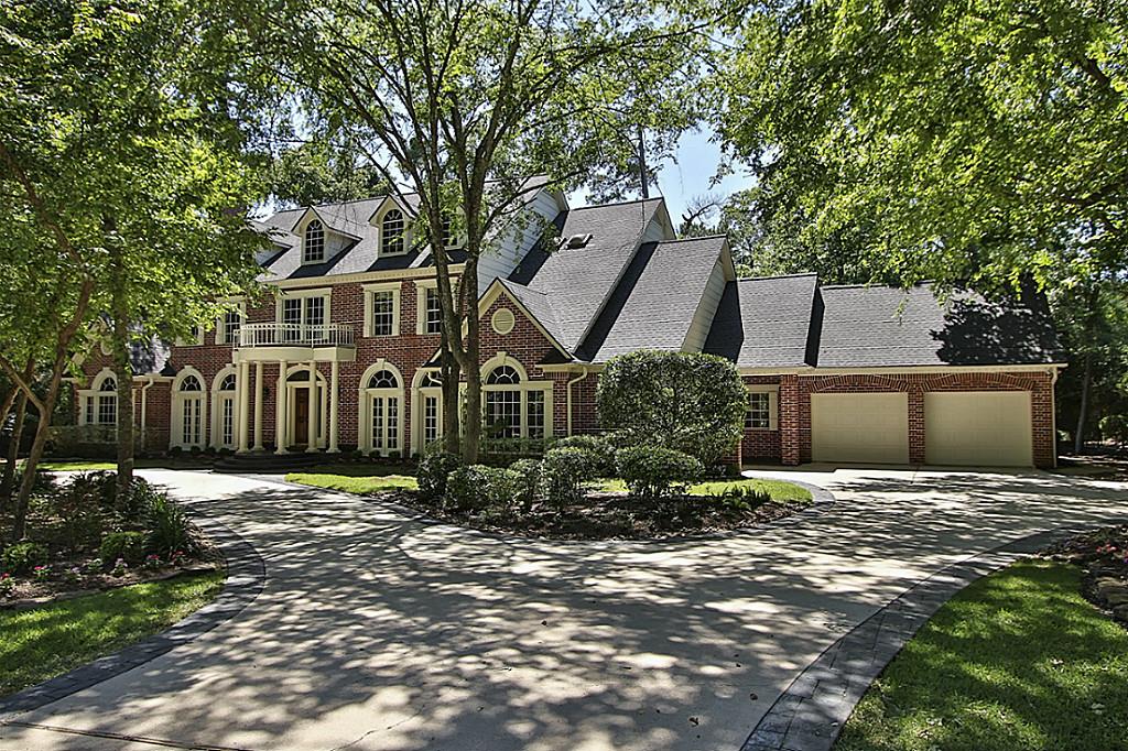
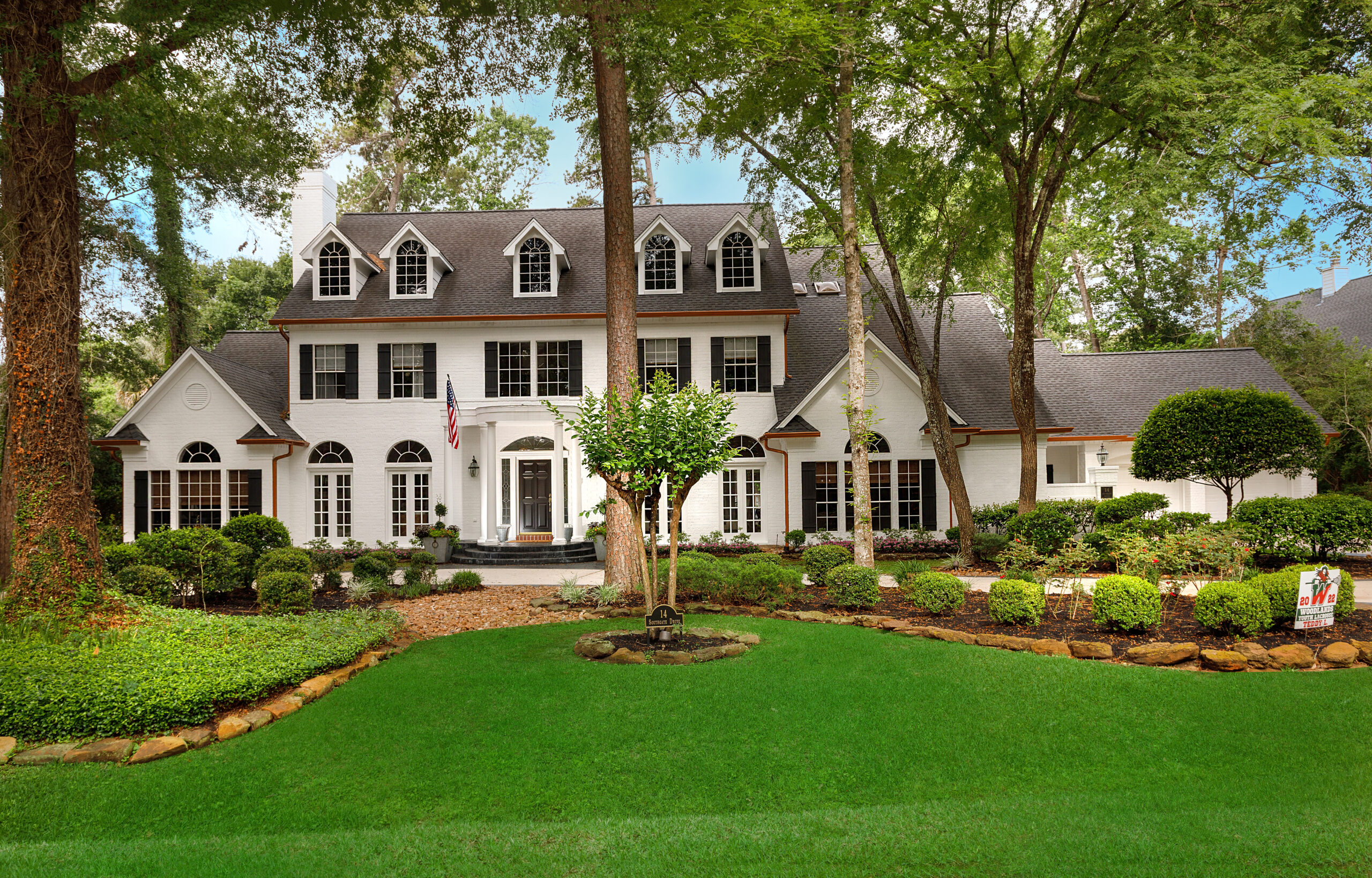
Front After: It’s amazing what a little white paint cant do for brick. We removed all the trim around windows and doors and this made a HUGE difference. While it was gorgeous, our goal was to update it and removing that was easy and made a huge impact. We also added vinyl shutters. With humidity and weather in Houston, these will wear a lot better than wood. The copper gutters are like jewelry for the house and we love how they turned out. Removing the railing off the front porch was a small, but impactful detail, too. It’s really amazing to look and see how minor and semi-easy changes really change the look, vibe and feel of the house.
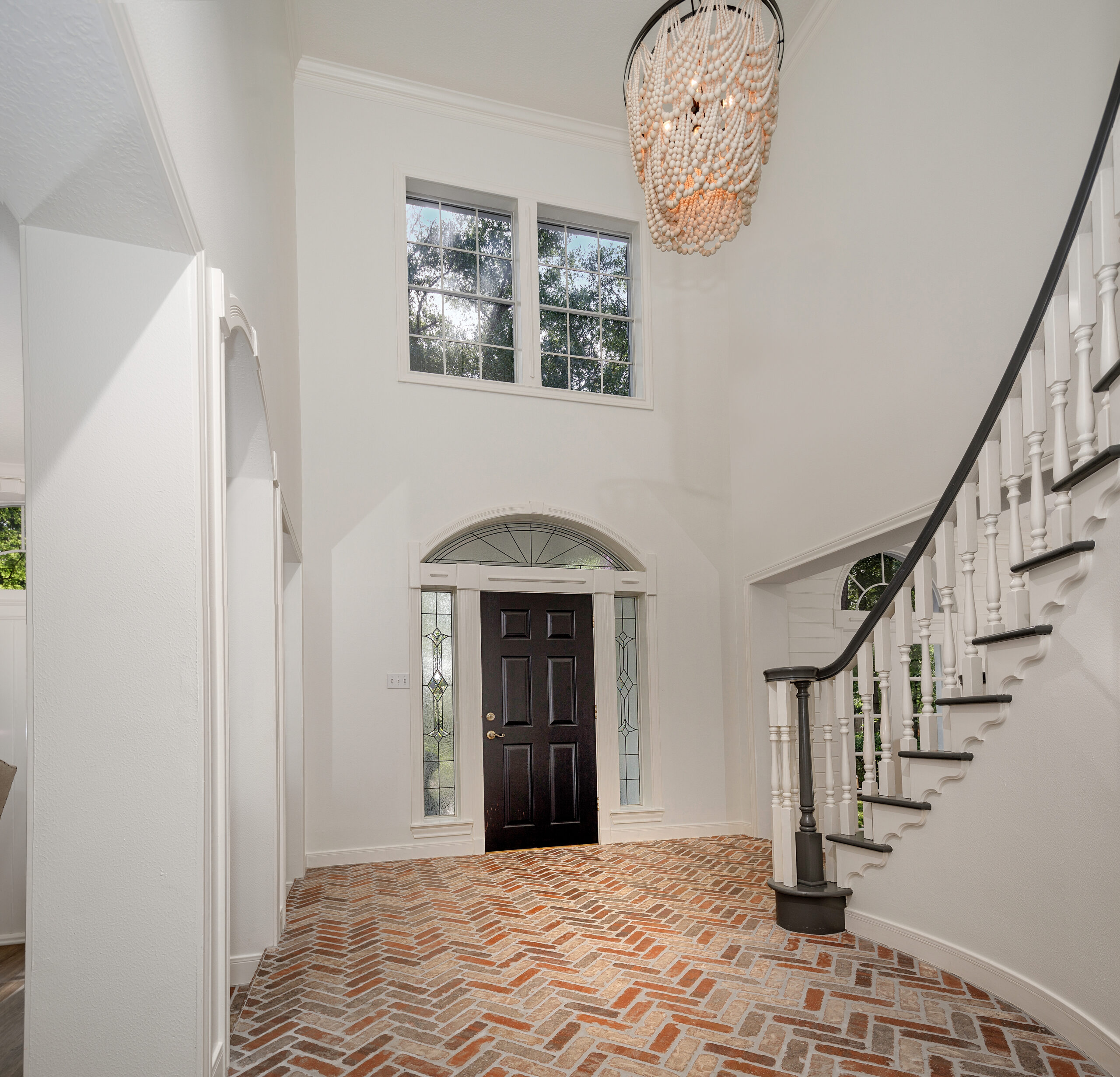
Entryway Before:
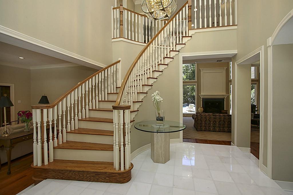
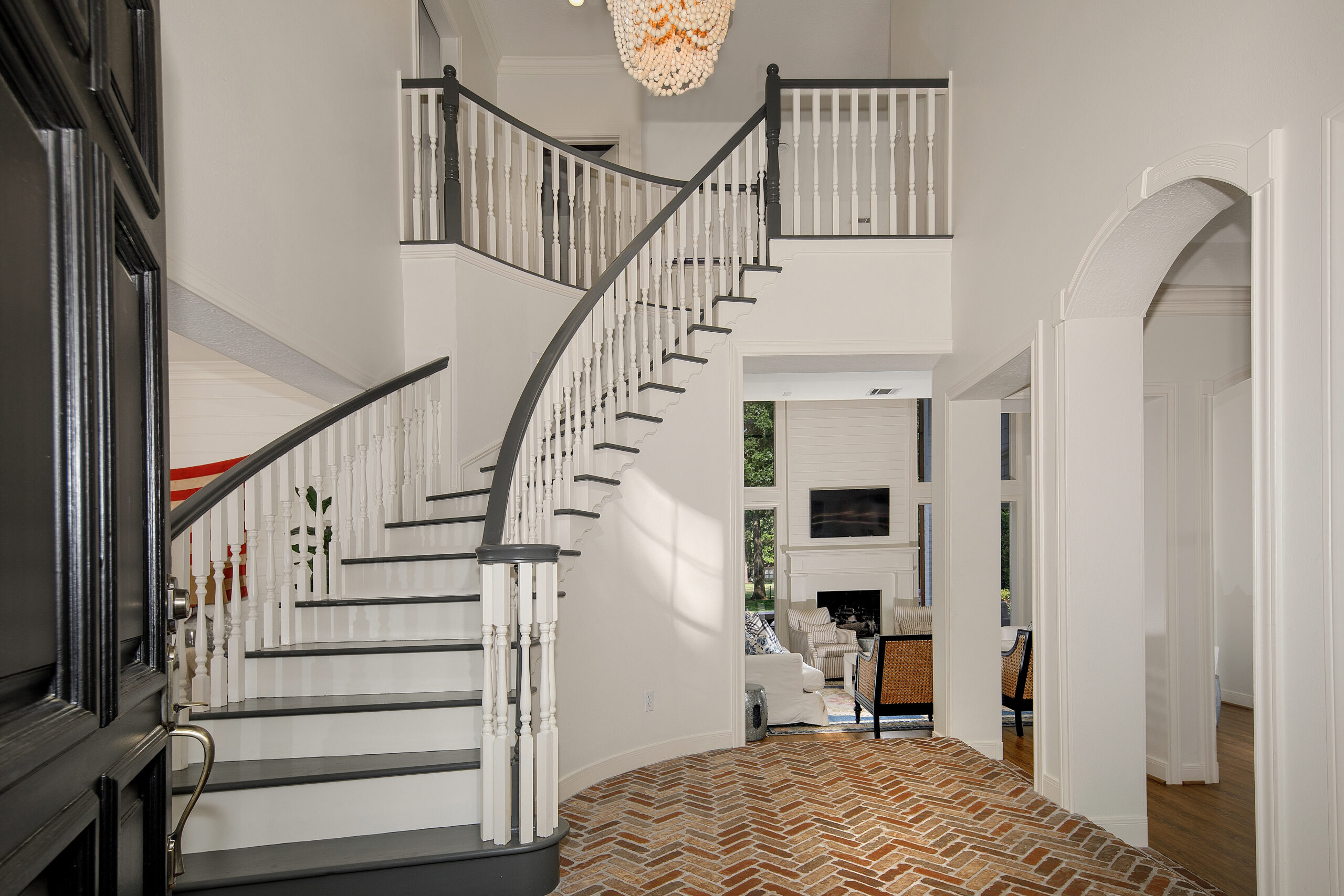
Entryway After: We truly loved this grand entry, but it really needed a bit of updating to make it more our style. We opted to paint the stairs Kendall Charcoal by Benjamin Moore and the spindles are White Dove like the rest of the house. We added my signature brick flooring and it just made the space lighter and brighter. My favorite chandelier hangs from the ceiling. Fun fact: I’ve had this light in two of my houses. The only thing that we considered doing, had we stayed, would have been adding a double door to the front. This was always something I wanted to do, but painting the door black actually made a huge impact and I was thrilled with those results.
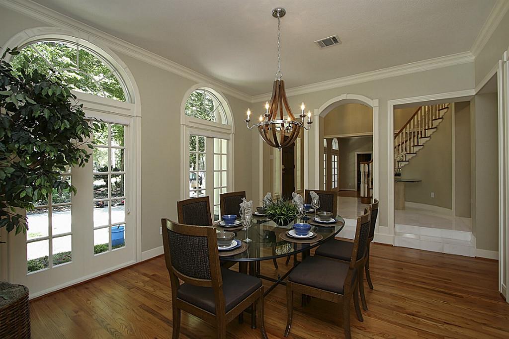
Dining Room Before:
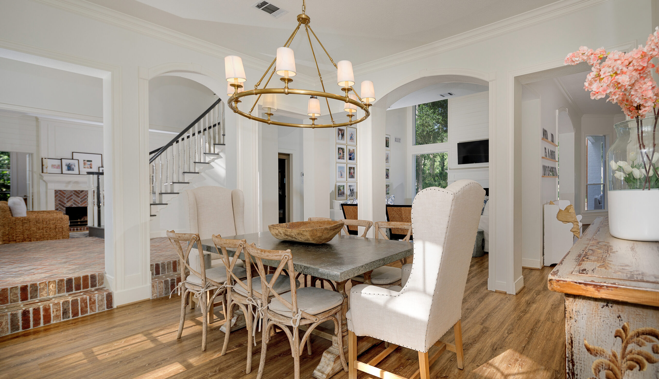
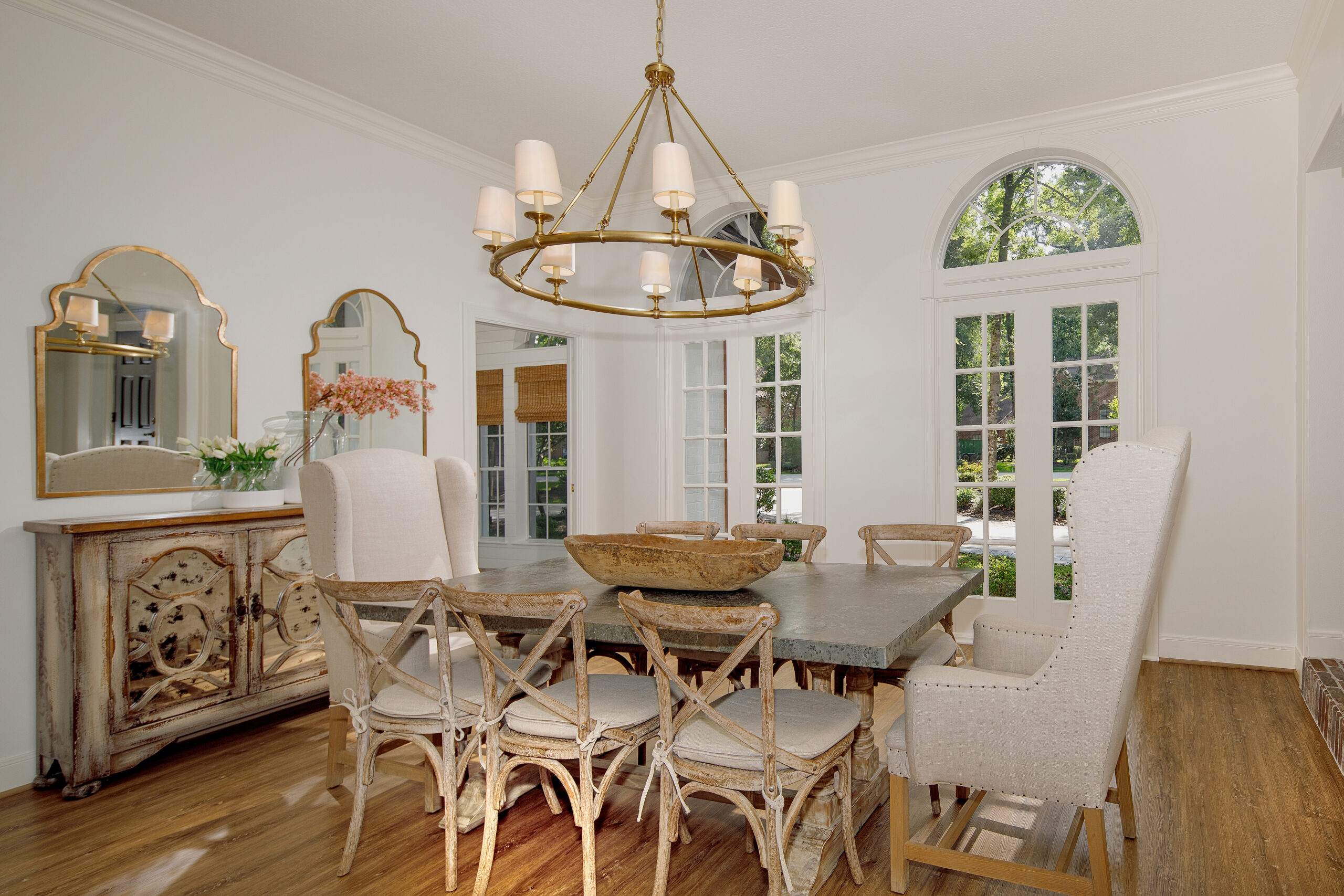
Dining Room After: This space is a prime example of just how much changing out furniture, lighting and painting, can change the look of a space. This light and bright space was the setting for tons of meals and memories over the years.
Fun fact: I have had this light in numerous houses, as well. If I love something, I will always try to incorporate it again in another house.
Family Room Before:
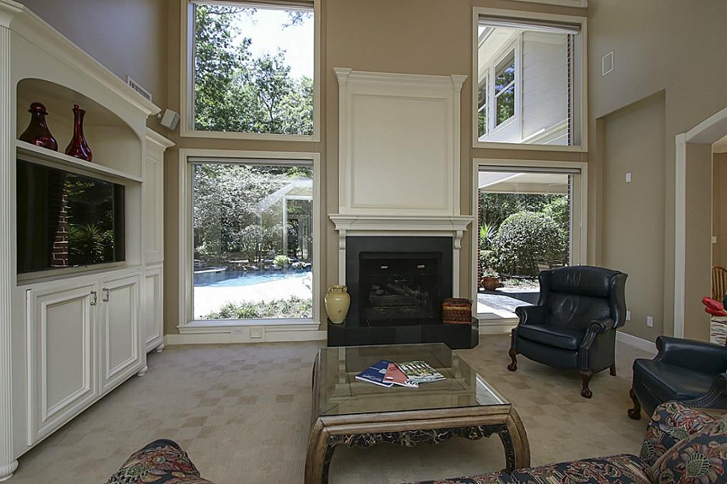
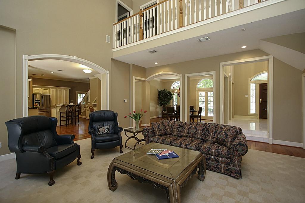
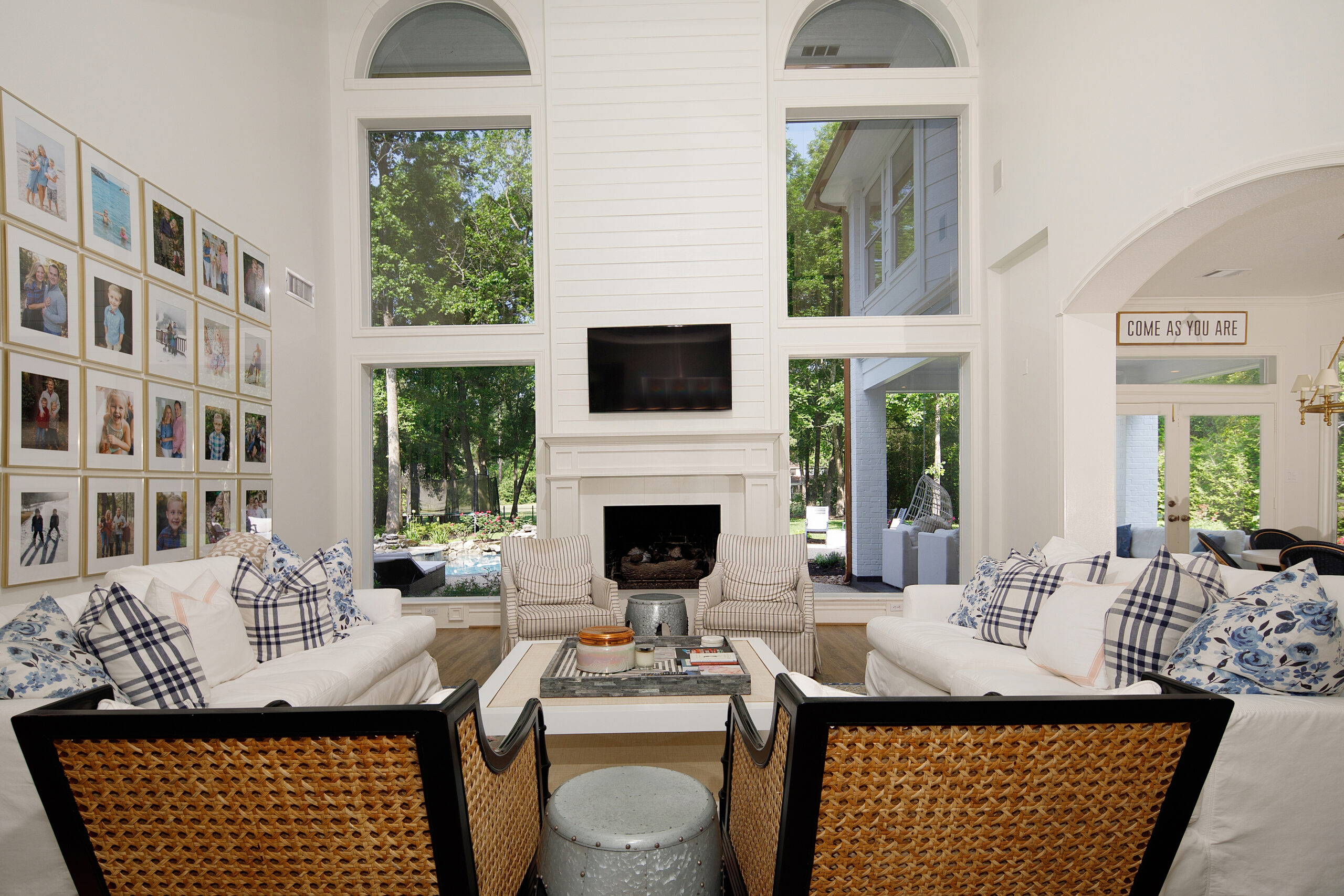
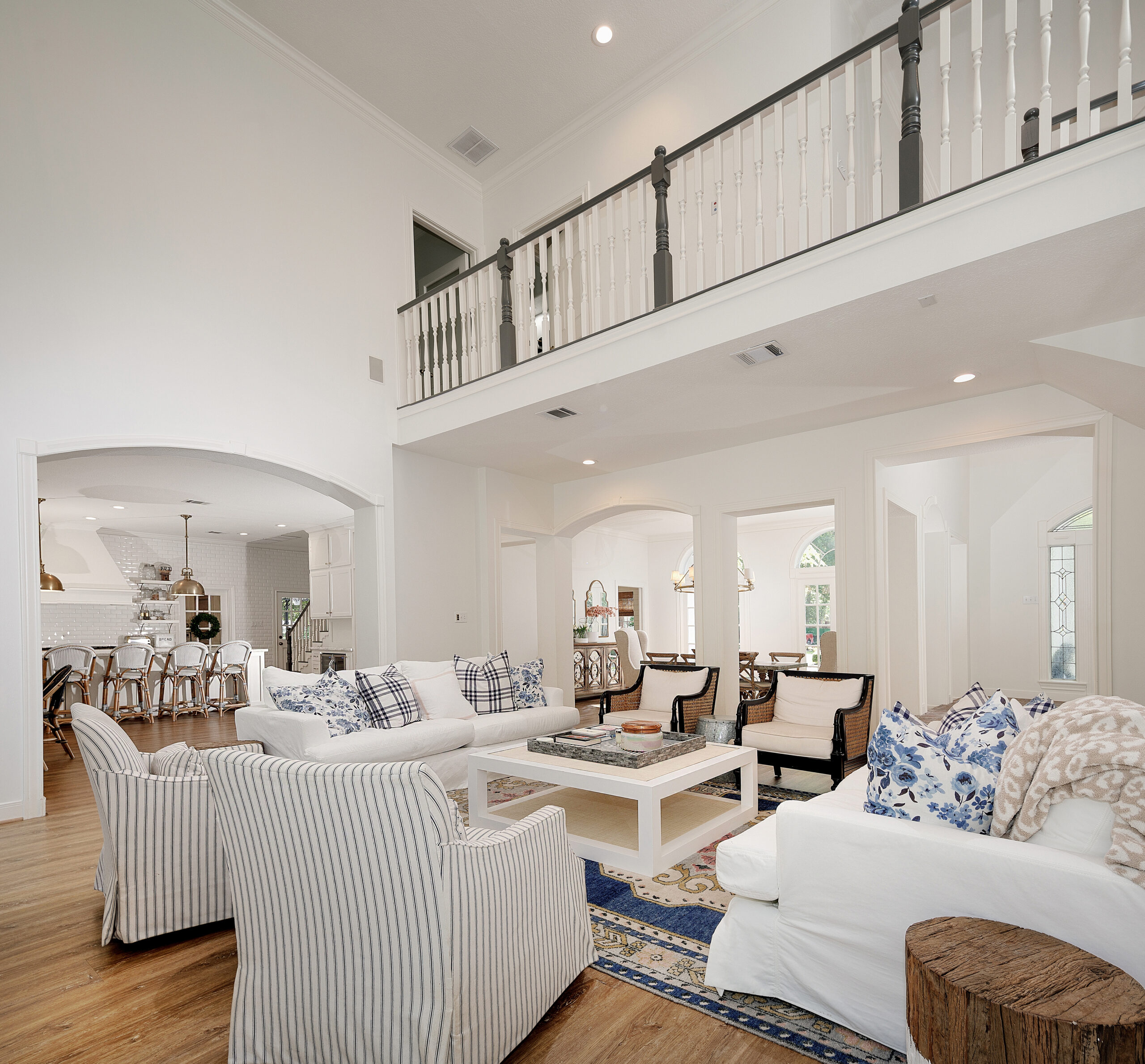
Family Room After: This is the first room you see when you walk in the front door, so I knew it needed to make a huge impact. The first thing we did was change the fireplace surround and add shiplap to the ceiling. We all removed the builtin and added a gallery wall. Removing this builtin really made the room look more symmetrical, which is something I try to always strive for. I really prefer clean and symmetrical lines. This gallery wall was a favorite project and has been replicated in many of your homes over the years and it can be done on a larger or smaller scale! Our frames are 16×20, but there are lots of size options. Because this was the main sitting area, we wanted ample seating. I opted for 2 couches and 4 chairs. Most guests seem to prefer a chair and you can swivel the chairs to face the fireplace (I had my coffee here every single am).
Fancy tip: We opted to paint the fireplace tile the same color as the rest of the house (White Dove by Benjamin Moore) and this was not only cost effective at the time, but I loved it. I planned to eventually change it to tile, but we preferred this look over the years.
SHOP THE SPACE:
GLIDER | COUCH | COFFEE TABLE | WICKER CHAIR | FLORAL PILLOW | RUG
The Kitchen Before:
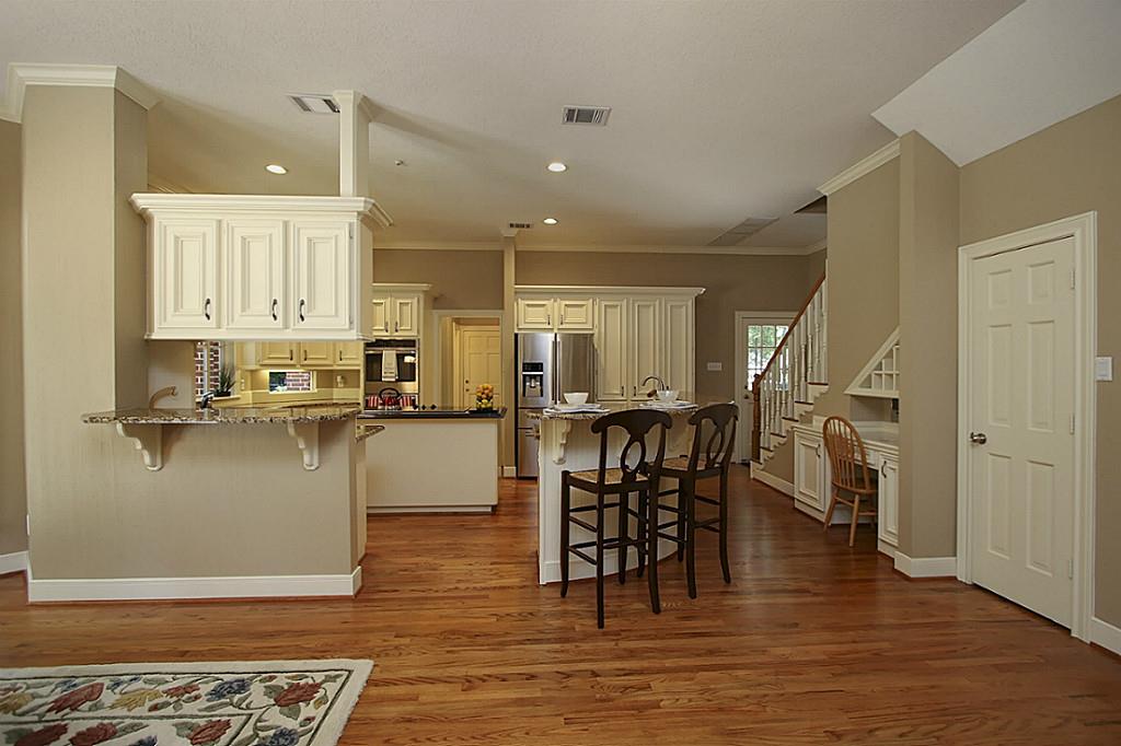
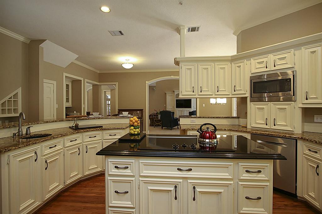
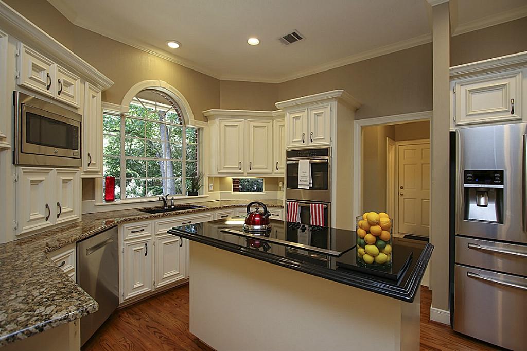
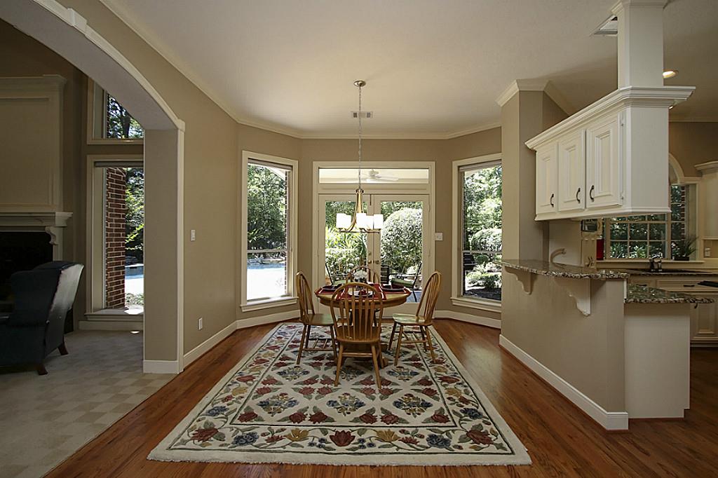
The Kitchen After: You’ll have to weigh in, but this to me was the biggest transformation of our Texas house. The kitchen was massive and more space than anyone actually needs, but it was such a blank slate! By getting rid of the peninsula islands and tiny middle island, we were able to add a MASSIVE 10 by 6 island. This island had drawers on one side, shelving, a microwave and ice maker and shelving under the barstools, too. My goal is always to get as much space utilized as possible. I also prefer open shelving and will likely always have it in some capacity. It has taught me to get rid of stuff we don’t use daily, plus things are just out and ready to be used. We did a similar shelving situation in our Florida house renovation. The La Cornue stove is my favorite and our drink fridges are awesome, too. We again did this on a smaller scale in the Florida house. I loved these pendants so much in my first Texas house, that I reordered for this home. They are discontinued, but these are similar. The ring light was also used in our other Texas house and again, I just loved it and bought it again. I have a thing for brass. Moving the door to the laundry room was key, too (Mr. Fancy’s idea). This helped to really give us a full wall of shelving, drawers and a spot for the range. The floor to ceiling tile wall is perfection and both my tile guy and Mr. Fancy thought I was nuts, but both of them agreed that it was a great idea (after the fact, haha). I love a floor to ceiling tile and incorporate in bathrooms a lot, too.
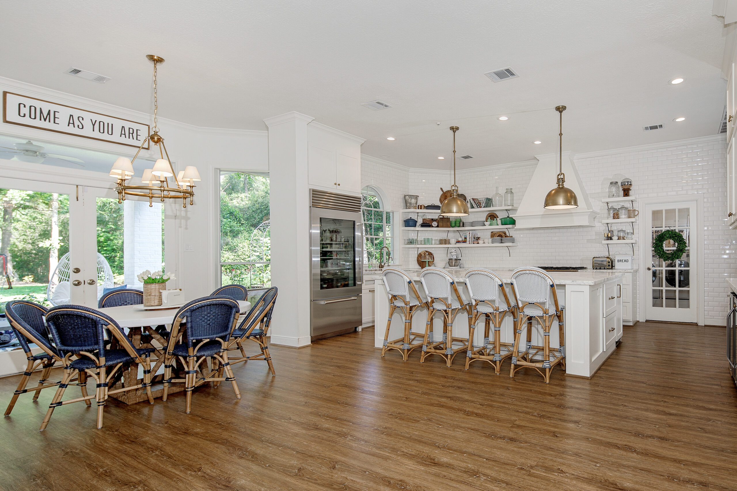
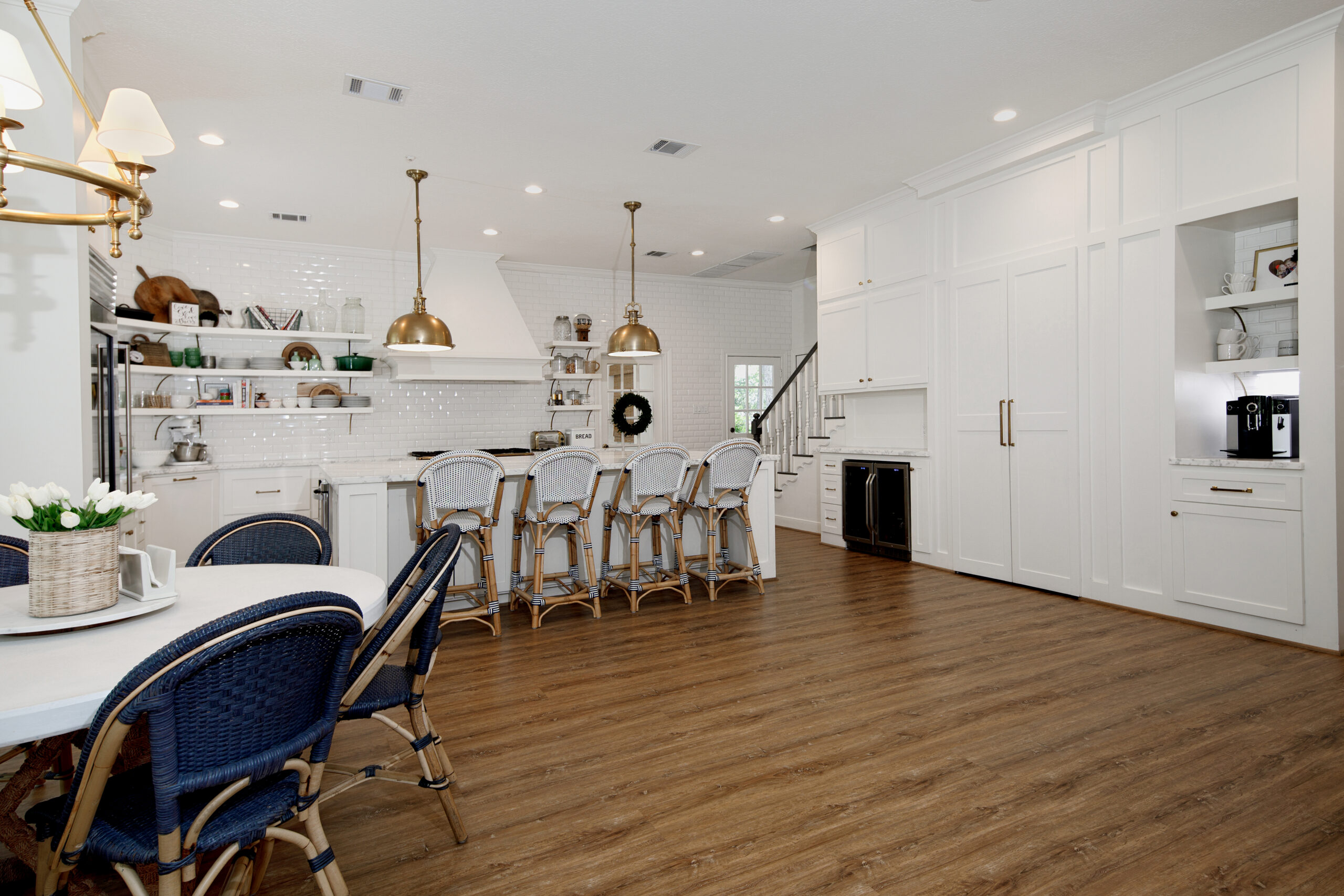
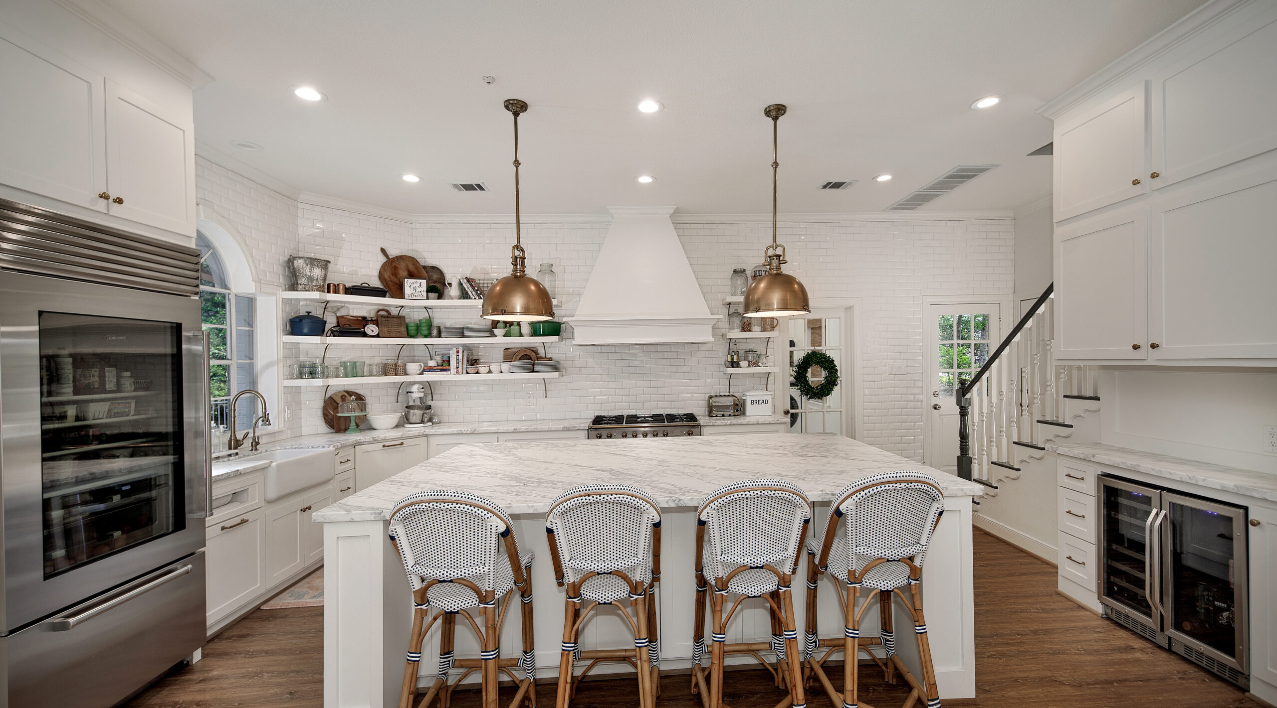
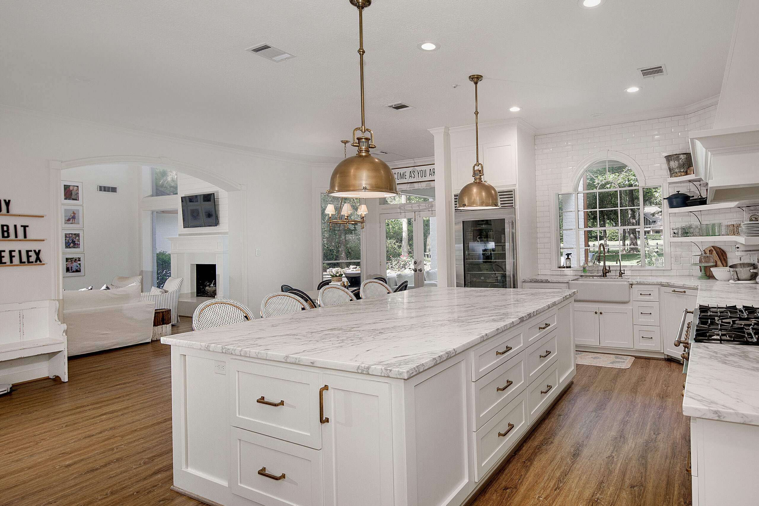
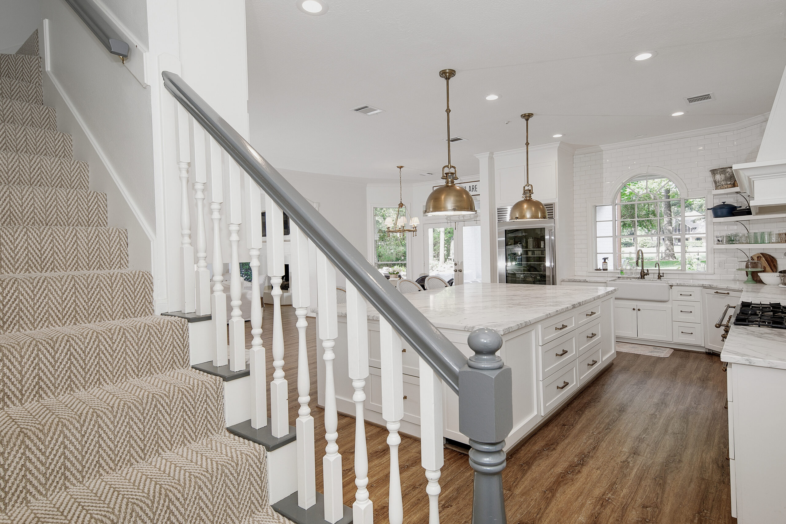
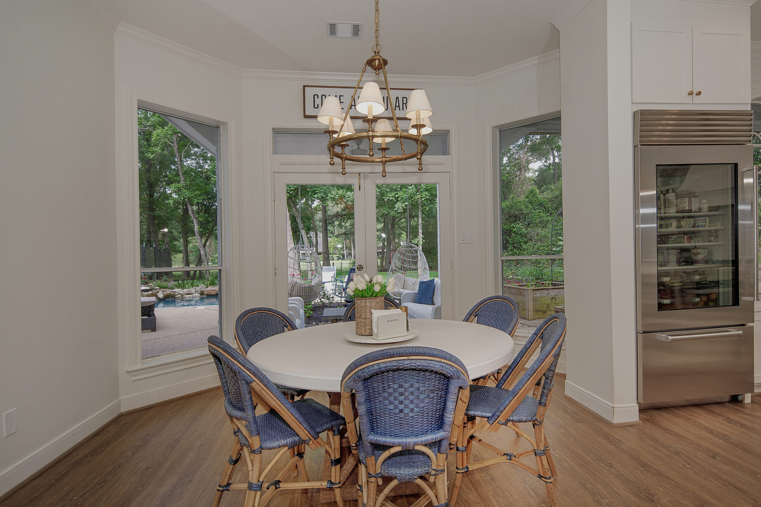
DINNING TABLE | CHAIRS | BAR STOOLS | CHANDELIER | SIGN | PENDANT
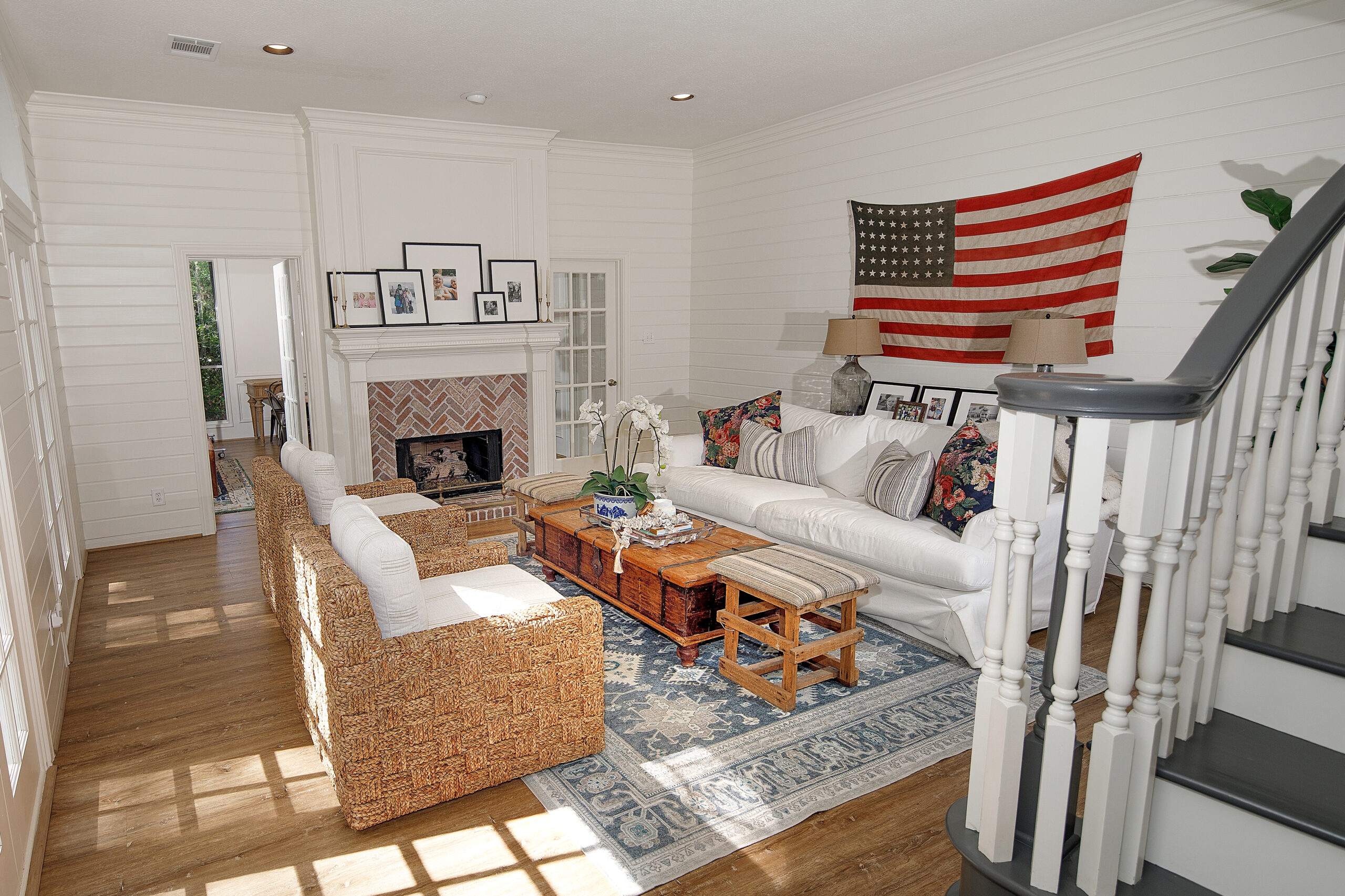
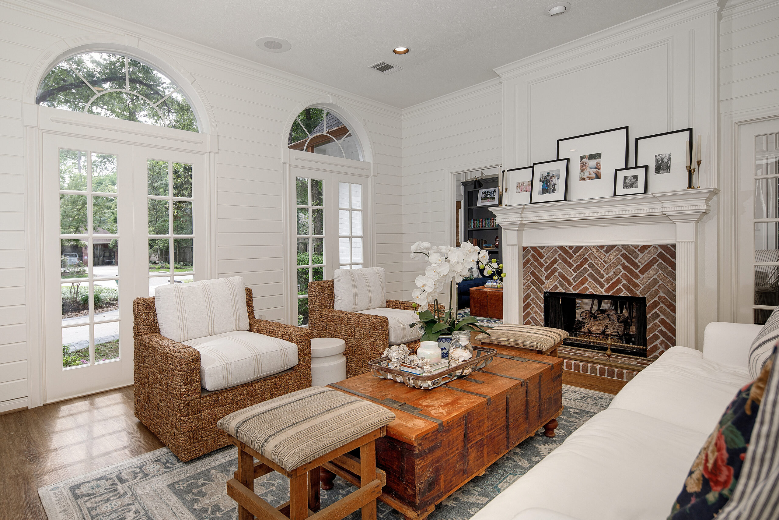
Living Room Before:
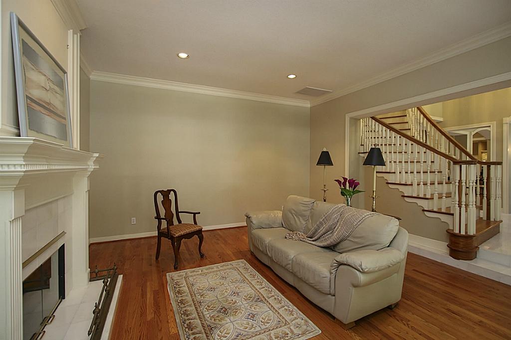
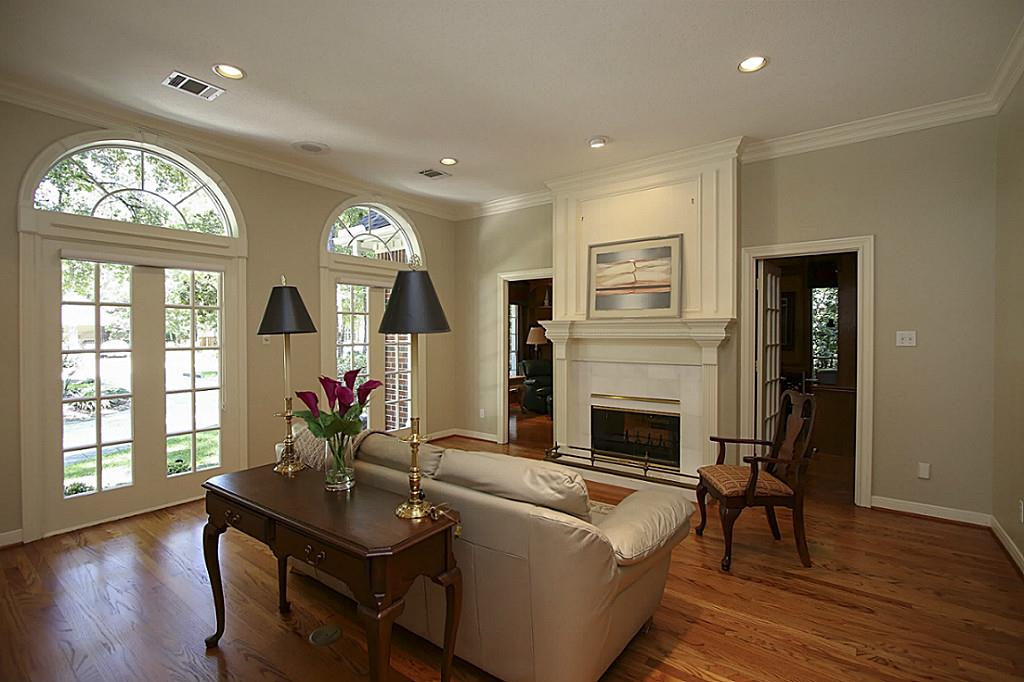
Living Room After: A little shiplap and some paint goes a long way, I tell you!! We also added the brick the double-sided fireplace to coordinate with the entryway floor. This room has great lighting and it was always one of my favorite spots to read! I used to think about putting a TV over the fireplace, but I loved having a room without a TV. It was perfect to read, for cocktail hour or quiet coffee mornings.
Mr. Fancy’s Office Before:
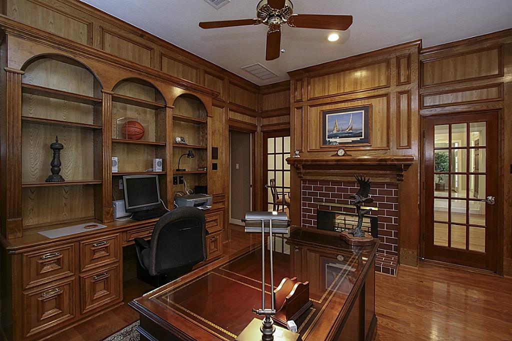
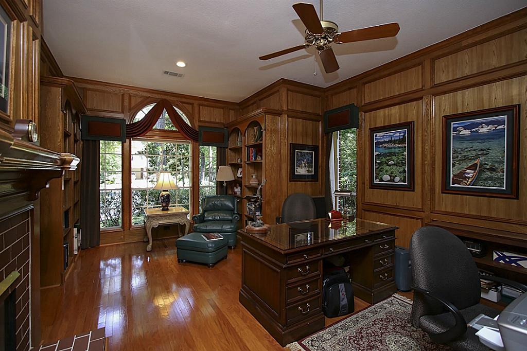
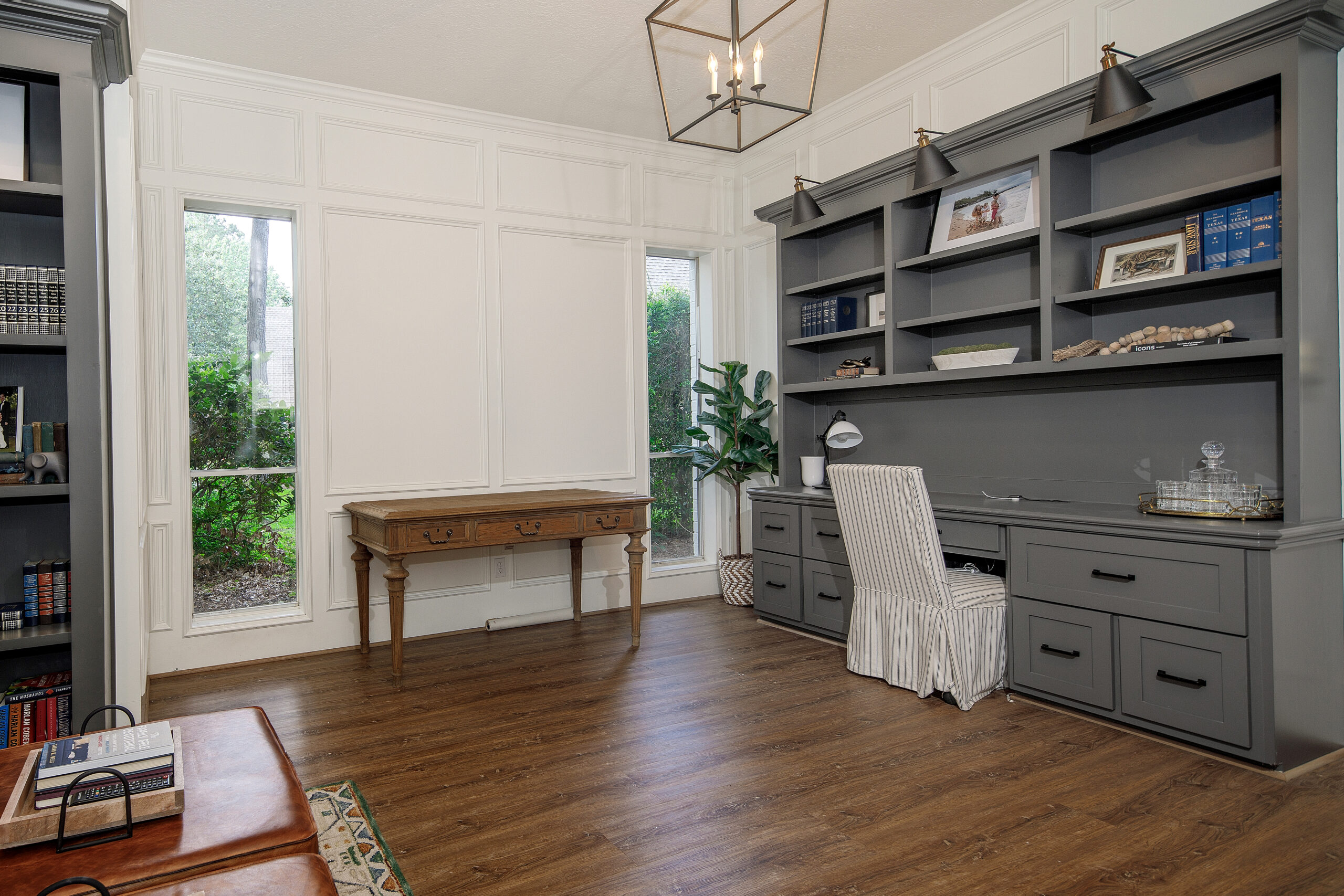
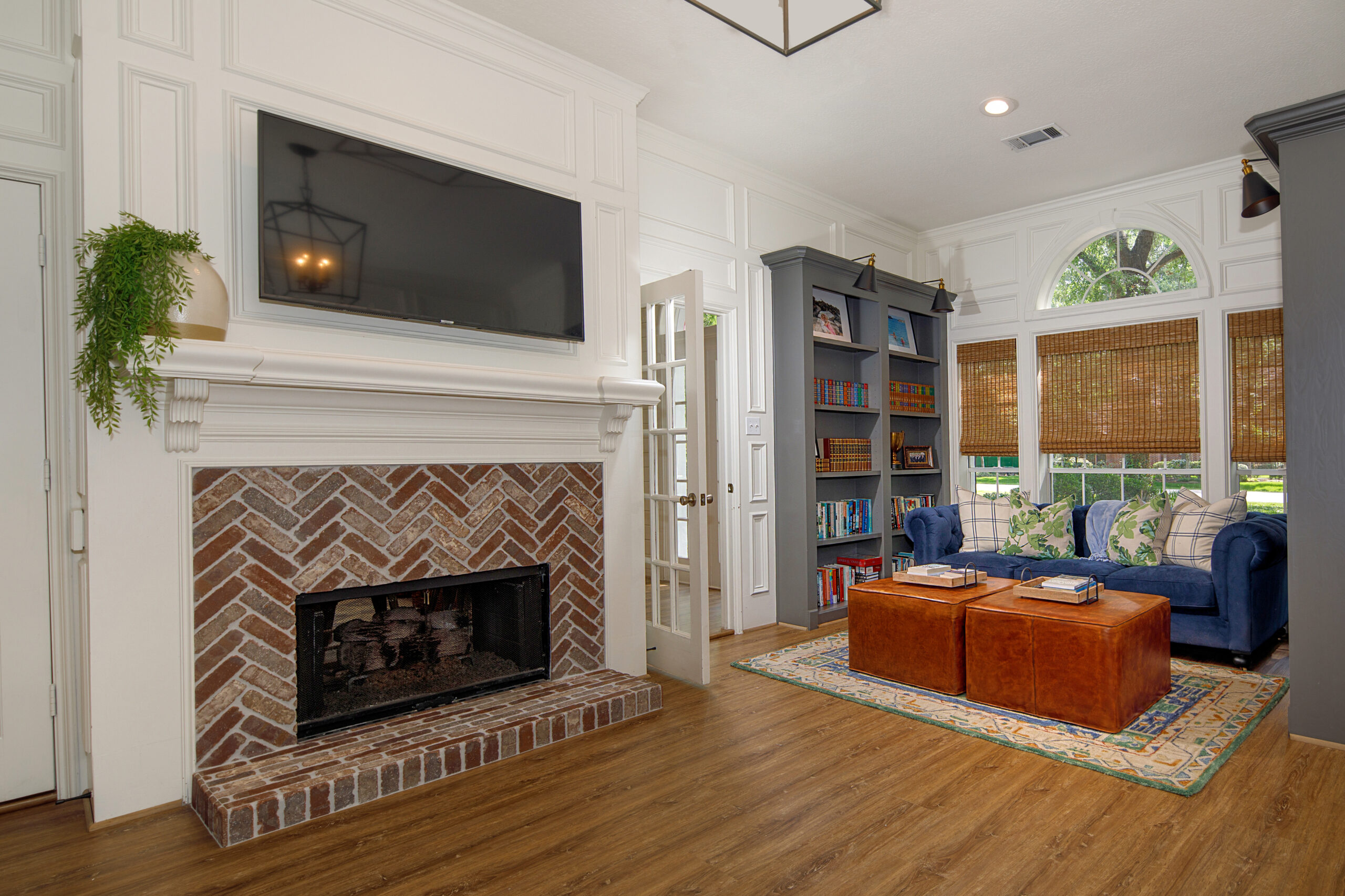
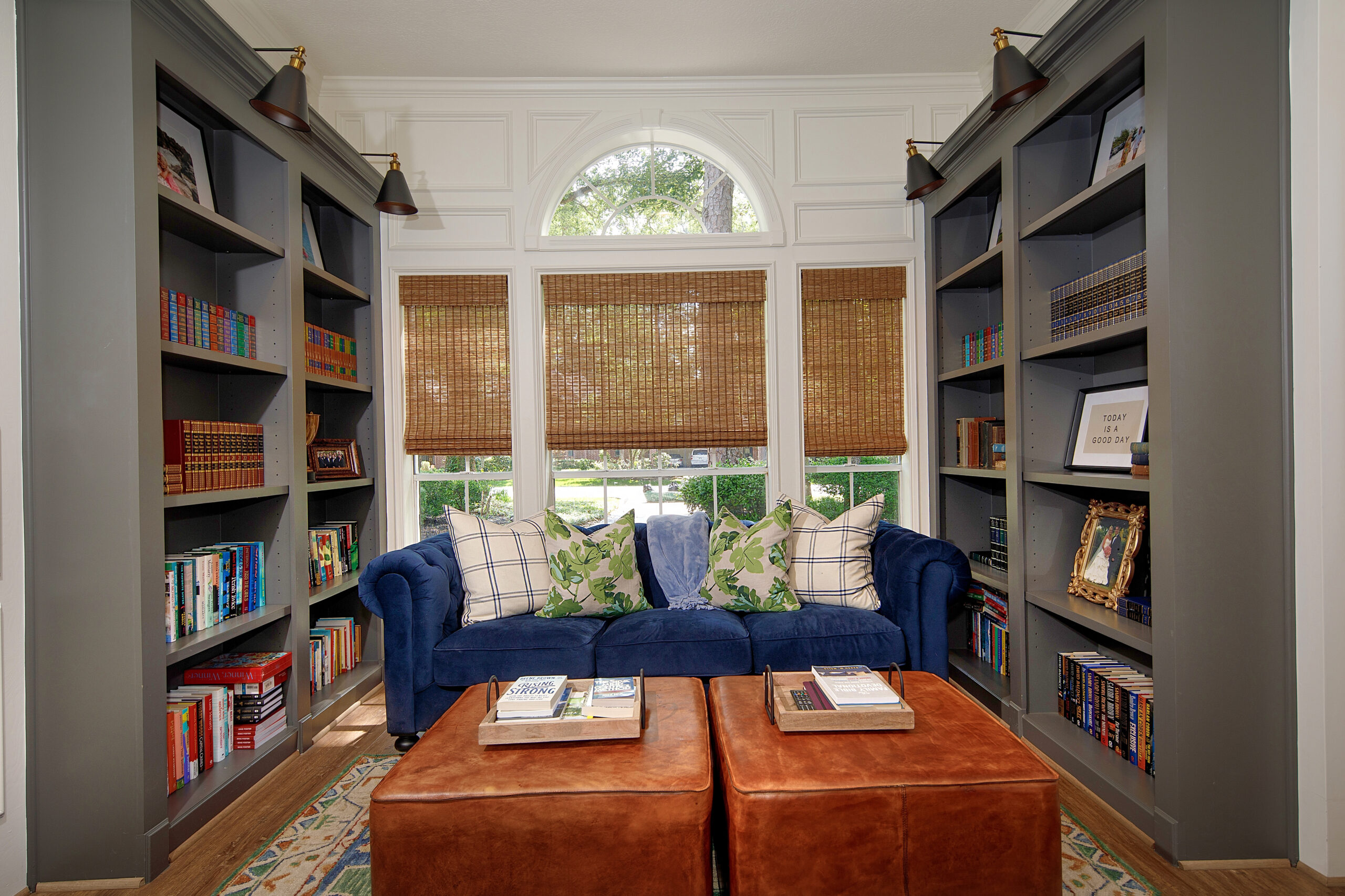
Mr. Fancy Office After: Well, I guess this space could also be in the running for transformation of the house. Holy wood before! Originally we sprayed the whole room white, but ultimately, we wanted a moodier look and opted to update the builtins and paint them Kendall Charcoal by Benjamin Moore. This is a great grey color! Mr. Fancy had a great sitting area in there and would often do his morning quiet time there or nap in there on the weekends while watching football. It was truly a zen space that I think he still misses to this day! It was also away from everything, so it was great for our lifestyle since when he works from home, he is on calls a lot.
The Primary Bedroom Before:
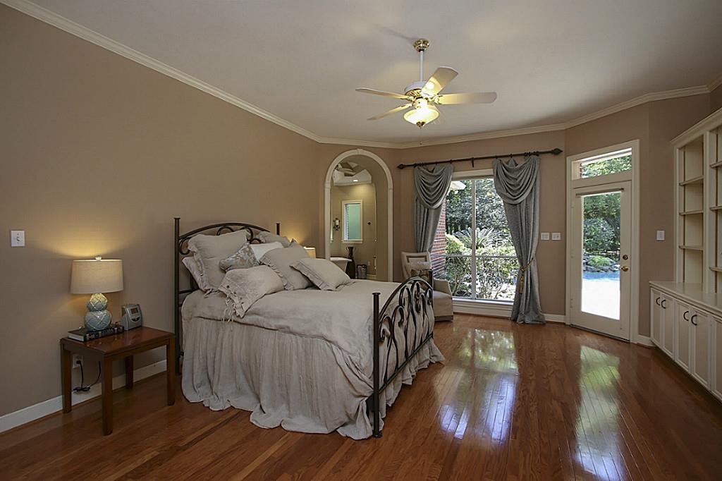
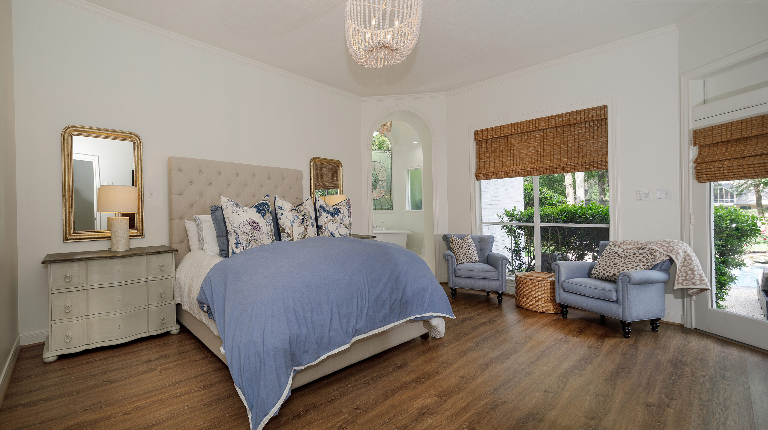
The Primary Bedroom After: This truly became a zen space and notice how much larger the room looks by removing the curtains and adding woven wood blinds. It really opens it up. Adding the sitting and adding a king size bed really made the space look larger, too. We removed the builtin in the before photo and added a small closet there. We had a small amount of unused space from removing the family room builtin. According to our floor plans, there was a wet bar at one point, so we just used that space for a little closet. It was perfect!
The Primary Bath Before:
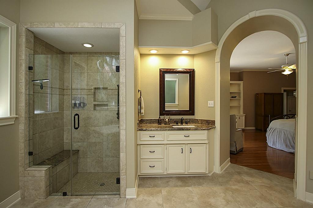
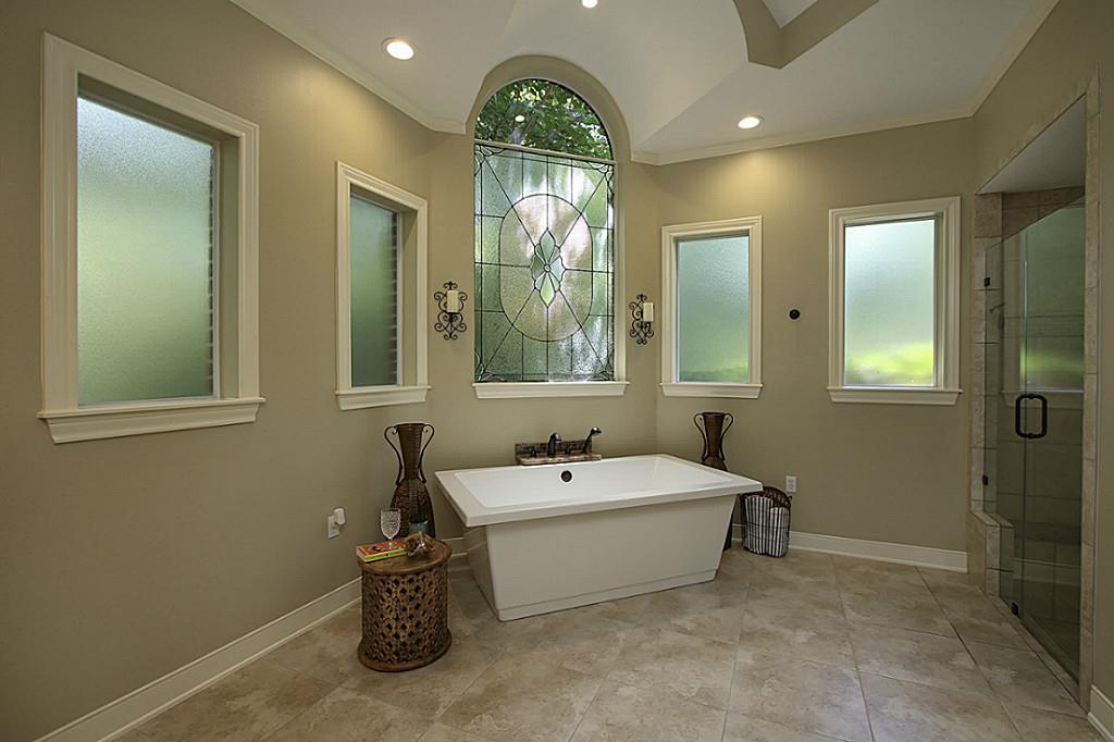
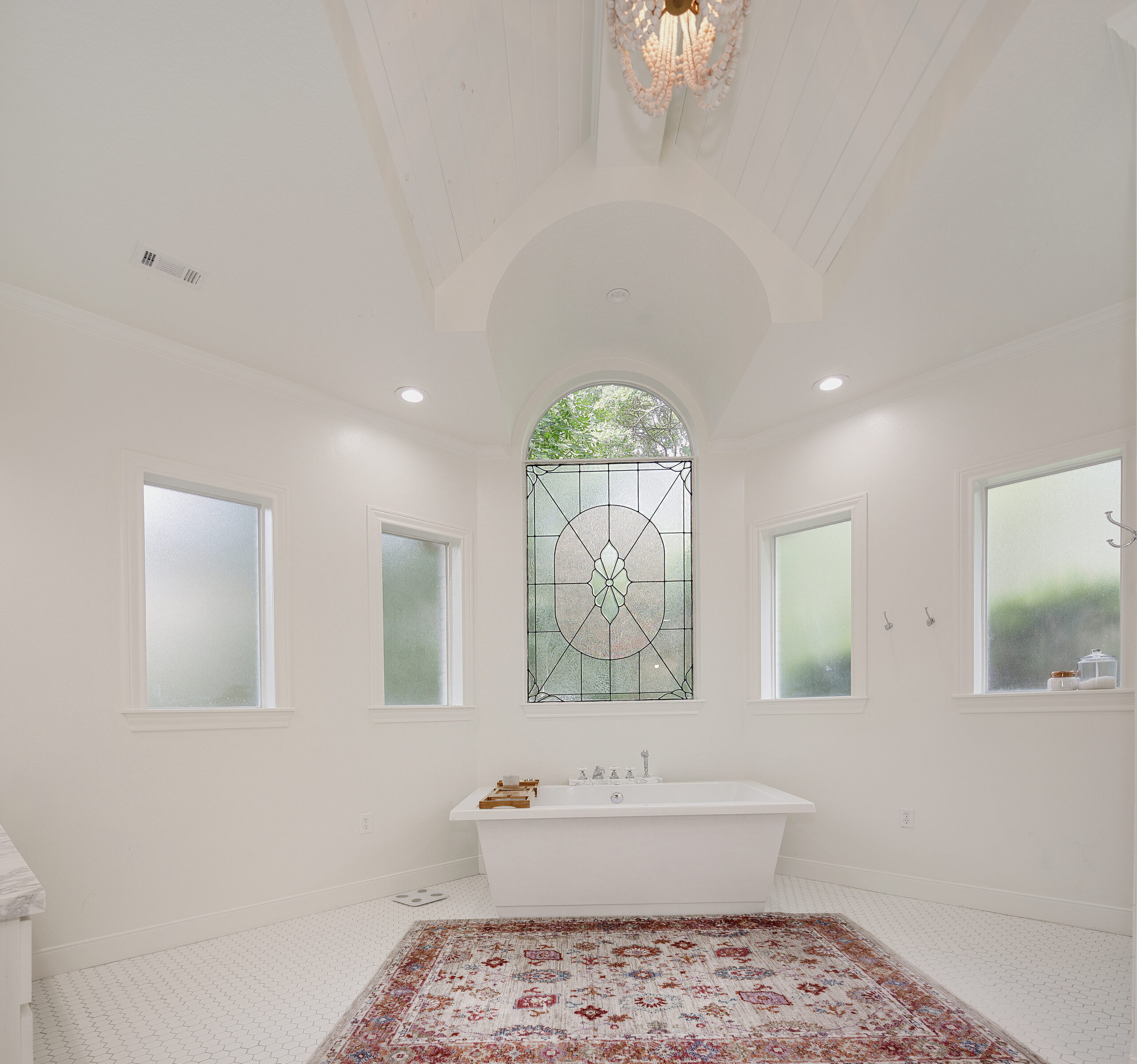
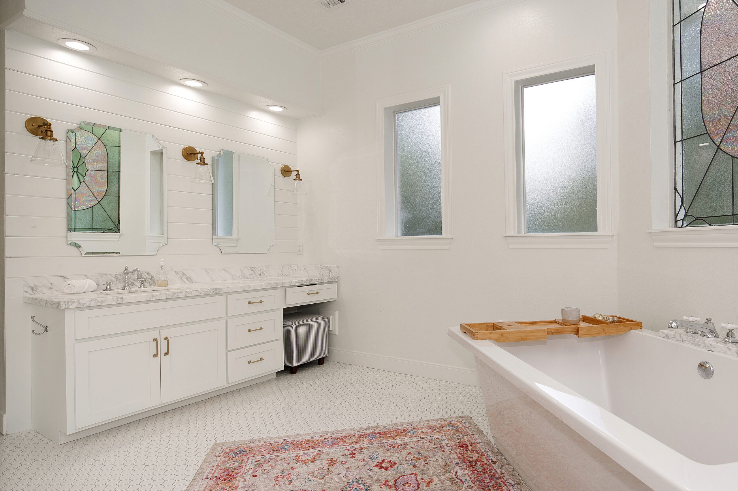
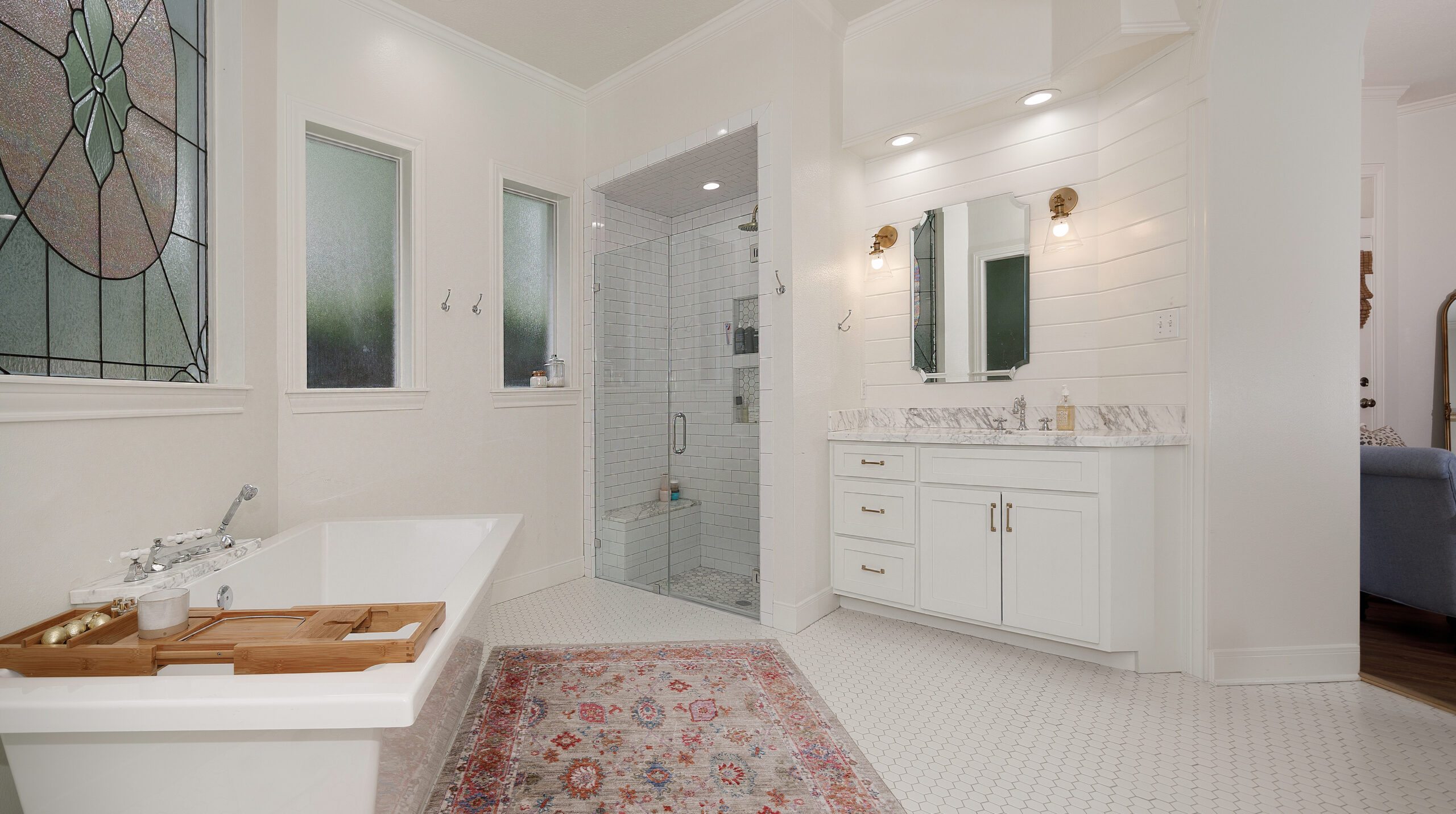
The Primary Bath After: We did a super easy facelift of this bathroom! Paint, shiplapped ceilings, new cabinet boxes and some awesome tile and marble, all made huge impacts. This bathroom is huge and we didn’t want to change the footprint at all. We loved the huge bathtub and window being the focal point as we walked in. We loved our set up in here and it was nice for me to have all of that counter space. I wish I could say that it was always this clean though! Haha! I saved marble from our kitchen to use in here and I had just enough for the counters and the shower. We truly loved how bright and airy this space turned out.
The Laundry Room Before:
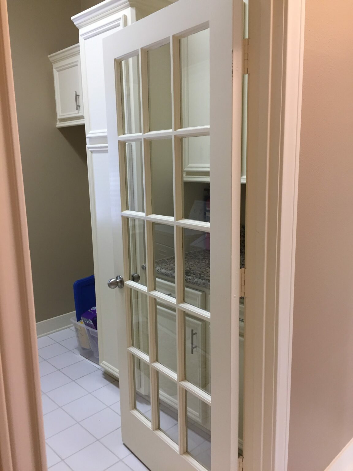
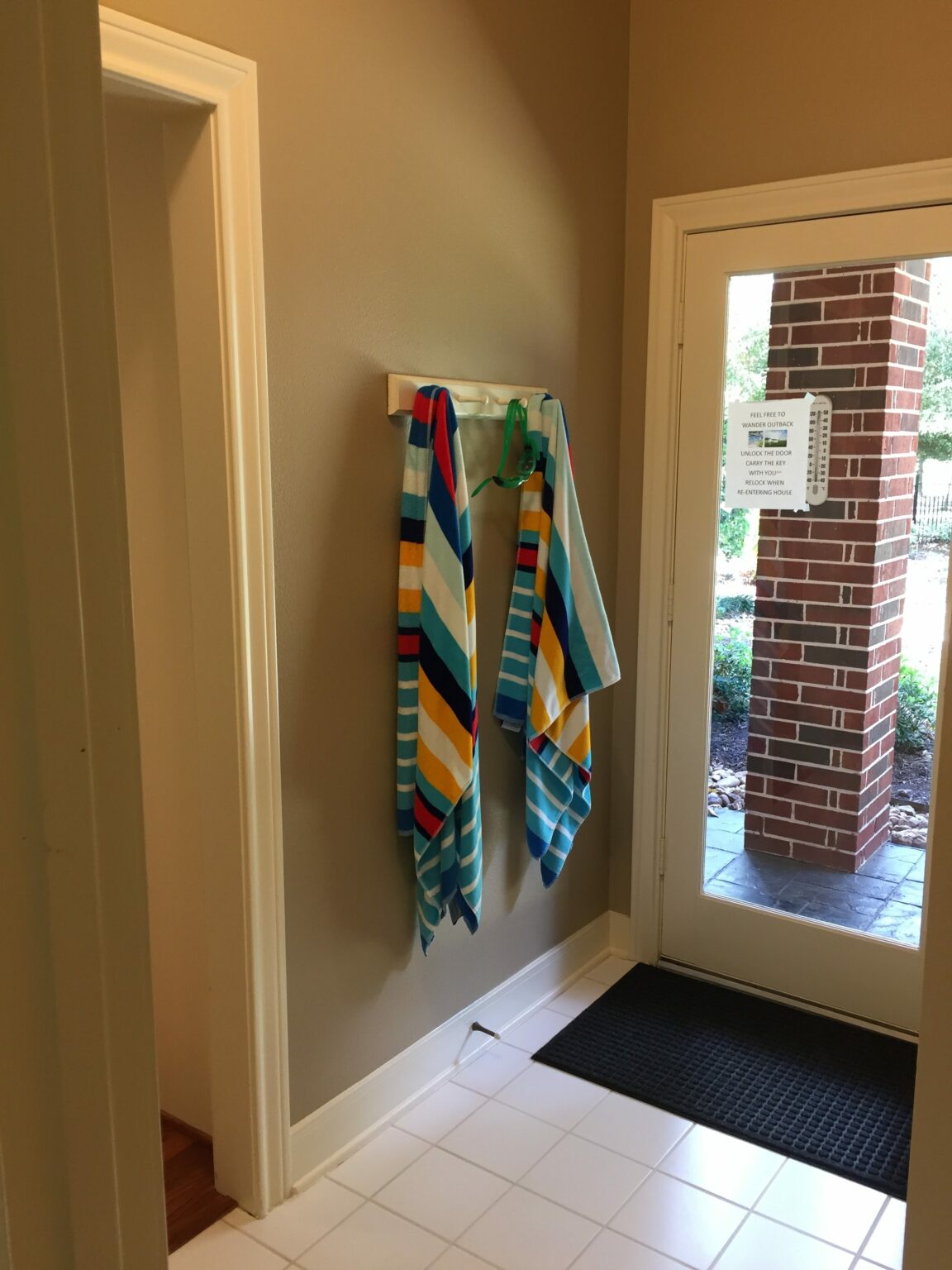
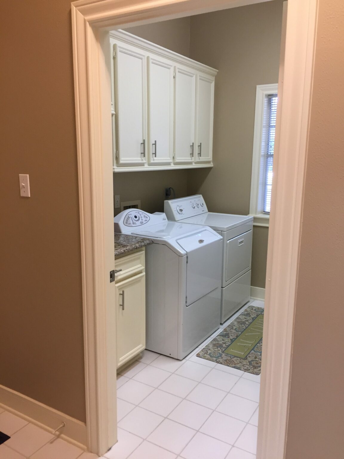
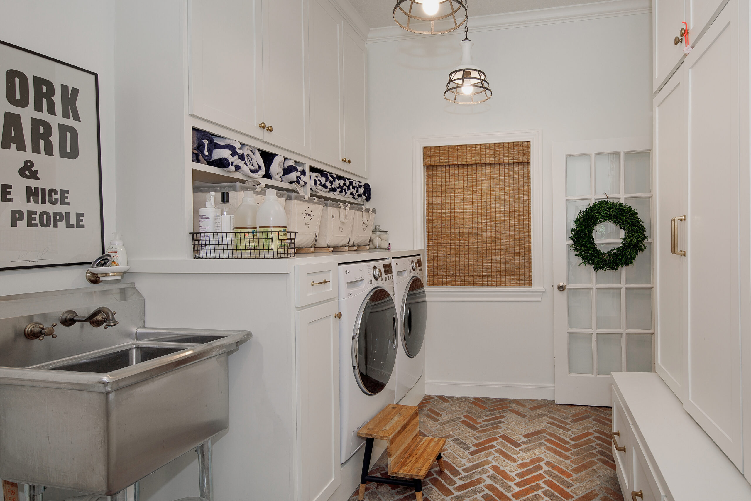
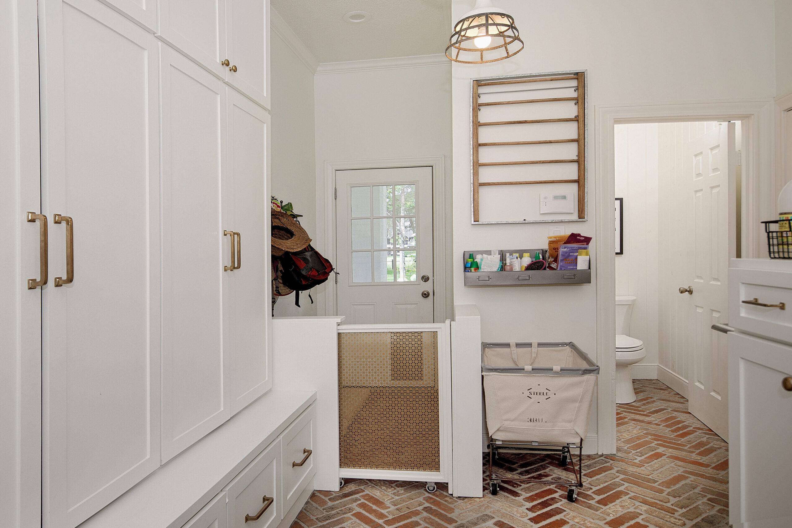
The Laundry Room After: Another big transformation! This was a tiny space with a hallway and we made it into one large space! I have always dreamt of a HUGE laundry room and this was my biggest yet! It was right off our garage, so we had lockers built to store backpacks, purses, coats, books, etc. We also had drawers for shoes- this is key! If you are building lockers, add the drawers to store shoes- it is a game changer!! Our lockers were originally open, but I quickly got tired of seeing the junk, so I’ll always have doors from now on.
Fun fact: I changed a tiny front hall closet in the Florida house into a locker area and we gained so much more space with floor to ceiling cabinets/lockers/drawers. Can’t wait to share that soon!
My Office Before (third car garage):
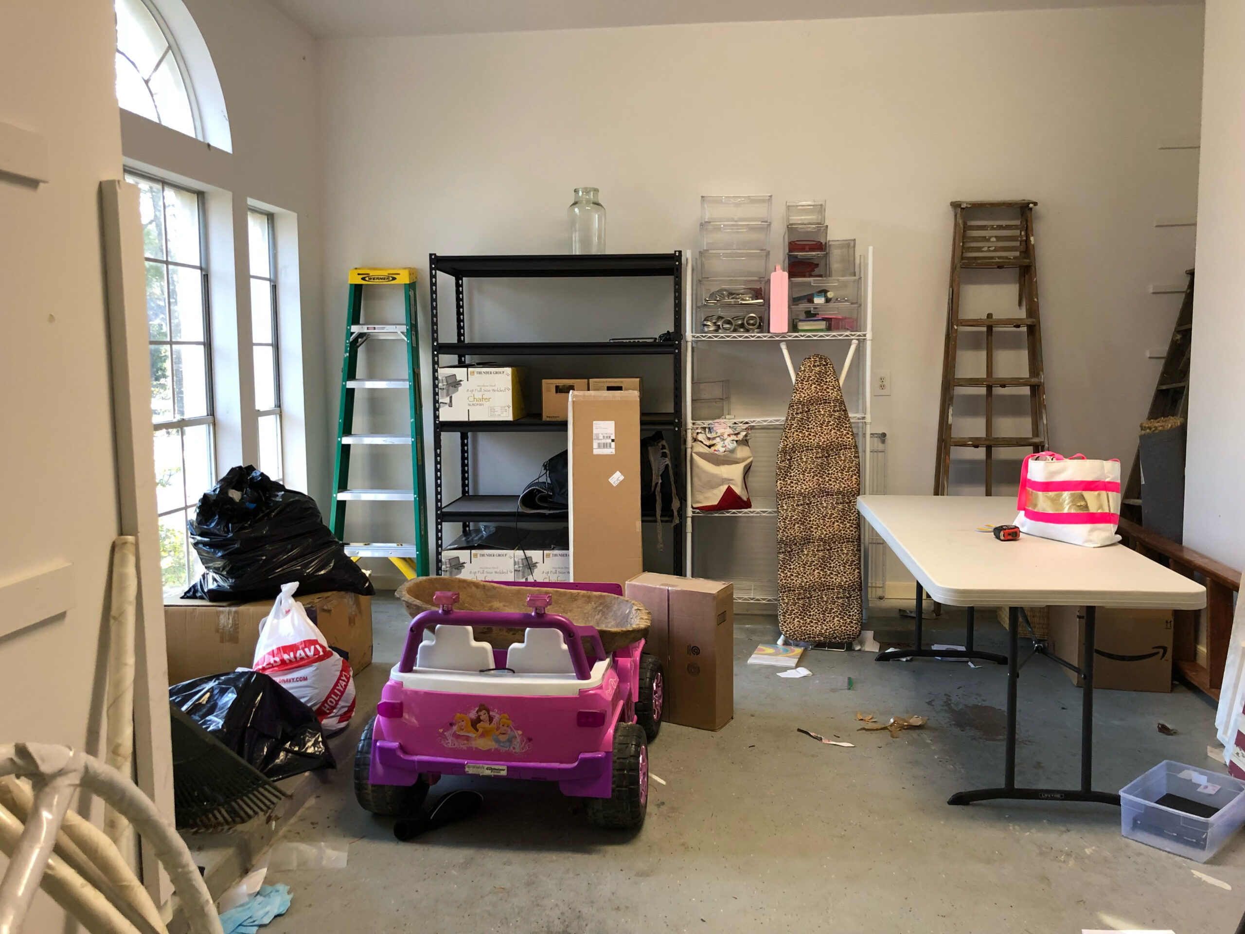
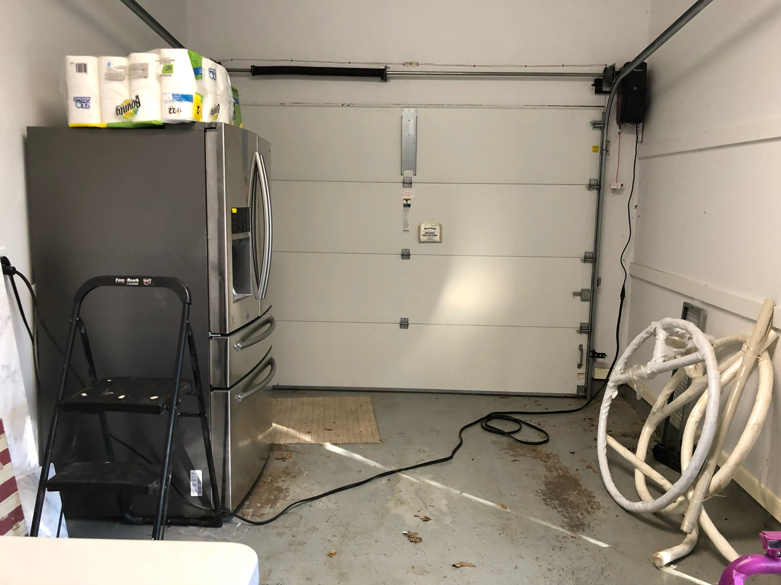
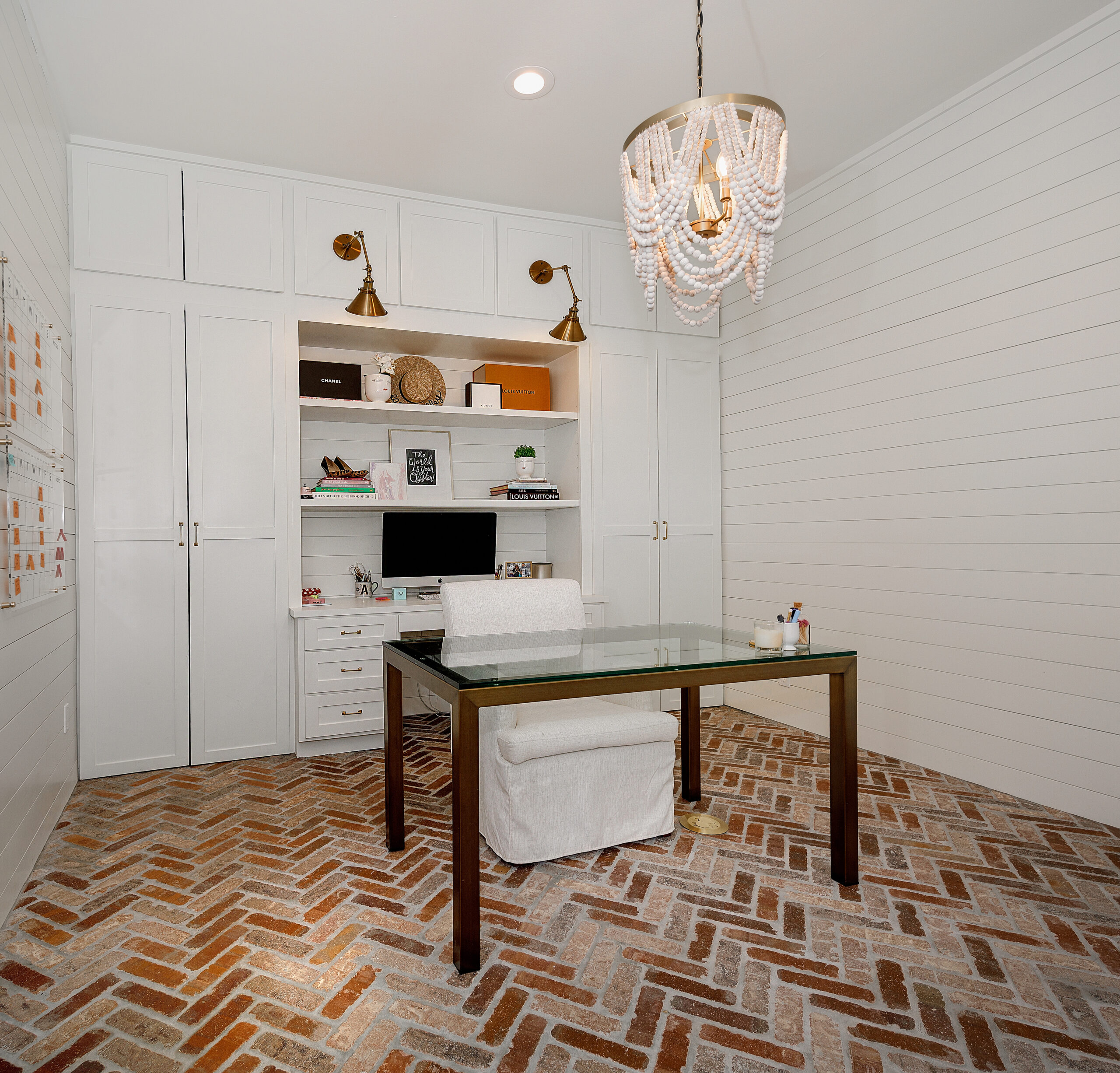
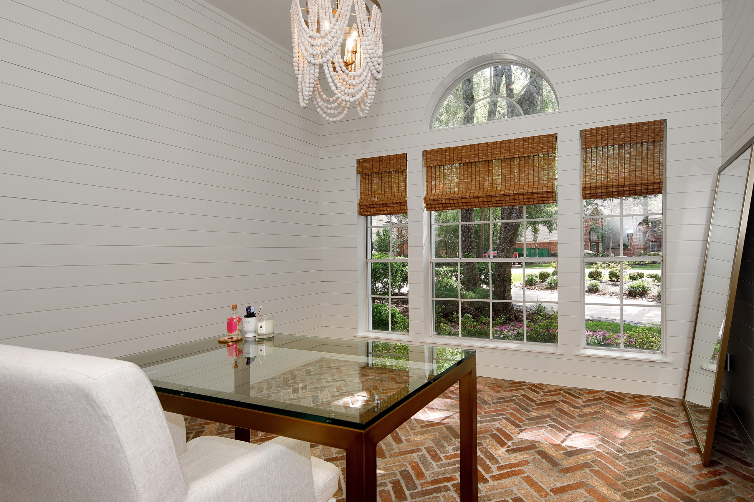
My Office After: This was our third car garage and it was naturally on the other side of the dining room, so it just made sense to wall it in and make it an office. We were still able to keep a section of the original garage for a second fridges, bikes and other miscellaneous storage. This was such an inspiring place to me and I miss it!! From the brick floors to the shiplap walls, it was an awesome workspace that brought a lot of inspiration and creativity.
TV (game) Room Before:
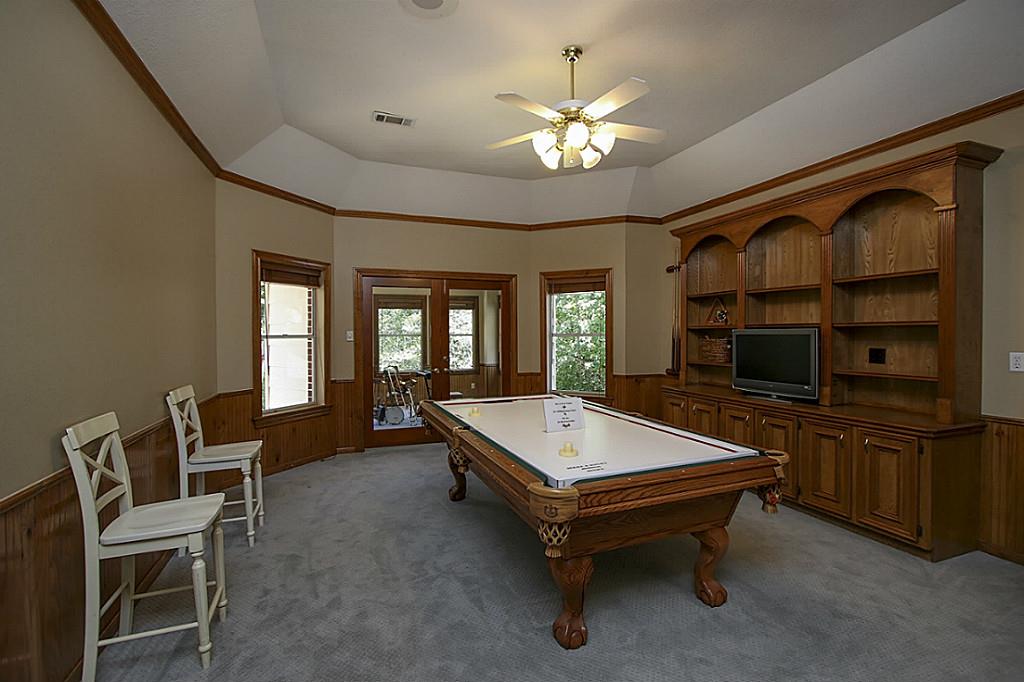
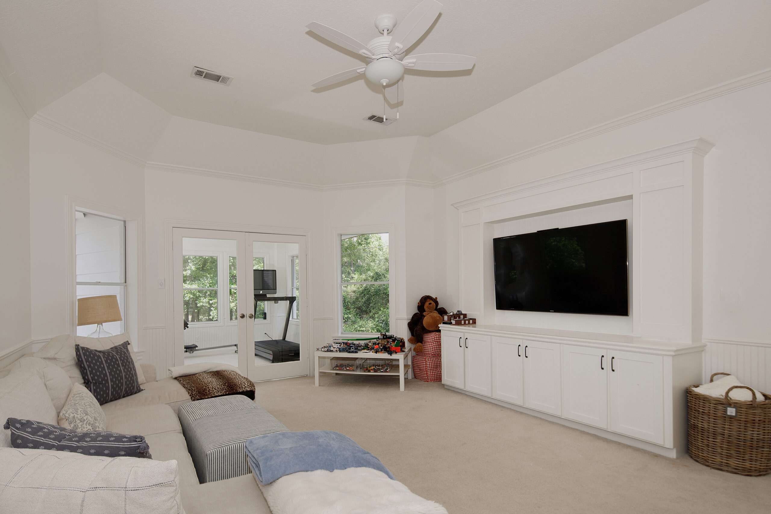
The TV Room After: We really wanted a space where the kids could hang, watch their own shows, play games and hang with their friends. This space was perfect for that and both kids spent a lot of time up here. We just reconfigured the existing cabinet t house a large TV and it was perfect. Again, amazing what some white paint can do!
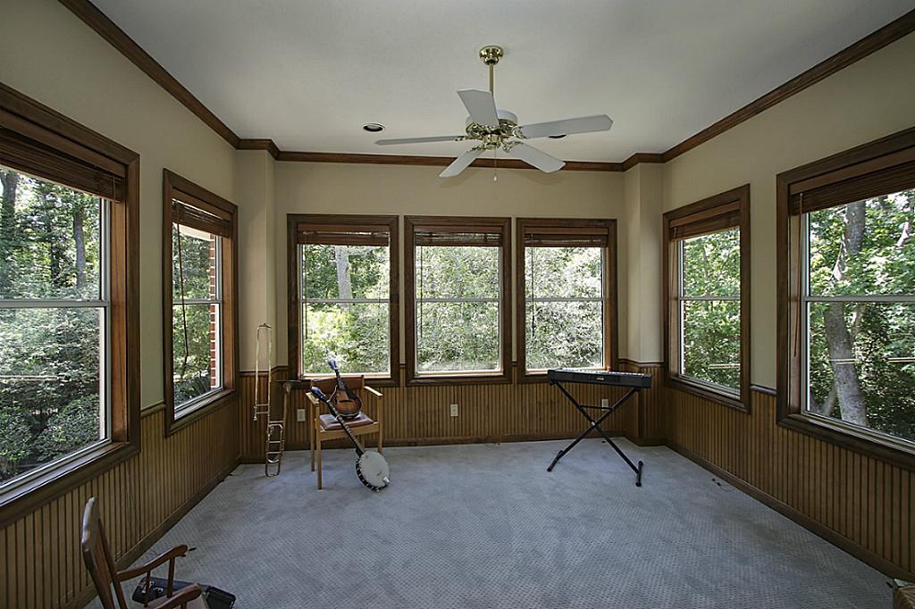
The Workout Room Before:
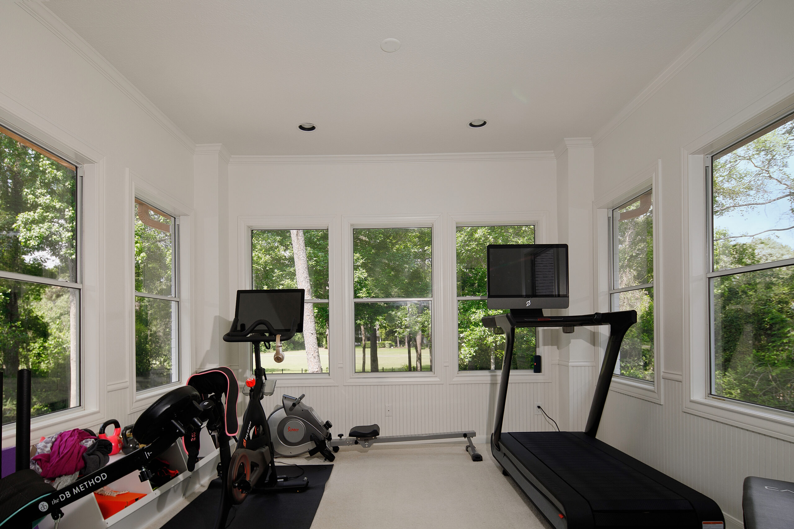
The Workout Room After: This was an interesting little space right off the TV room. It was originally an outdoor balcony that they enclosed. Over our years of living there it went from playroom to gym area. As the kids got bigger and didn’t need as much play space, we took it over and created a little gym area. It was tiny, but mighty and Mr. Fancy and I logged many hours working out in that space over the years!
Teddy’s Bathroom Before:
Teddy’s Bathroom After: There was nothing wrong with this bathroom prior, but we wanted to bring it up to date and make it light and bright like the rest of the house! This is my favorite bathroom project to date! Teddy wanted to keep his bathtub, so we just added an awesome gridded door and new tile! The green vanity is a favorite. These vanities come in lots of colors, but I just love the green and to this day, it’s a favorite touch of this space. The black and white tile, the gridded door and the crisp white paint just makes it so bright and happy! The pop of green us unexpected and it was a fun nod to Teddy, as it’s also his favorite color!
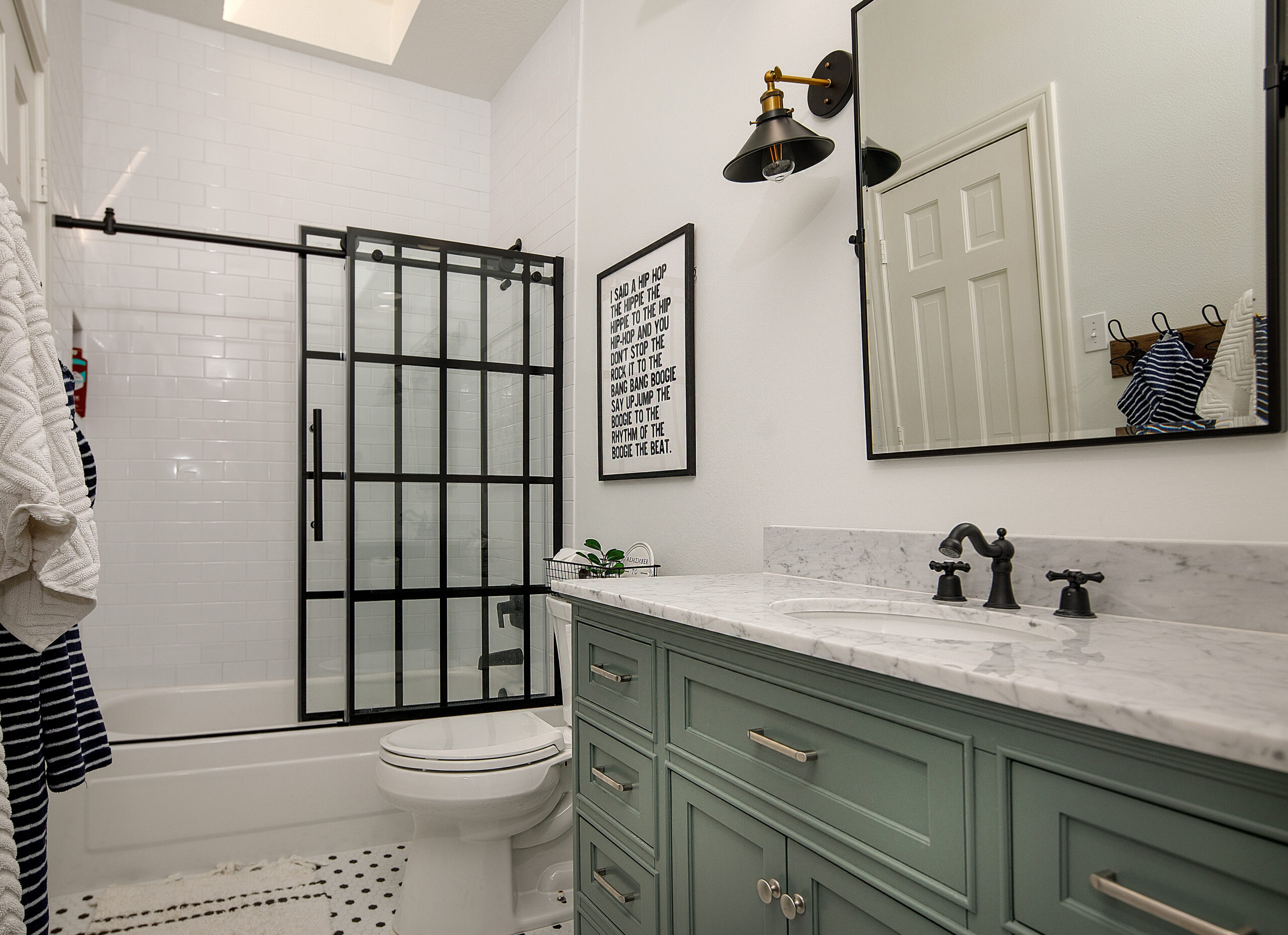
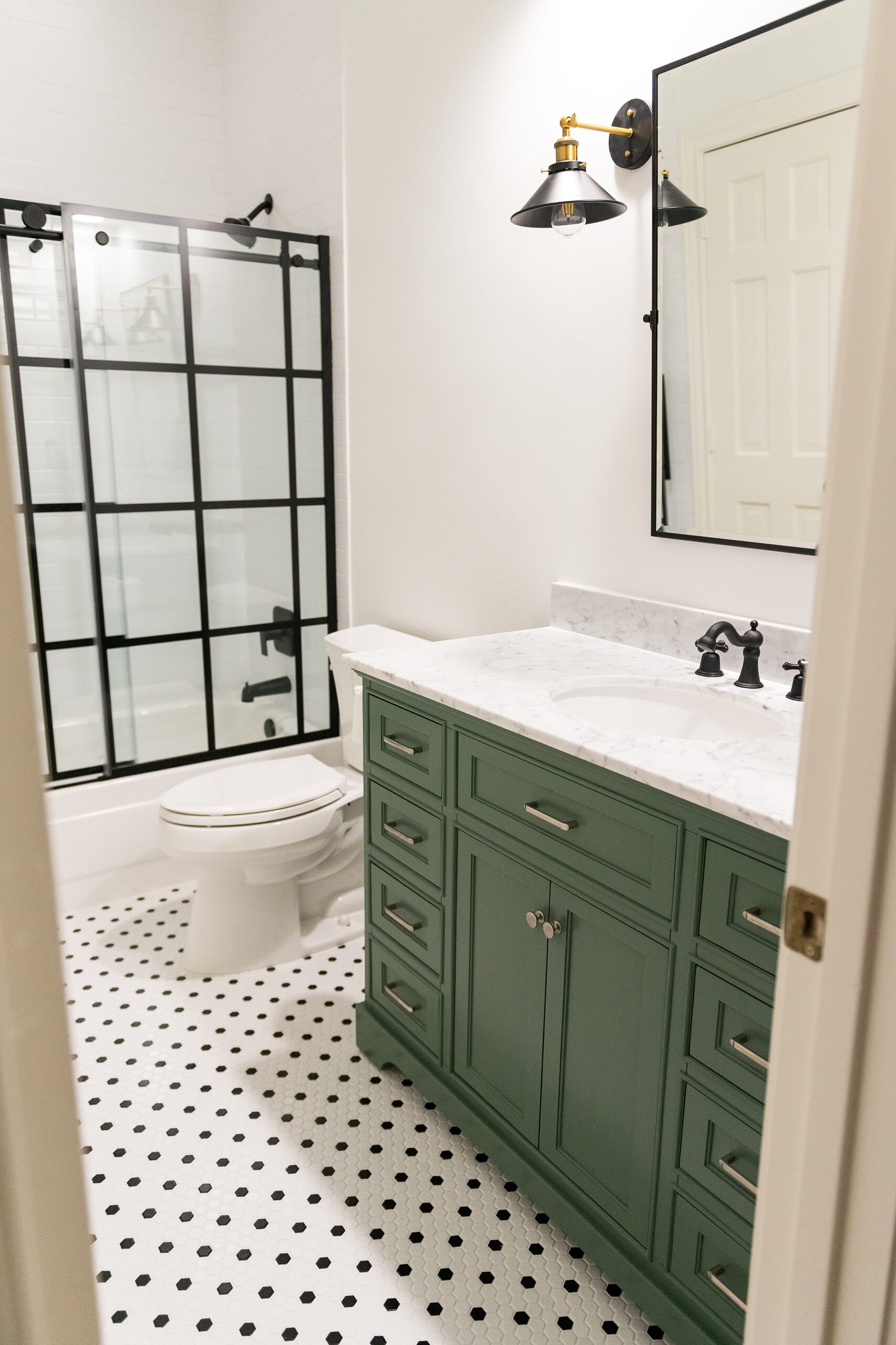
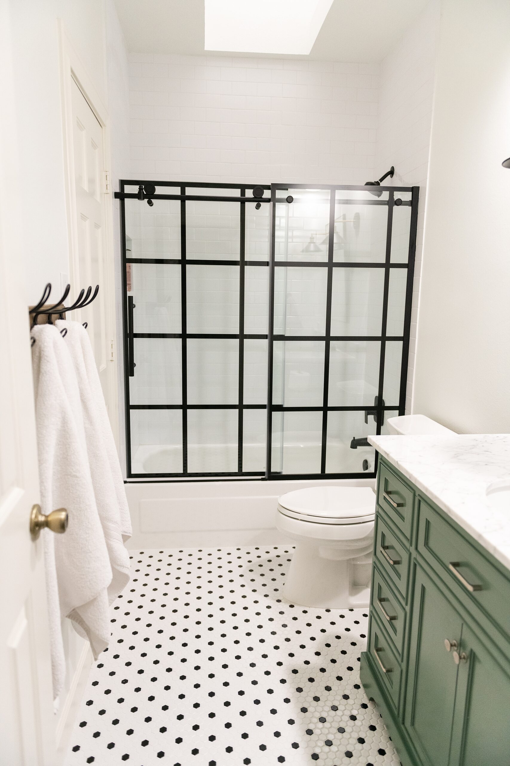
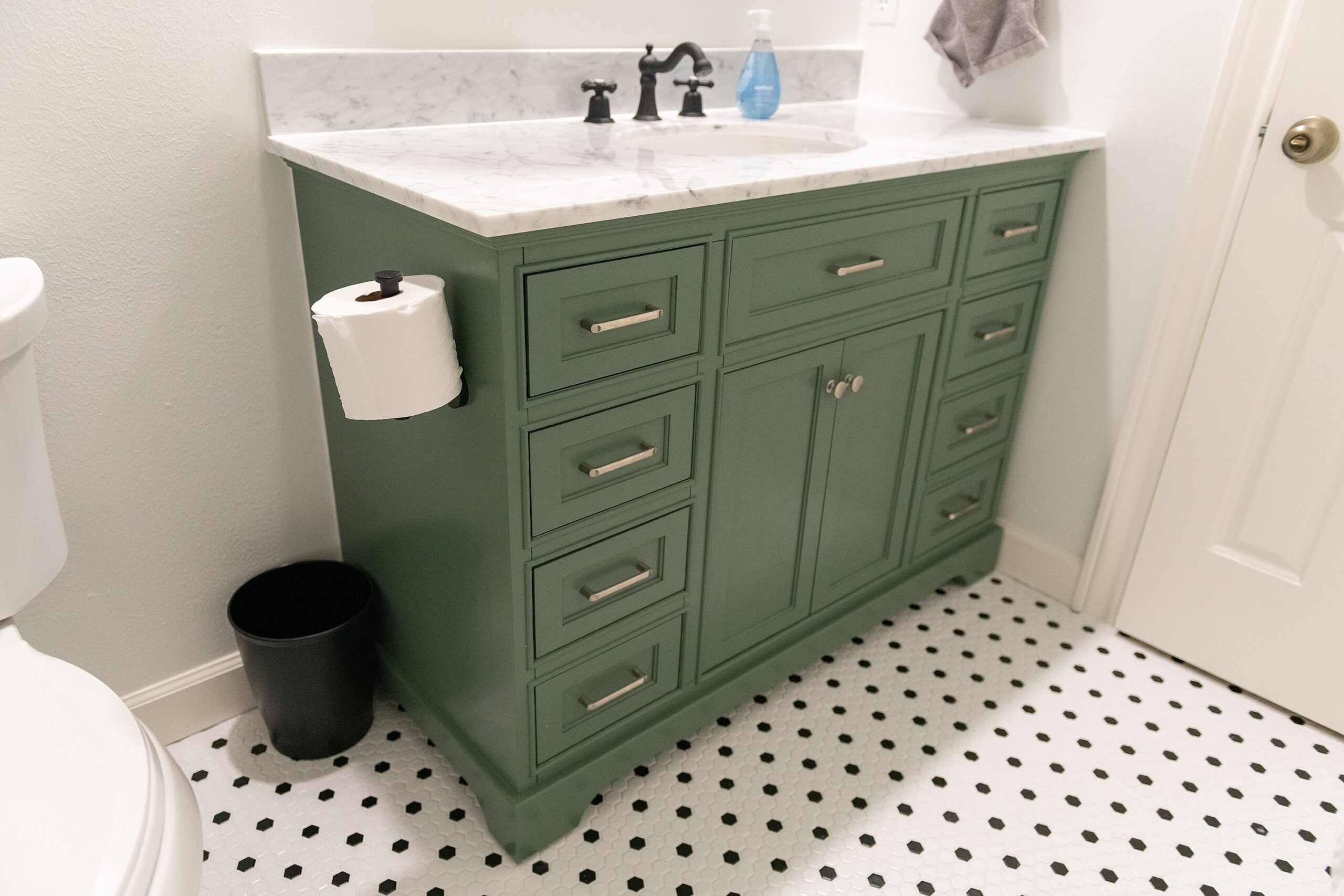
VANITY | SHOWER DOOR | MIRROR | WALL SCONCE | TILE
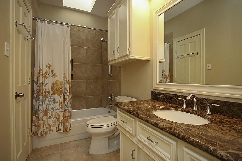
The Guest Room Bathroom Before:
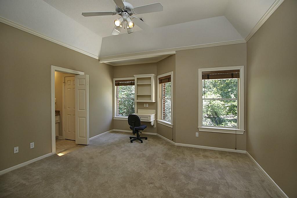
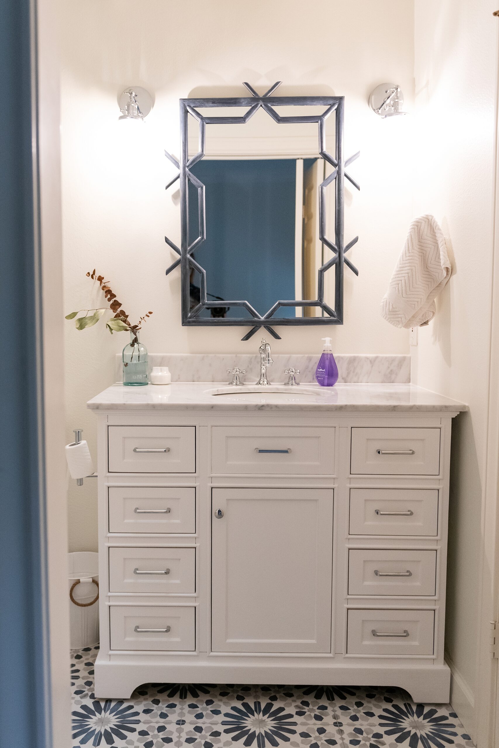
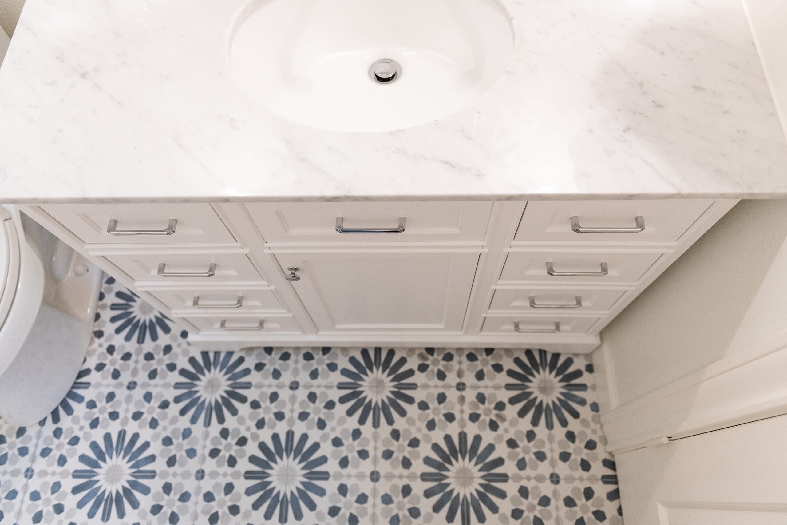
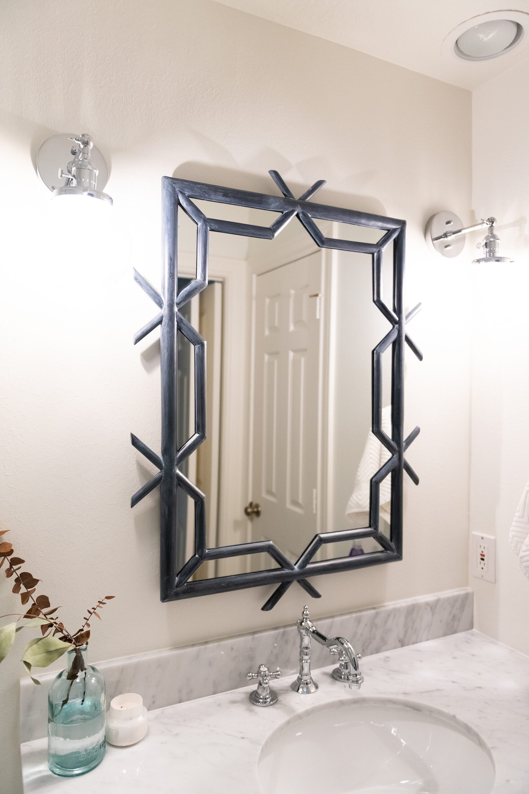
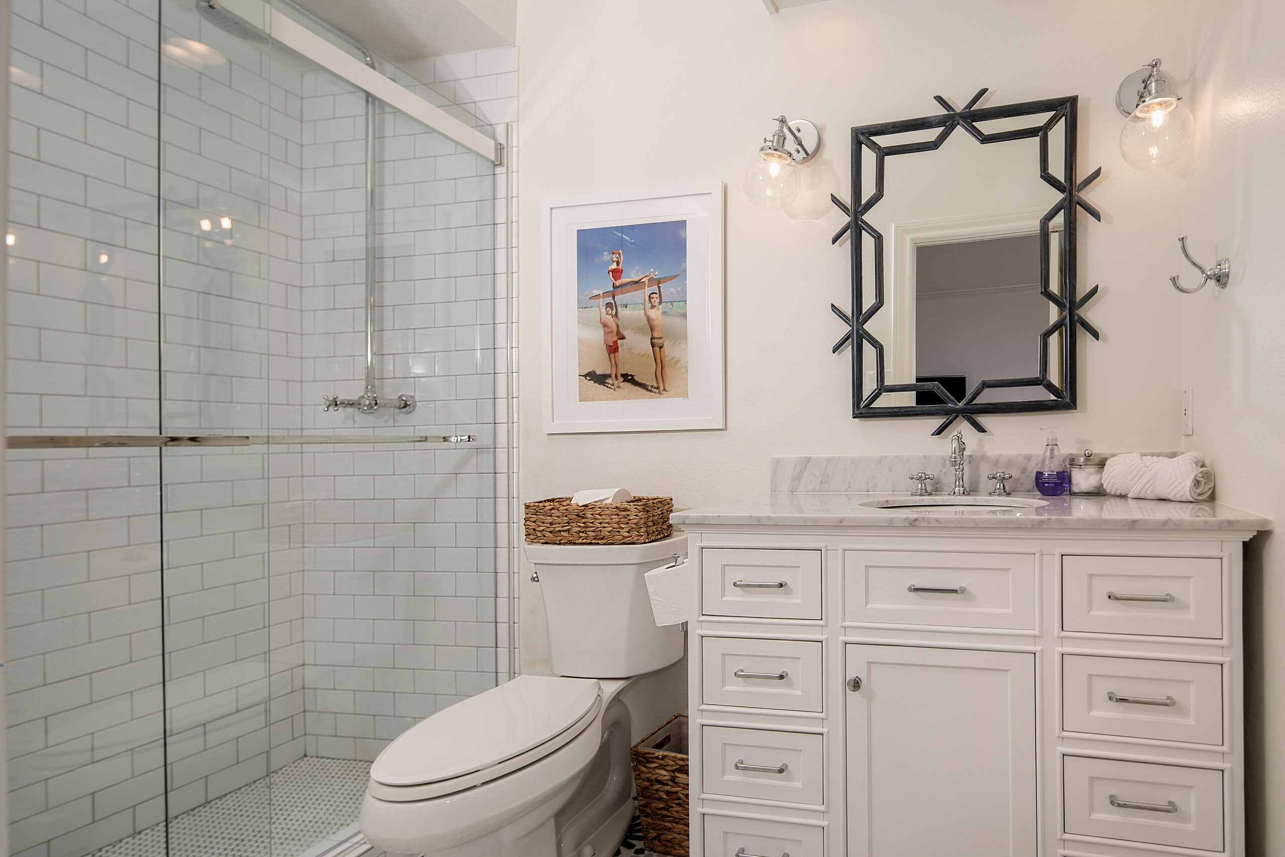
The Guest Bedroom Bathroom After: This bathroom and Reagan’s were mirrored to each other so when we started to frame out the showers, the bathrooms were open to each other. The goal was to remove the shower bathtub combos in these rooms and honestly that is such an easy fix. We did that in the Florida house in one of the bathrooms, too! I really wanted each bathroom to have their own personality, so they weren’t matchy-matchy. I did this fun blue tile with a classic subway tile wall and classic penny tile floor. Subway tile is so cost effective, but it’s honestly one of my favorite products to use in a bathroom. It’s so timeless. I used my favorite vanity in here again, but in white. We used these in the Florida house, too. Adding a fun pop of blue with the mirror, breaks up all the white and ties in the floor!
Reagan’s Bathroom Before:
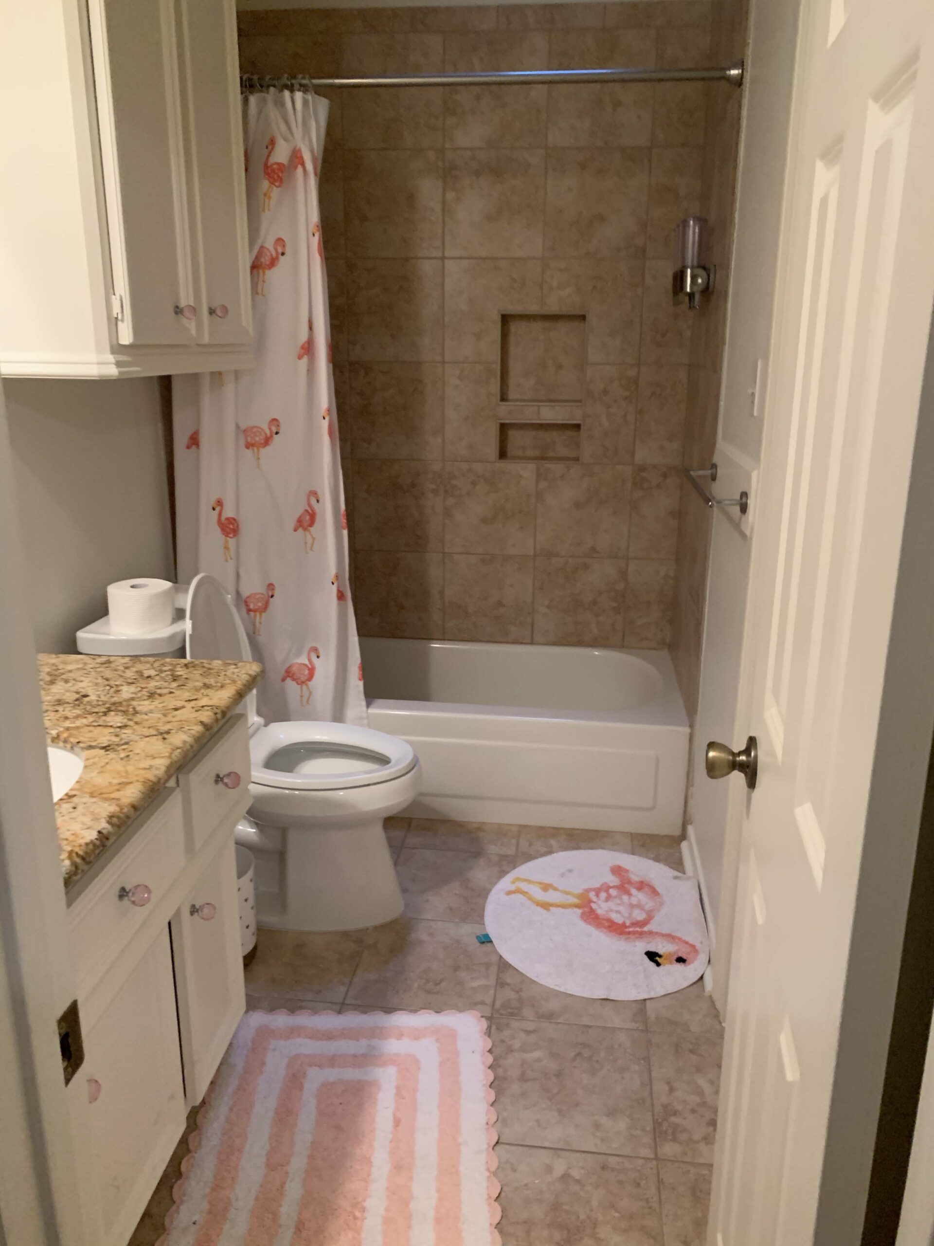
Reagan’s Bathroom After: We loved this cement floor tile and in fact, Reagan wishes I would’ve used this in her bathroom in Florida! Again, we just turned the tub into a shower. We did a subway tile again, but added a grey penny tile for a pop and this also carried in the grey from the floor and bench cement tile. I love this for a girls bathroom. It’s such a darling little tile and we loved the pop of pink! The huge mirror was a favorite of Reagan’s, too. She loved it because she could basically get full body length in it. It does come in a smaller size, too, if you space is smaller. All of our bathrooms would be super easy to recreate!!
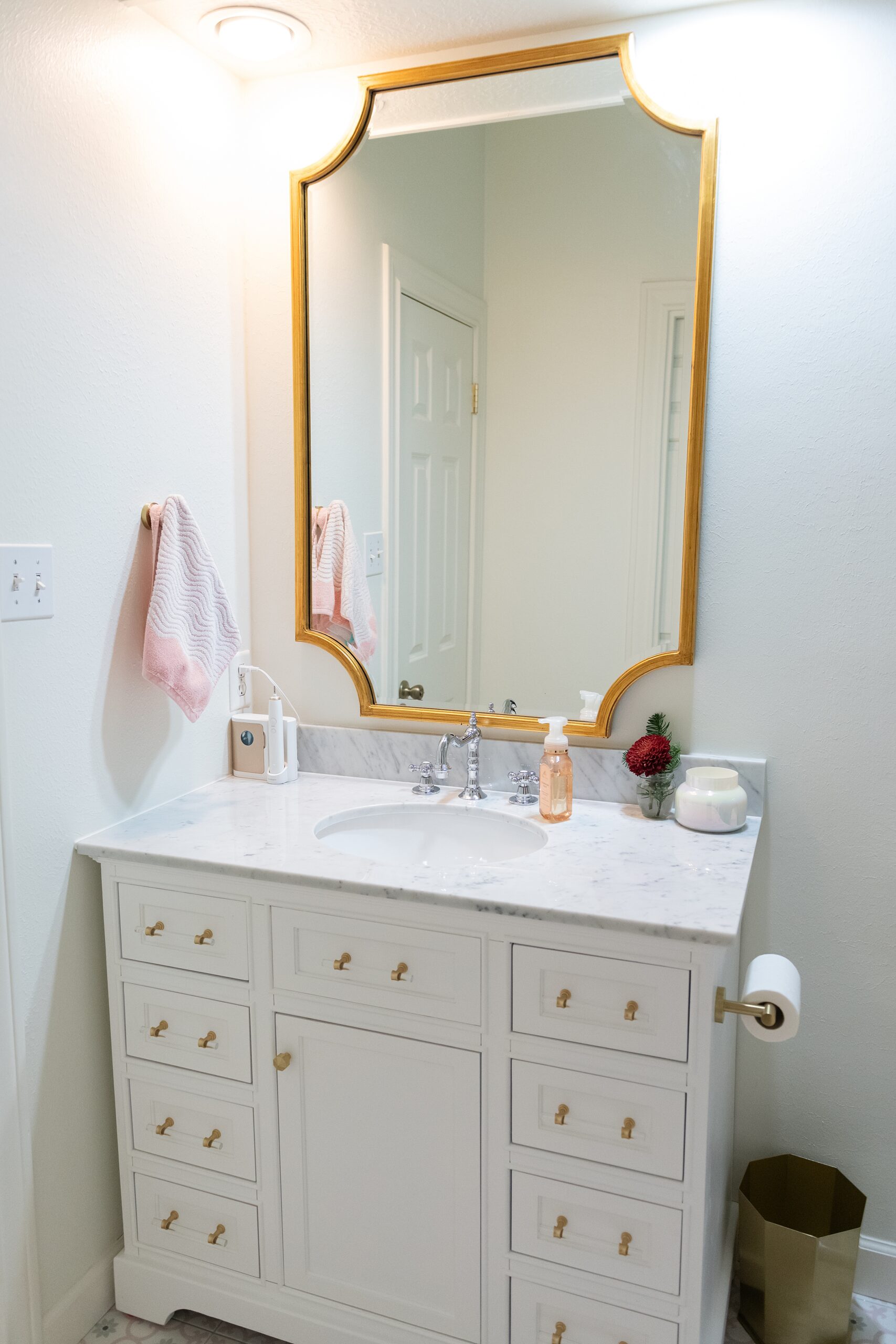
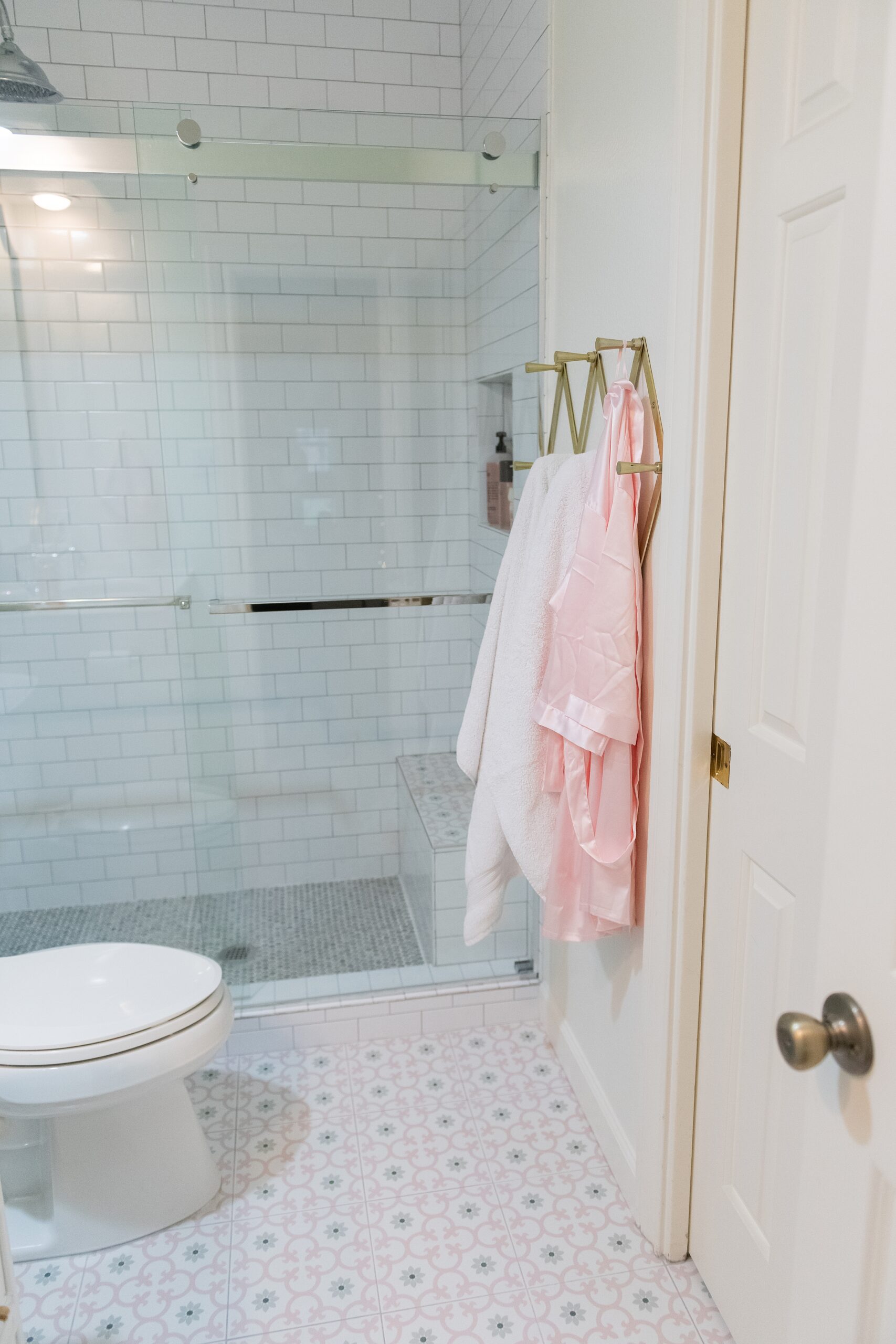
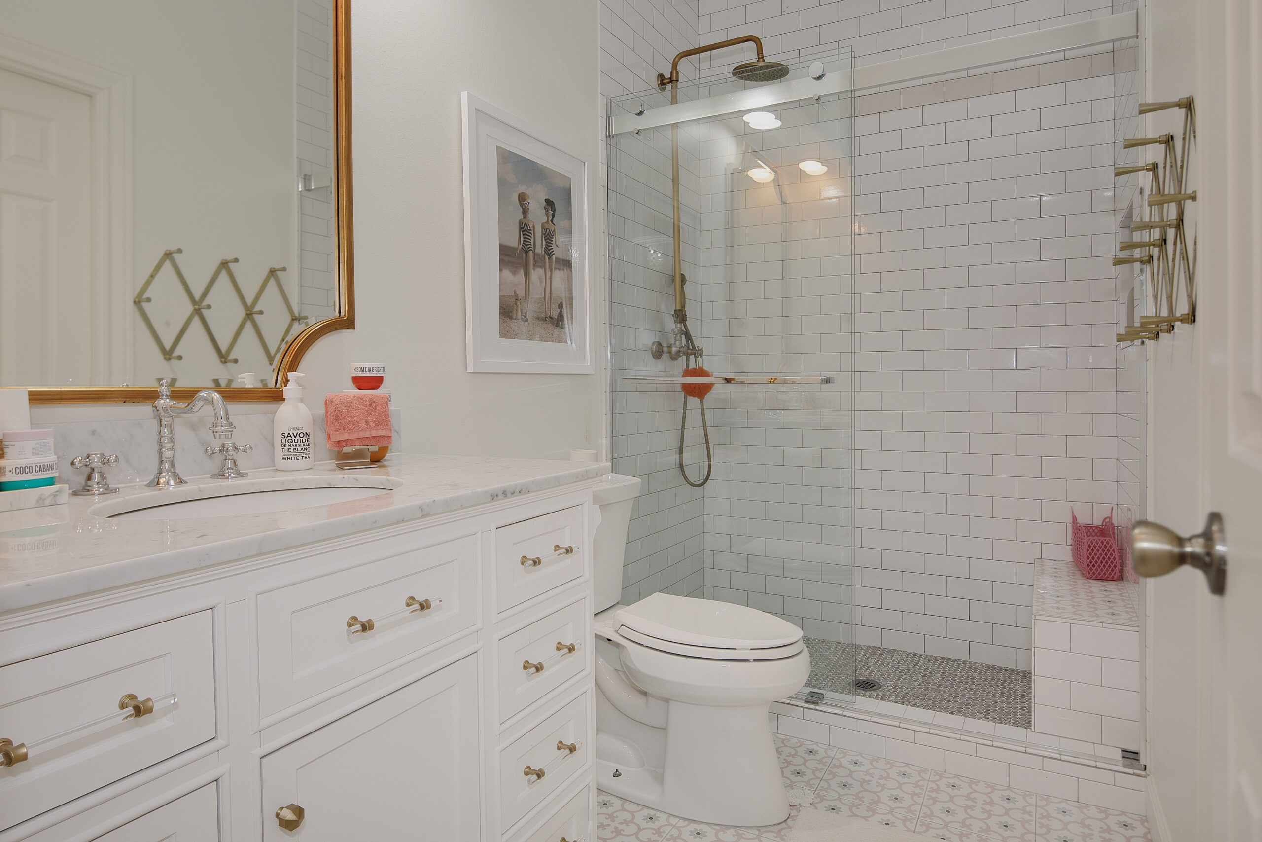
VANITY | MIRROR | TILE | WALL HOOKS
The Backyard Before:
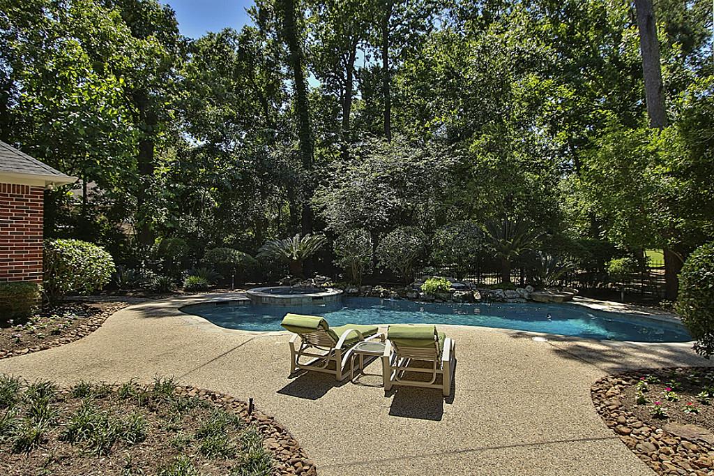
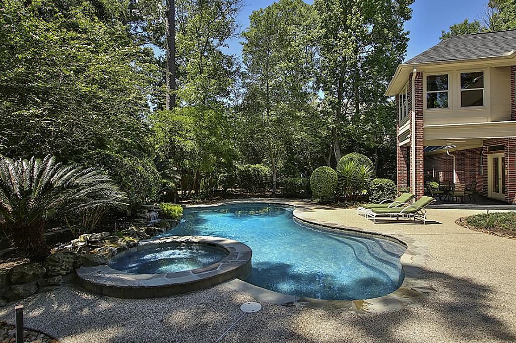
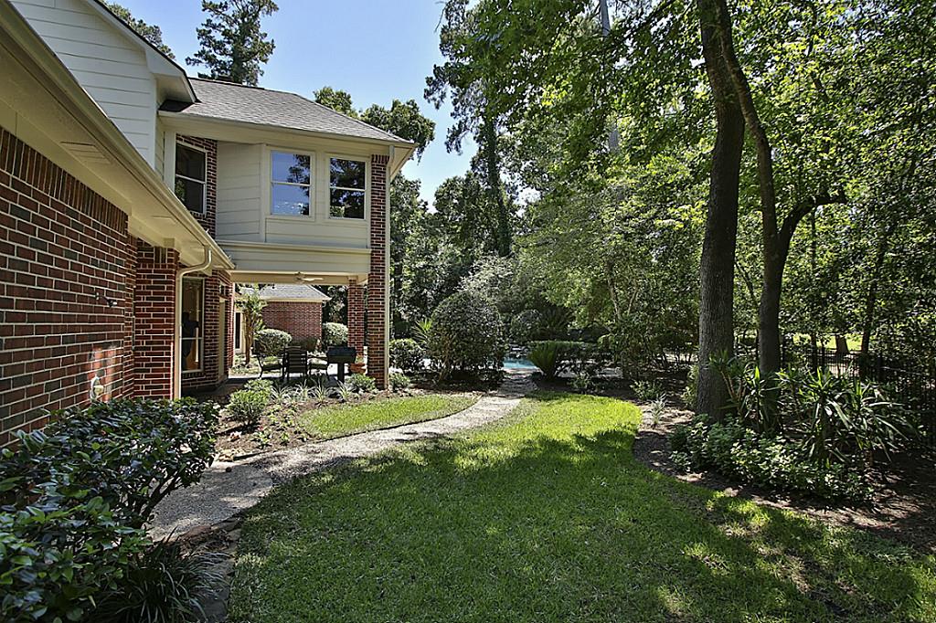
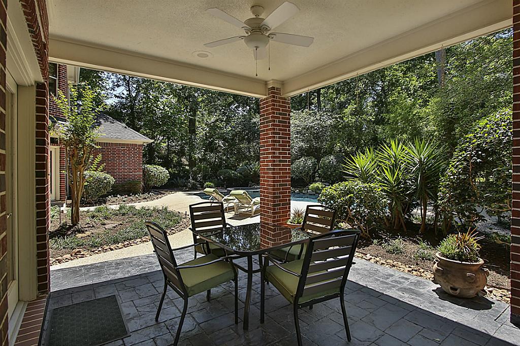
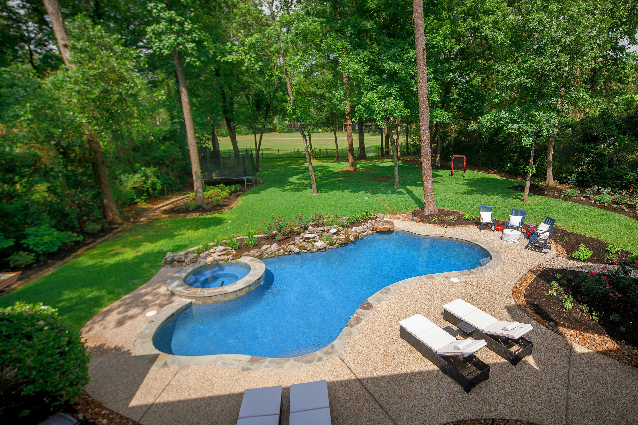
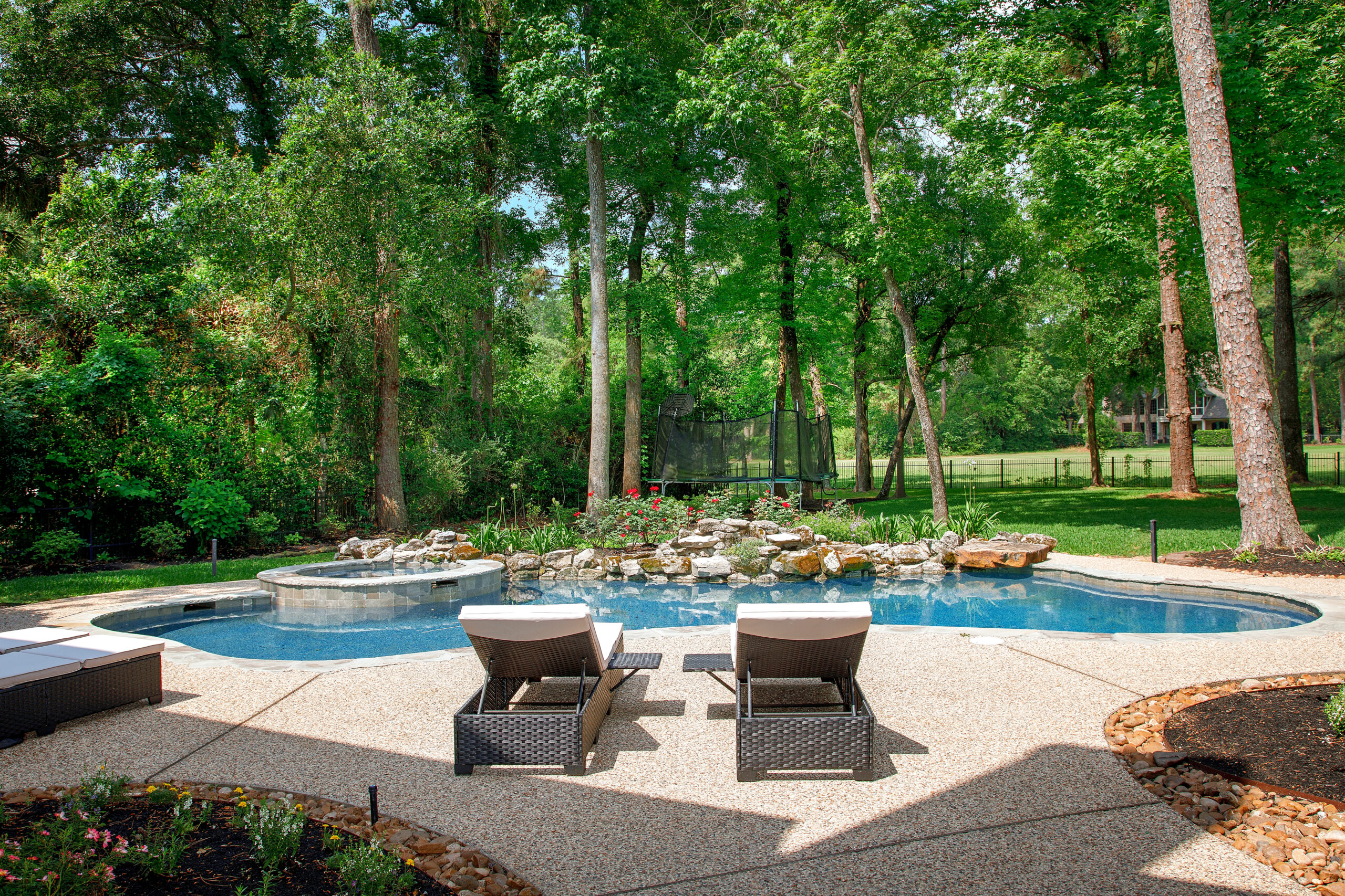
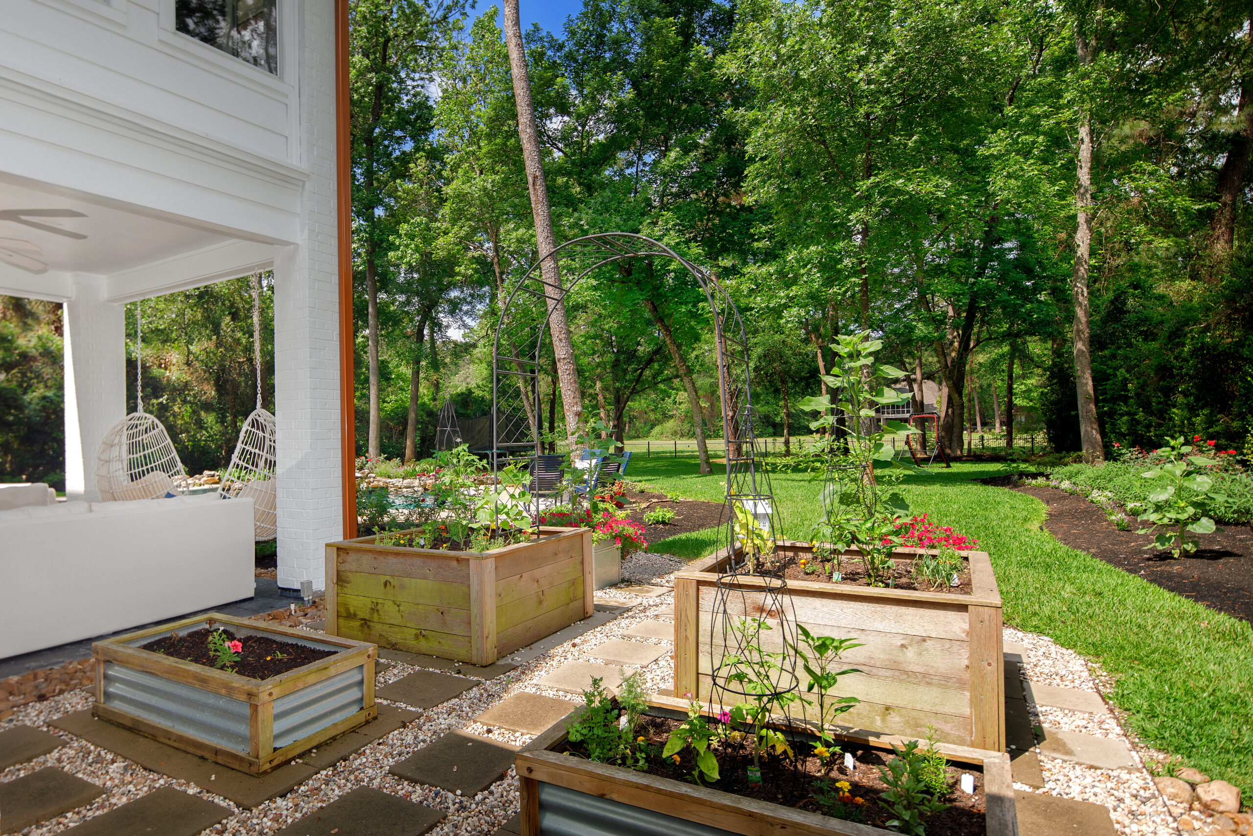
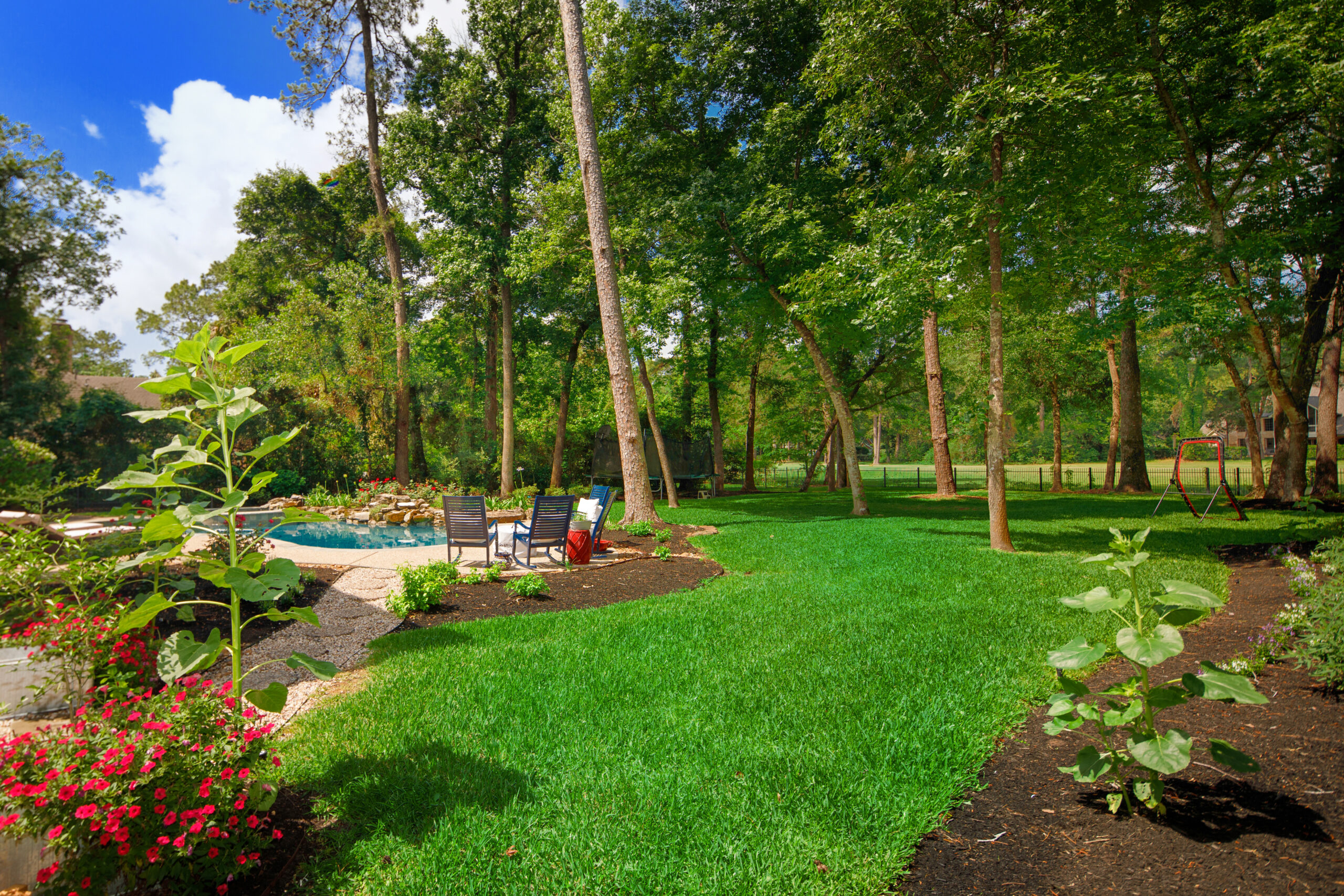
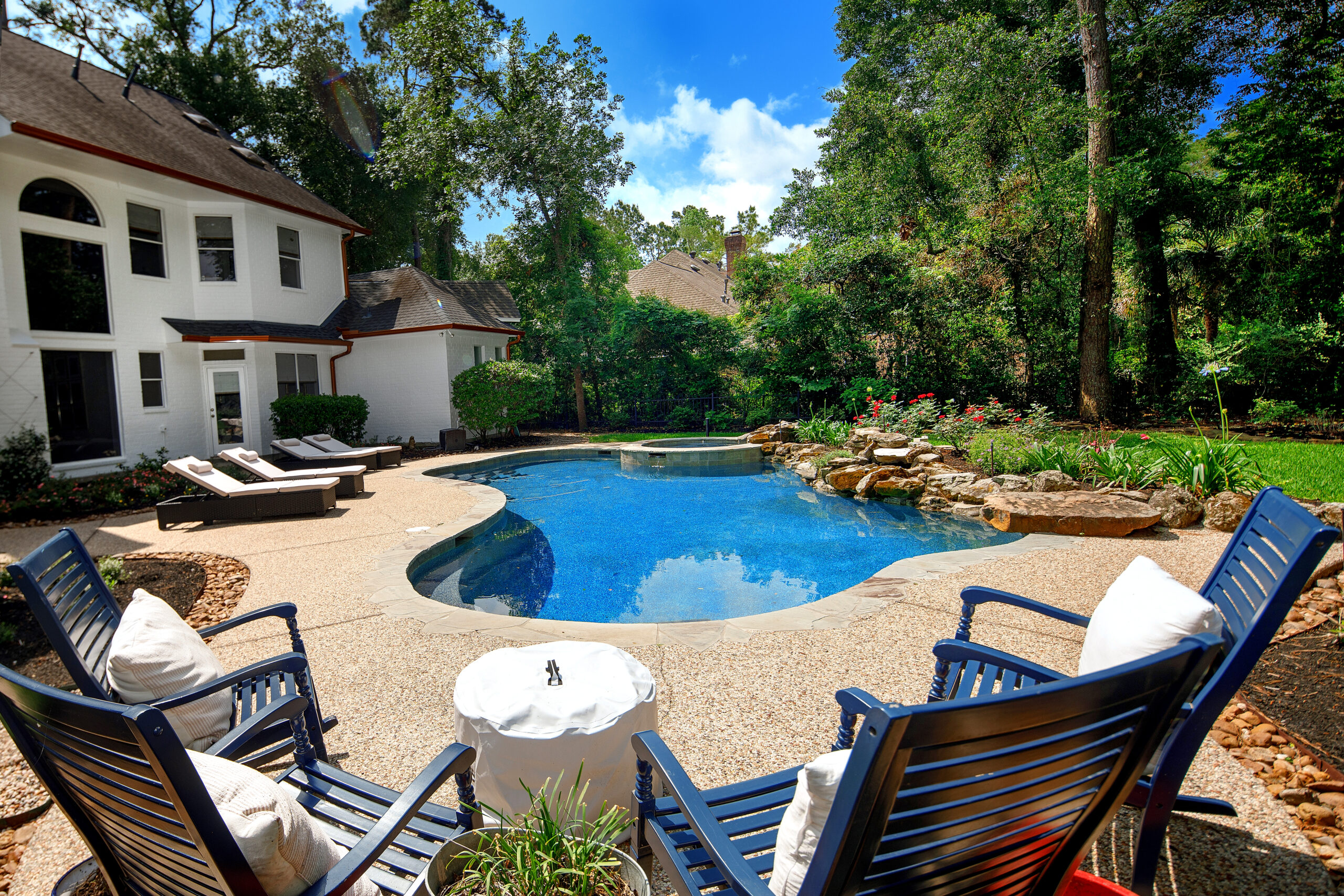
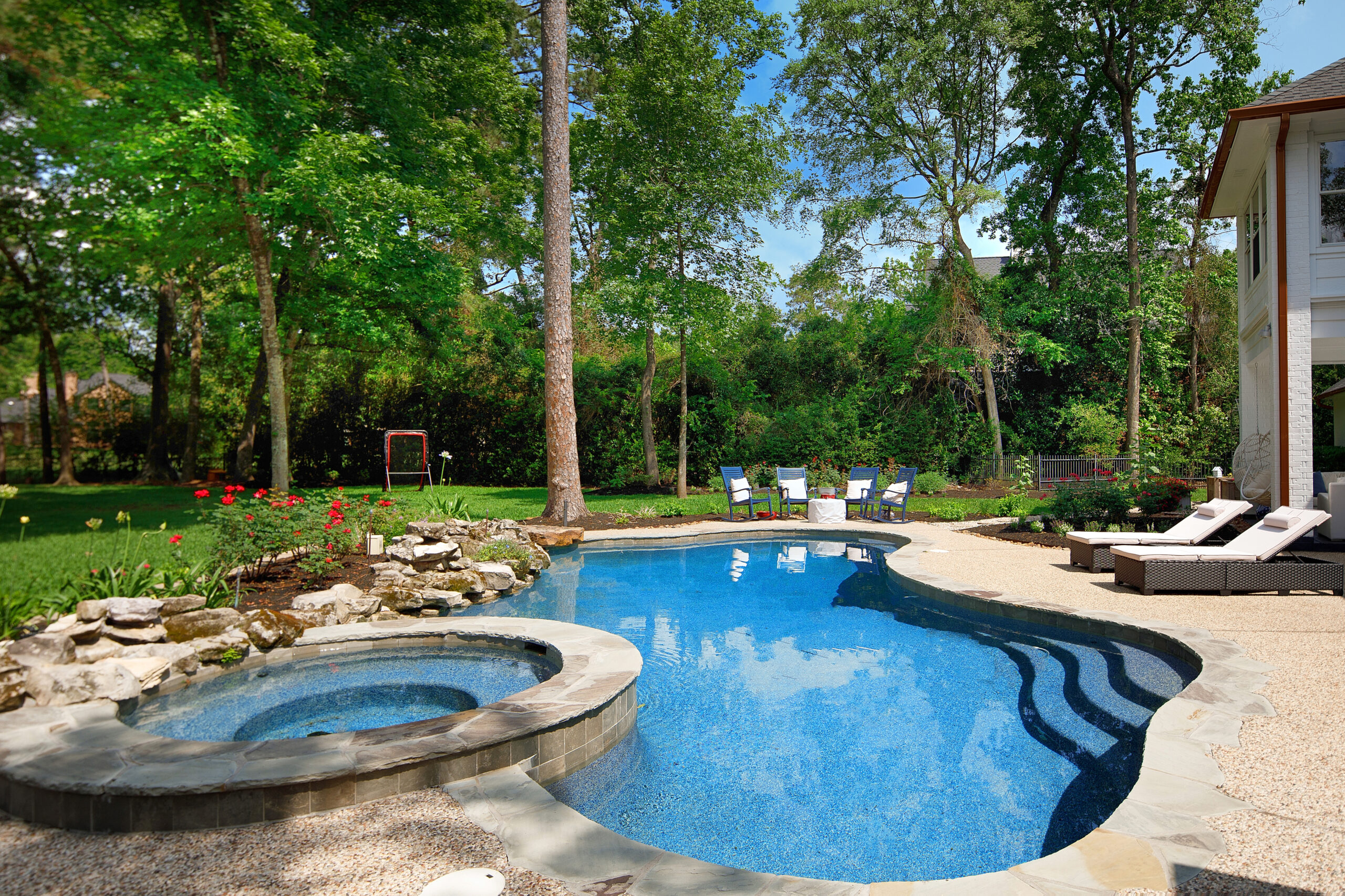
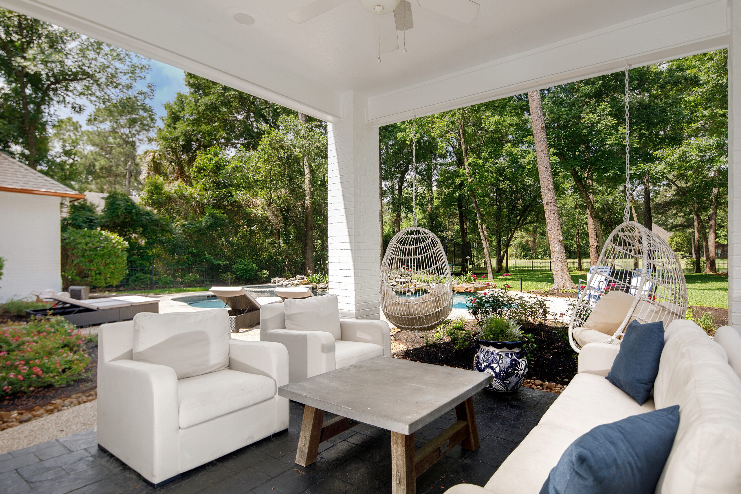
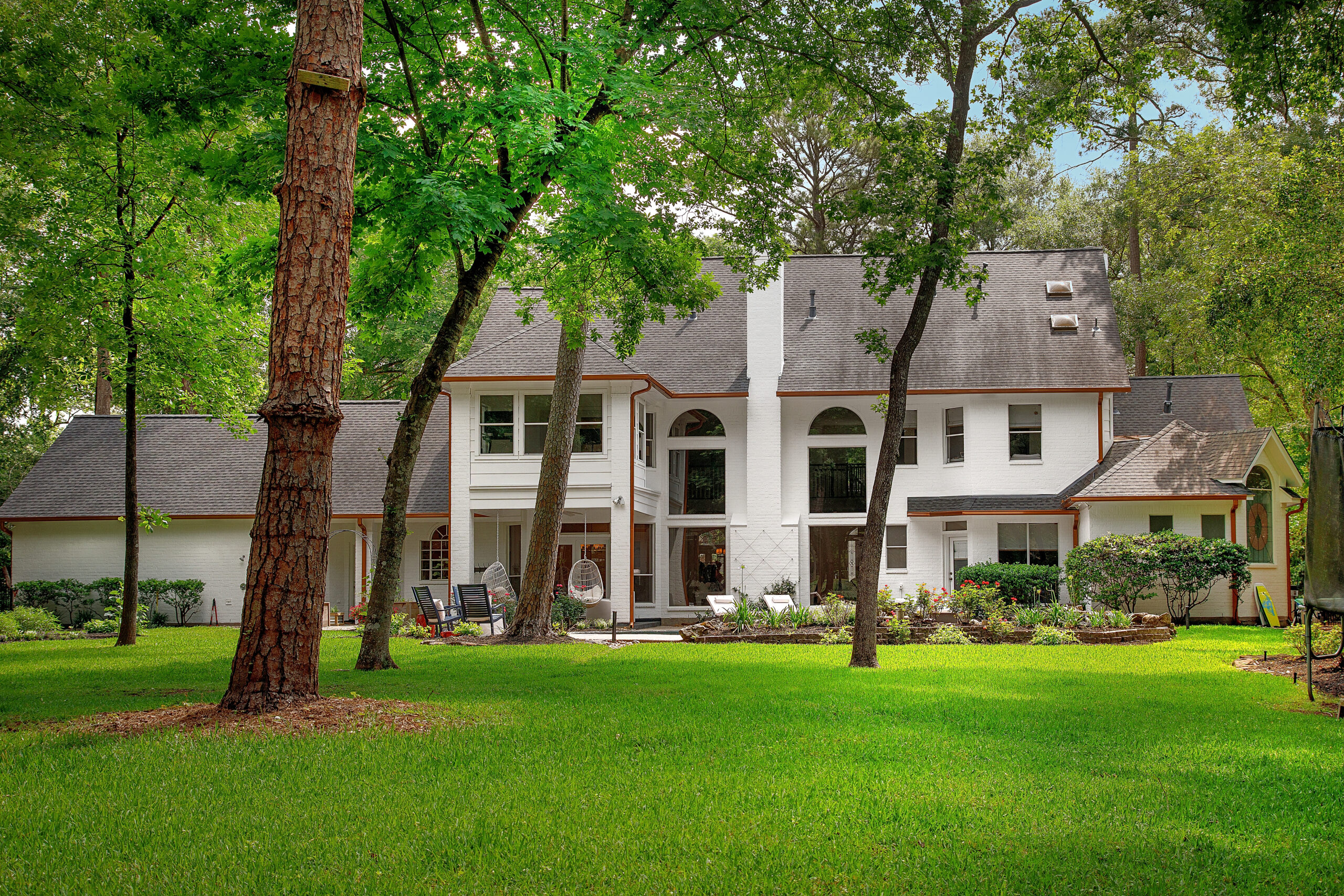
The Backyard After: Nestled on almost an acre and on the 9th hole of the golf course, we loved this view! As you can see in the before, the original owners preferred the privacy and had the yard gated right behind the pool. We had A LOT to clean out in the yard to get it to look like this. Plus, by going to our property line with the fence, we really got to use our space to the full potential. Had we have stayed in this house, we had big plans to add a huge outdoor patio and redo the pool to make it even more custom to us!
I hope this post wasn’t too long for you, but I really wanted you to be able to get a full scope of the house before and after we renovated it. Like I said, it was a wonderful house and I’ll love it forever!! When we sold it, it was very clear based on all the interest that others also loved what we put into it design/decor wise. We will work on individual posts for each room with shopping links for you! Those will be coming soon! Love y’all and thank you for being here! Hope you loved this post! XOXO







You remodeled home is stunning. I enjoyed looking at the transformation each room received! Thank you for sharing with us.
Is white dove the color on your walls as well as the trim?
Thanks again . Great job to you and Mr Fancy!
Yes! White dove floor to ceiling!
Loved, loved this post! Not too long at all. You did an incredible job on that house, the end result was absolutely stunning! You’ve inspired me to work on a few refreshes (changing lighting and mirrors) I’ve been putting off in my own home.
I knew you made this house fabulous with the various remodels but seeing it side by side…. I’m shocked! It’s absolutely fantastic, sister!!! Can’t wait to see the before & afters of your new house!
Loved your TX house. Great job with all the changes you made! You should be an interior designer. Can’t wait to see more of your FL home.
Beautiful home!,
I loved this post and can’t wait to see your new Florida home! Keep up the inspiring content you do! Enjoy visiting here every day!
Beautiful! That would be a hard place to leave. Can’t wait to see your new home .
Love all the details!