
Hi friend and happy Tuesday! Because it took me 6 years to get our Texas house before and after up on the blog, I told myself that I had to get our current home up on here immediately! When we decided to move from Texas to the Florida panhandle, we really thought we would stay in this home for years. After living here, we realized this house does not suit our family for 24/7 living, so we have decided to use this project as experience and lessons learned and we have decided to sell this house! The listing is linked at the bottom of this post if you are interested in buying it. I’m actually super excited to sell this one because I truly think it will make an amazing second home/rental property! We actually had rental projections done and this stands to make an amazing amount each year in rental revenue! This house was really made to house numerous families for weeks at the beach and I truly love all that we did to it. This house was built years ago and we purchased it from the original owners that built it. There are so many great qualities about this house that you will not typically find in homes in our area! We have huge bedrooms, large closets and large bathrooms. Most beach houses are tiny all around and we feel like these large living spaces really separate us from other homes here. This house was in great shape, it just really needed to be brought back to life and brightened up. It was super dark and really had more of a mountain house vibe than beach house vibe and immediately I knew some white paint and brighter furniture would really made the house pop! Grab a cup of coffee or a glass of wine, this is another long post, but you can see all the before and afters from our Florida beach house! Let’s get this party started!
Florida Beach House | Before & After
Exterior Before: This house was the original home built on our street/neighborhood and with it never being renovated prior, it needed a bit of sprucing up. While the green color was pretty, it really didn’t go with the vibe of the beachy neighborhood. It was more mountain home than beach house! The trees and bushes were super overgrown, too, so it just needed a little updating!
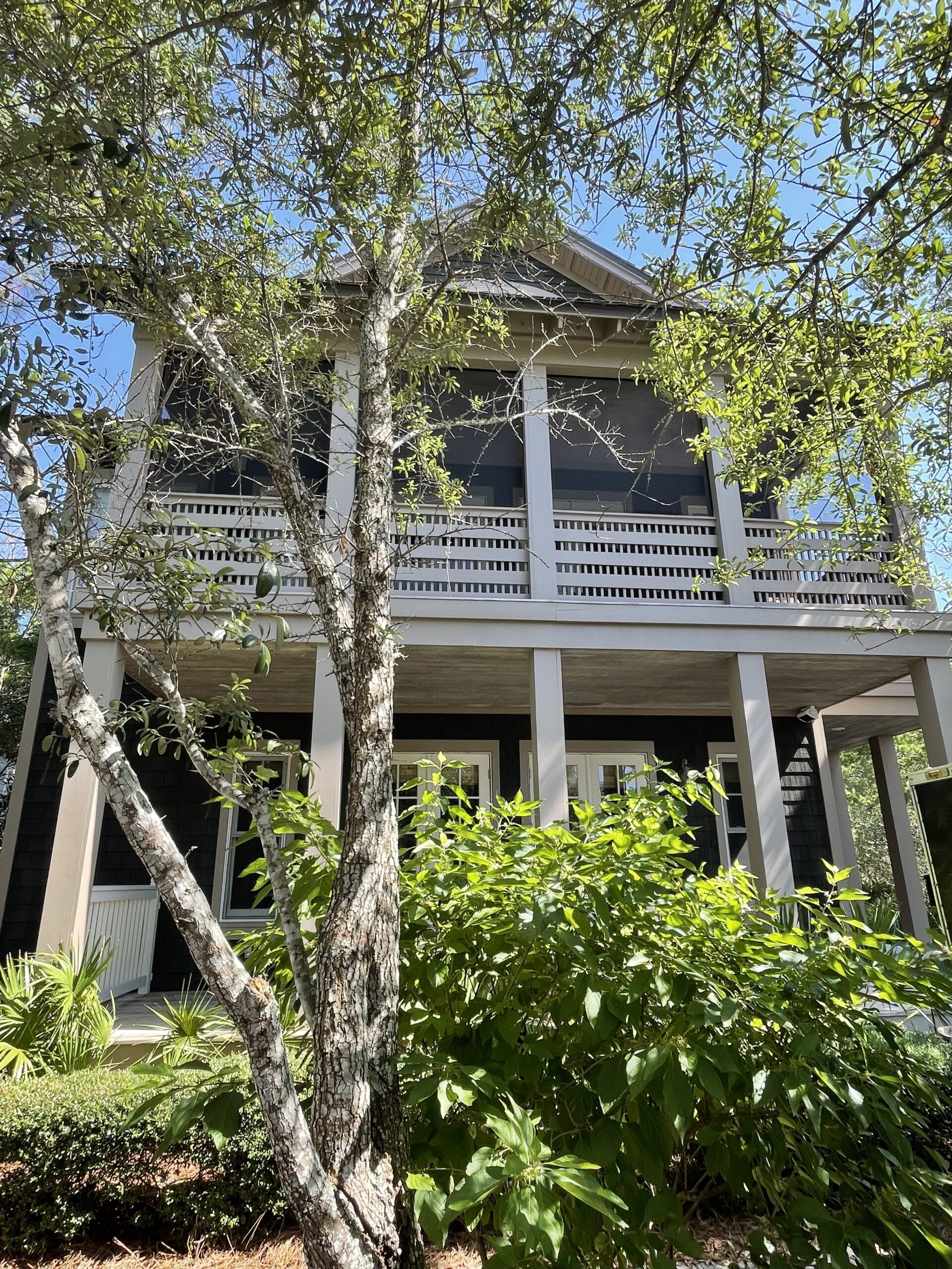
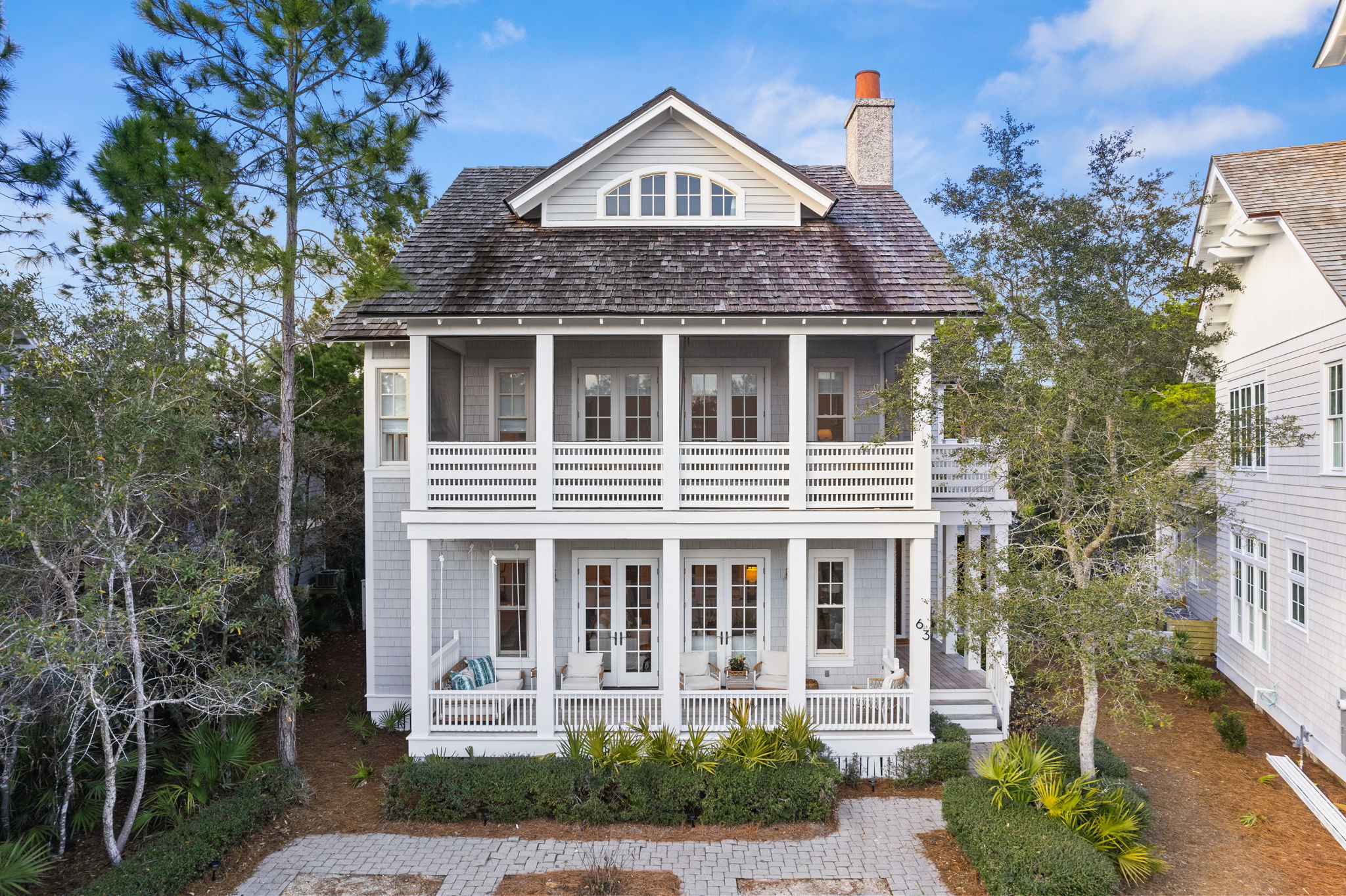
Exterior After: Since we painted the house and cleaned up the yard, we have neighbors stop by ALL the time to tell us thank you and how much they love what we did. It really just brought the house up to date and made it lighter and brighter. We have two front porches- one right off the family room/dining room and one screened in porch, right off the primary bedroom. Both have hanging bed swings and sitting areas and offer awesome spots to sit and enjoy the sounds of the gulf. We always laugh when we walk outside and hear the crazy waves because we can tell even before seeing the flag on the beach, how the gulf is that day, just by the sounds of it! Calm= quiet and loud= crazy waves!
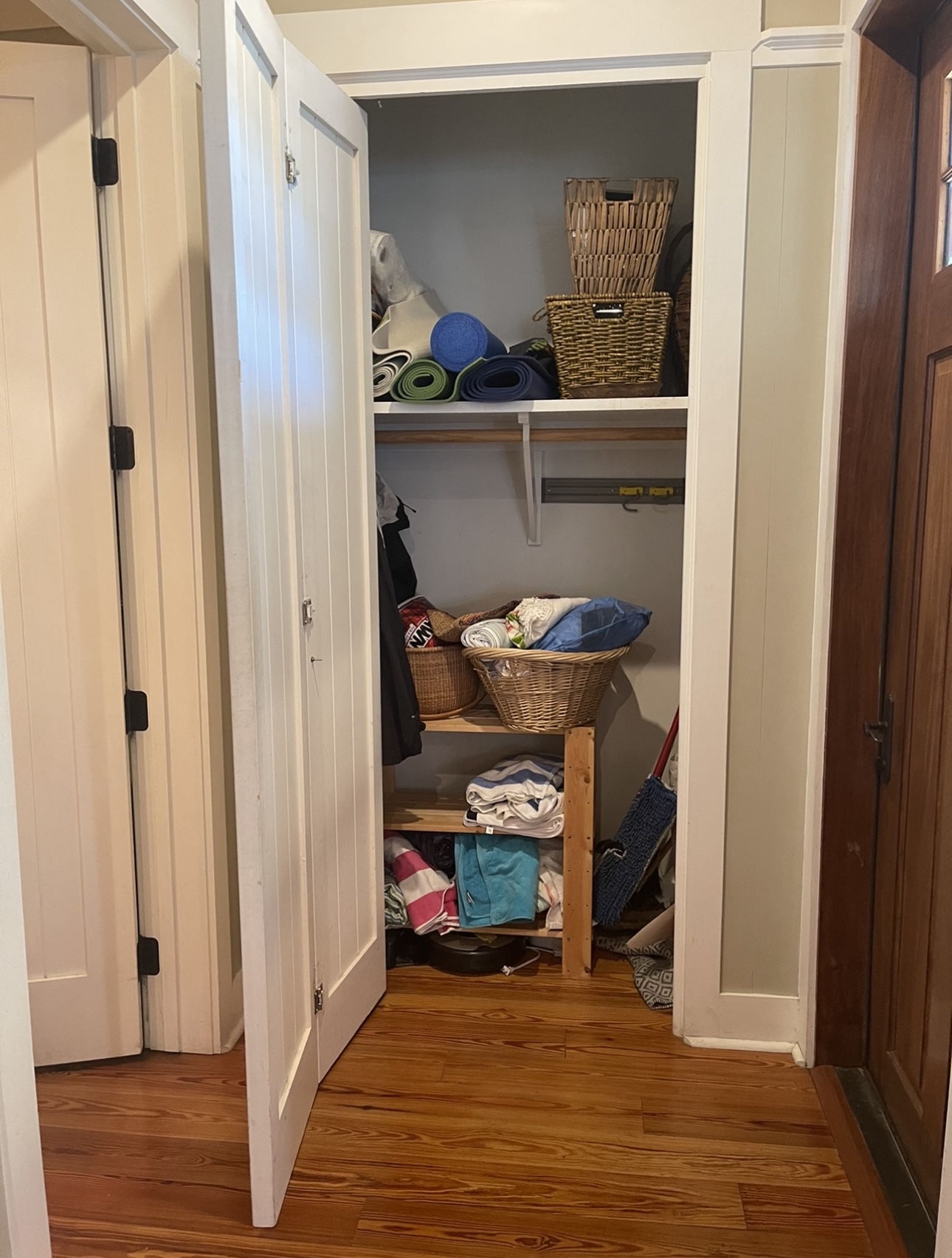
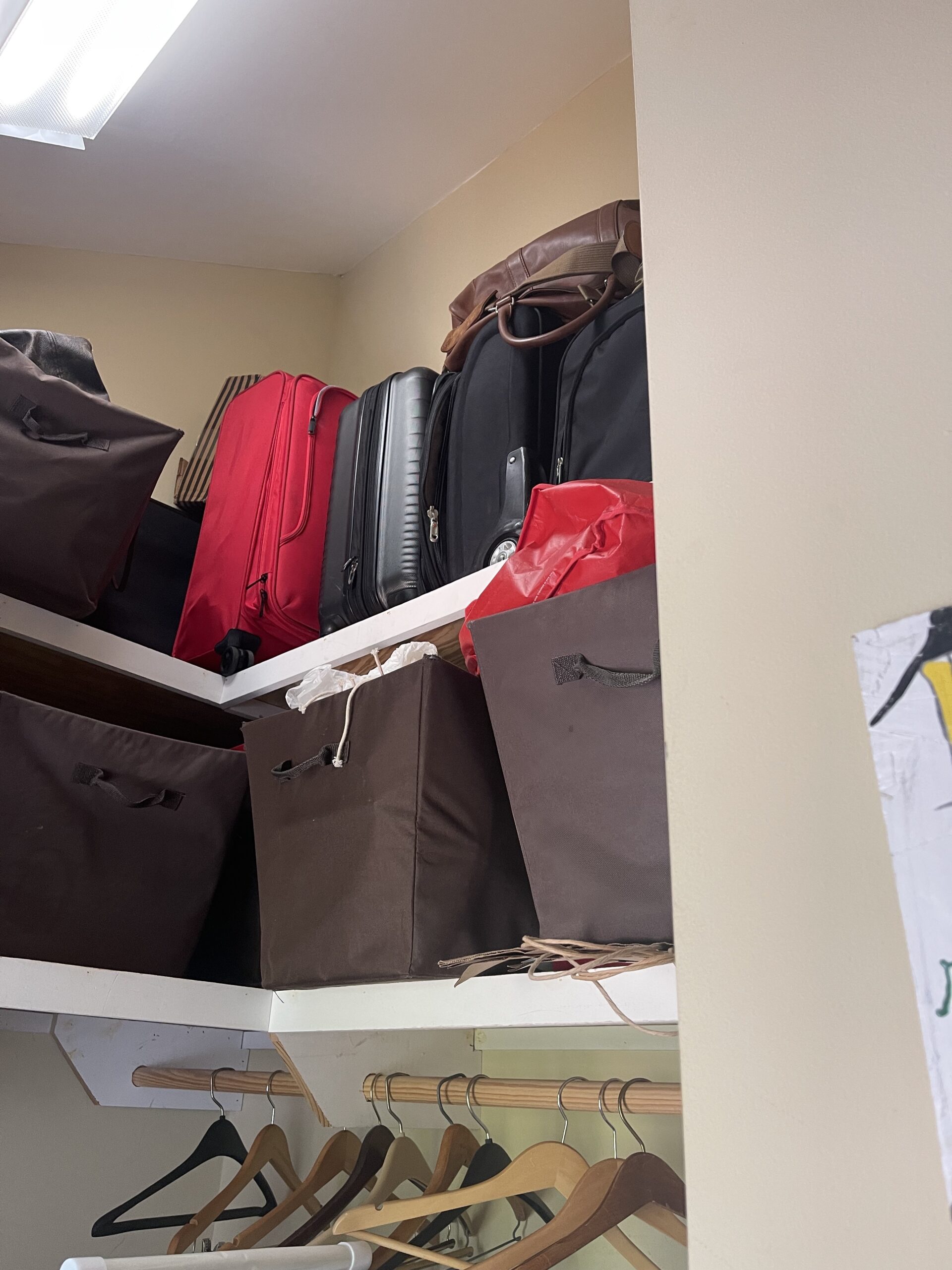
Entryway Before: The entryway had this closet that was super inefficient and hard to keep organized. You can see, it was just a mess and the accordion doors take up space when open.
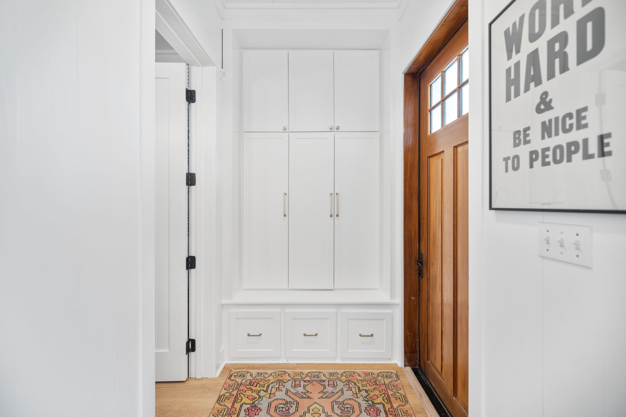
Entryway After: I always add lockers, drawers, cabinets where I can and this space is so much more efficient with the lockers and drawers. We use the upper cabinets for beach towels, back stock TP and cleaning products and loads of sunscreen. The drawers house shoes. Inside the lockers is full of backpacks, coats, purses and anything else that we don’t want out in this catchall area.
SHOP THE SPACE:

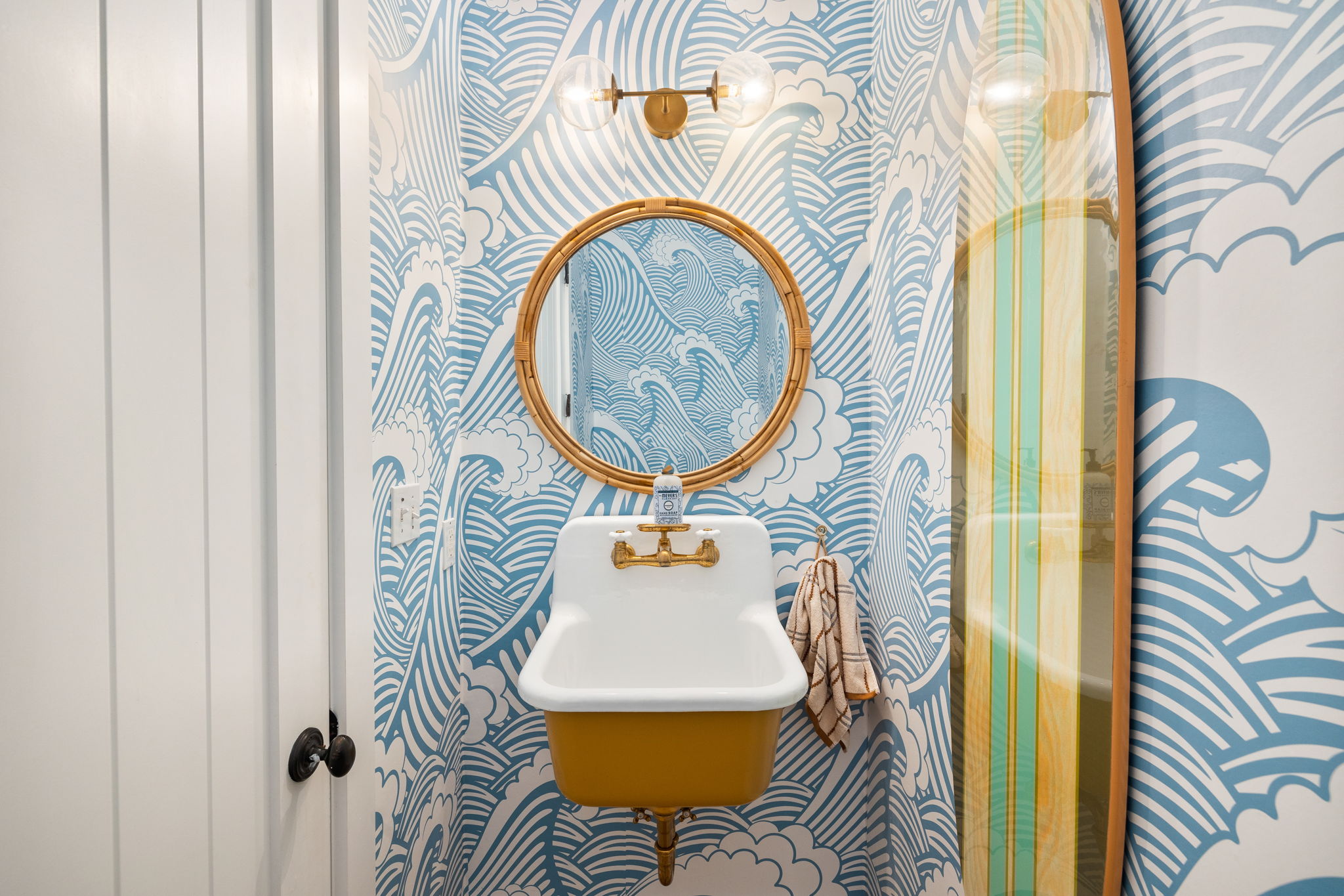
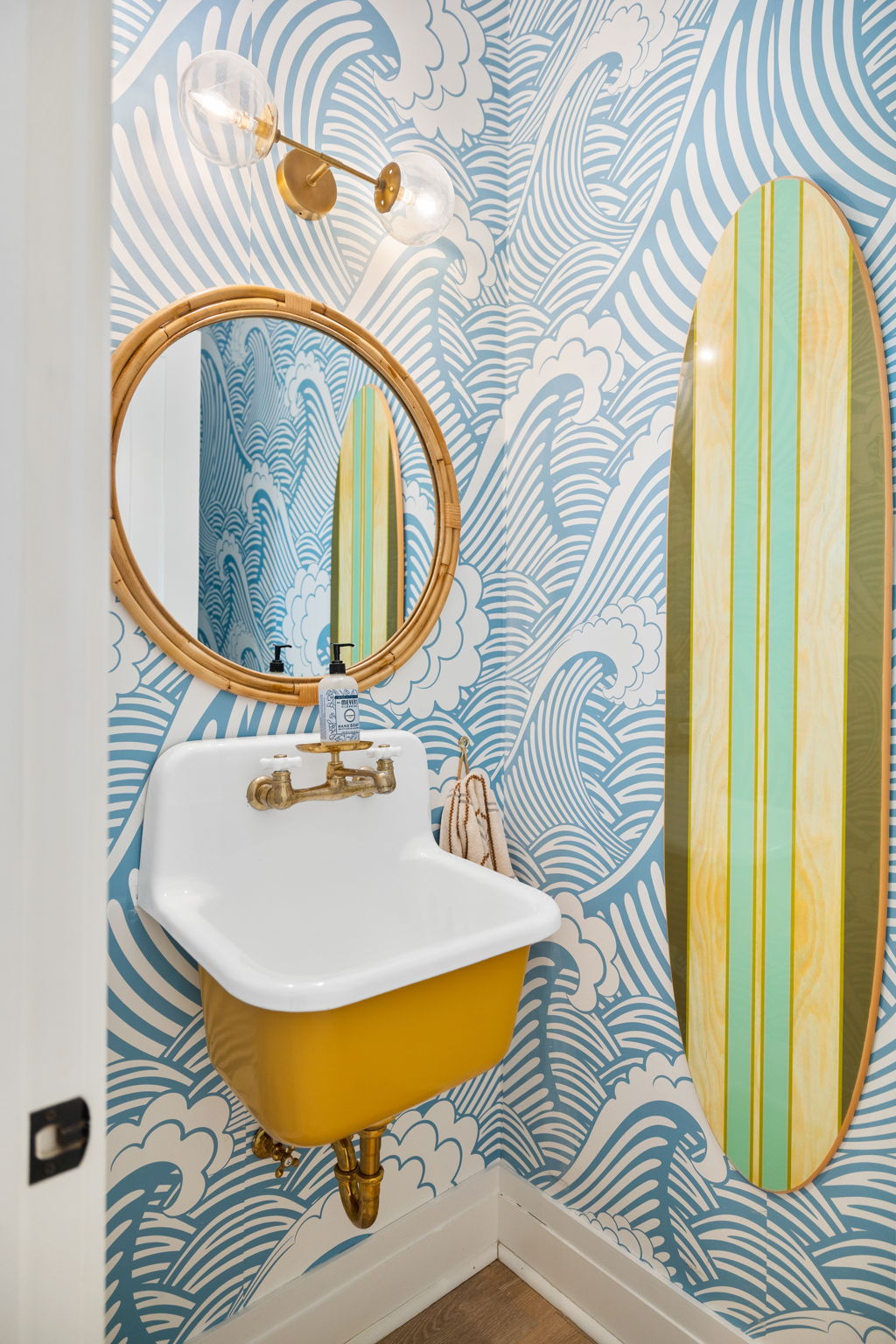
Powder Bath Before: If you’ve followed me for years, you know I love to add fun to a powder bath. This one was small, but had so much potential, as all powder baths do!
Powder Bath After: I knew I wanted to use this wave wallpaper somewhere in my beach house. It just adds such a fun pop of color and fun. Add in the quirky sink and bamboo mirror and brass touches and you’ve got yourself the cutest little bathroom. You could easily do this in a kids’ bathroom as well. It would be an easy vibe to pull off in a bigger space, too!
SHOP THE SPACE:
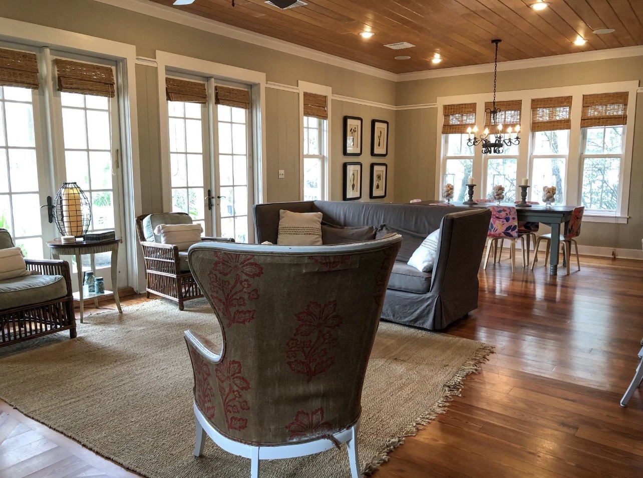
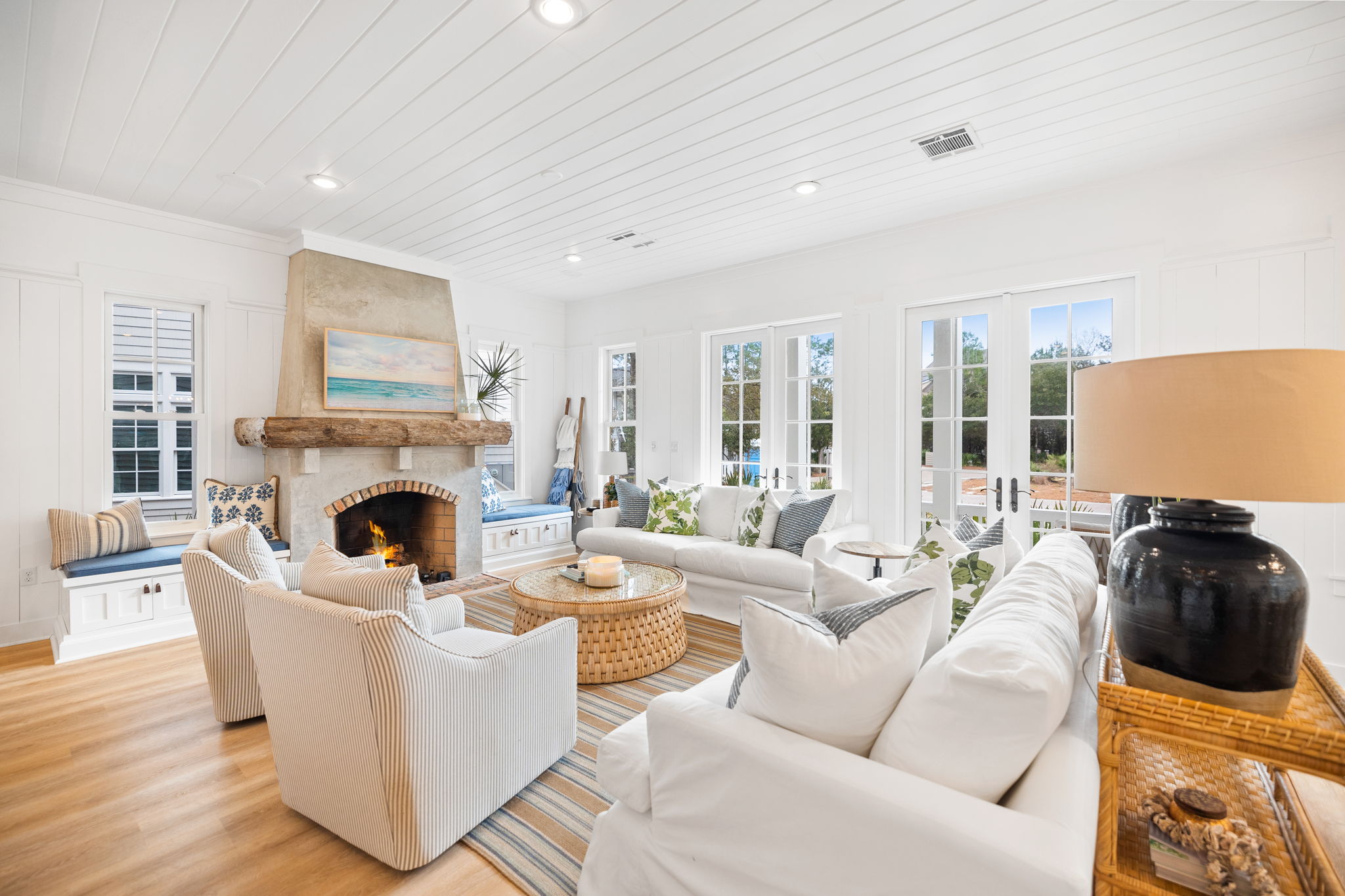
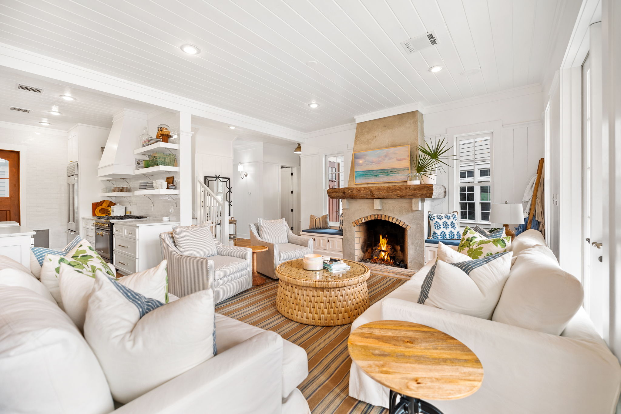
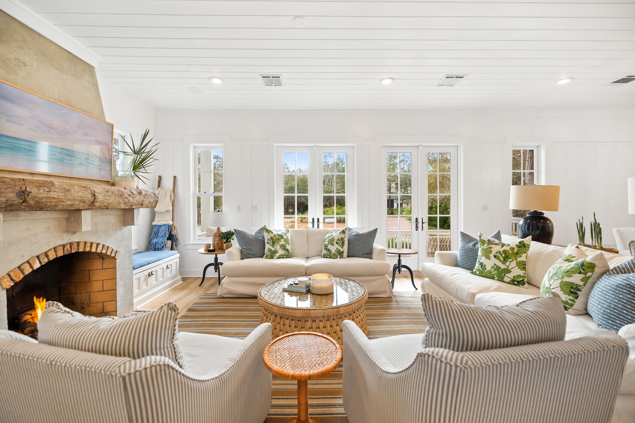
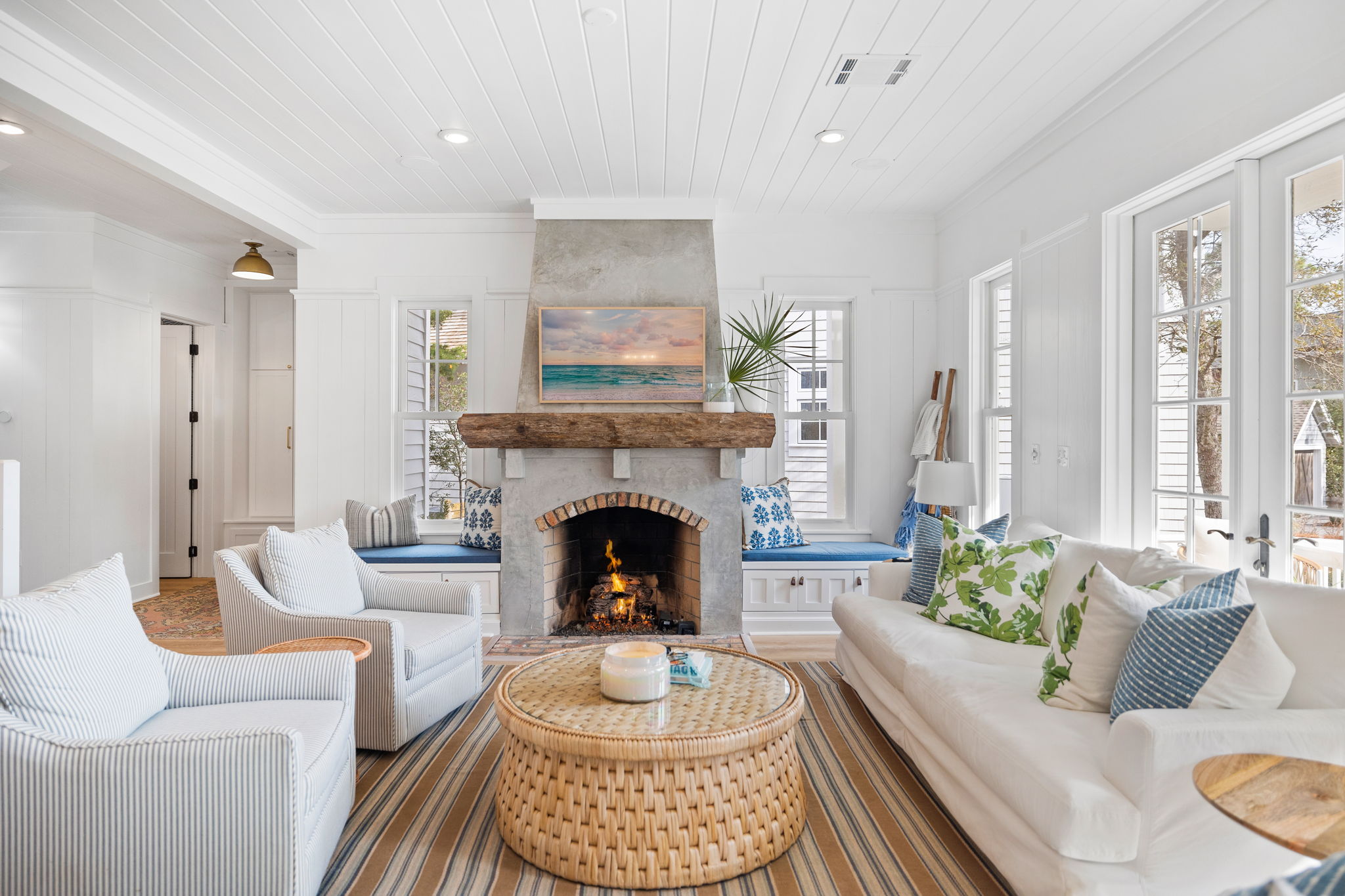
Family Room Before: With this being the main living space in the house and the first thing you see, we knew it needed to be brighter, lighter and it needed ample cozy seating. The fireplace is such a statement and we opted to keep it original to give a nod to the original house. Plus, we love that it adds a pop of color to all the white. This house, like our Texas house, has so much amazing wood paneling. I love all the texture it brings!
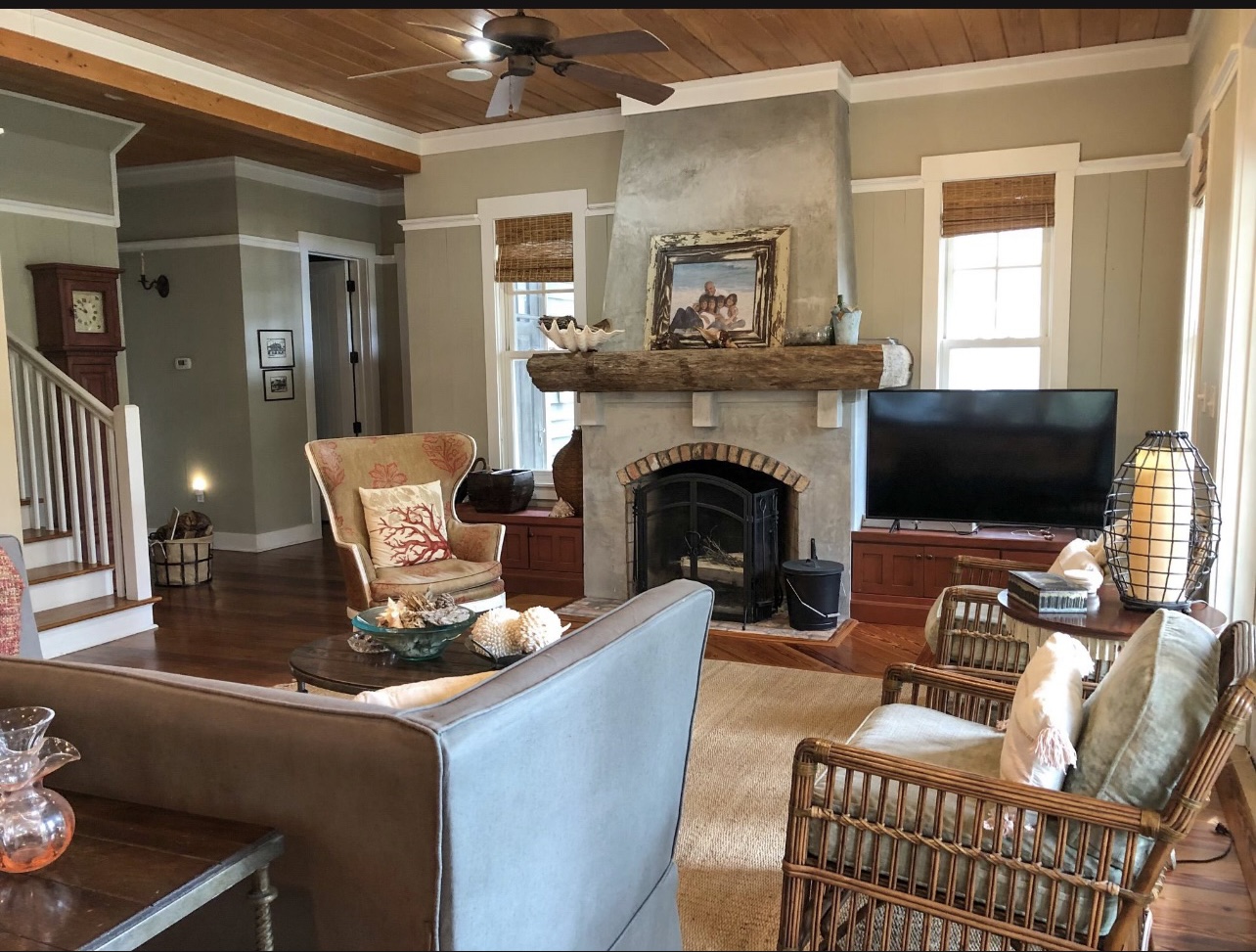
Family Room After: As you can see, we really brightened this place up. We opted for Benjamin Moore Chantilly Lace in the whole house to make it lighter and brighter. I always prefer to add in color via textiles, rugs, etc. Because we renovated this house knowing it would potentially be a rental/second home one day, we added even more seating by getting custom cushions made for the cabinets on both sides of the fireplace. After hosting family for Thanksgiving, I can say that we truly used all sitting spaces and this room was amazing for hanging and relaxing.
SHOP THE SPACE:
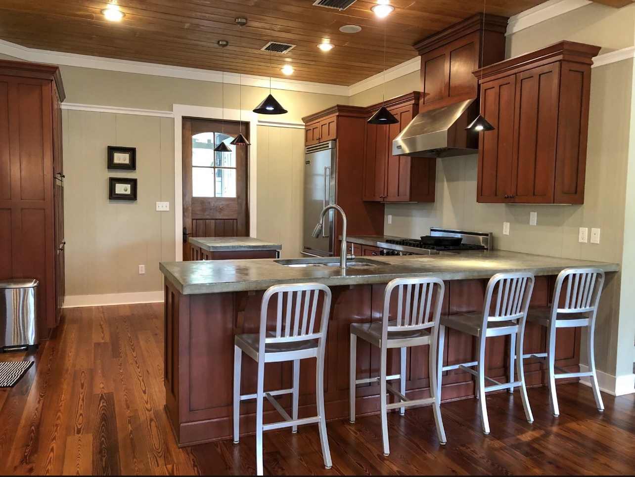
Kitchen Before: While this kitchen was fine before, it really was set up to not utilize all the available space. I joke that I could be a kitchen designer because I’m really good at figuring out the best way to use all the space efficiently! This peninsula really closed off the kitchen and made it seem much smaller than it was. Plus, that tiny island in the middle was hardly usable!
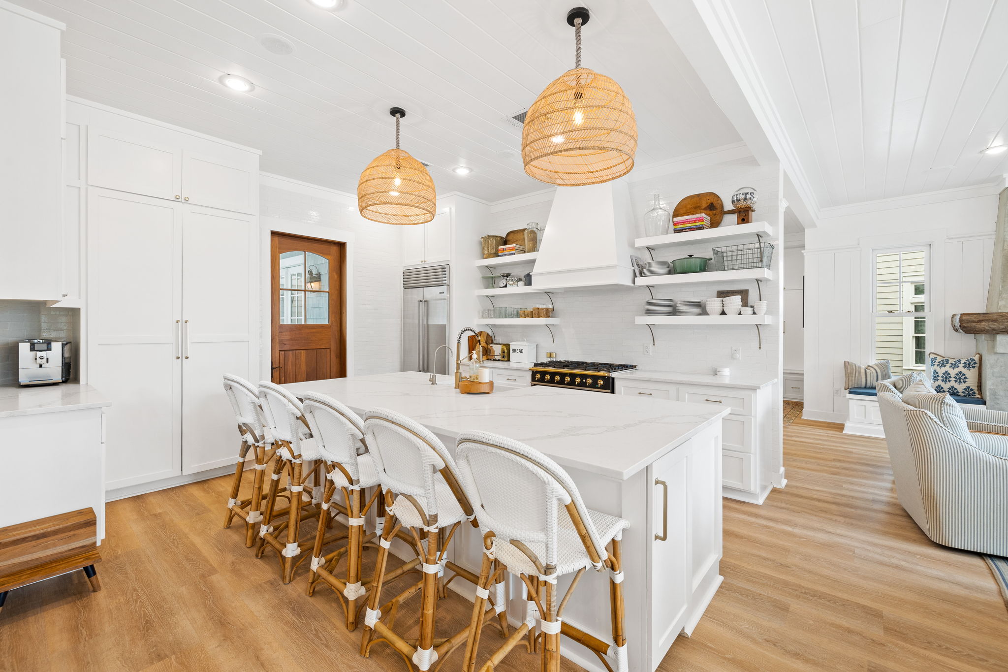
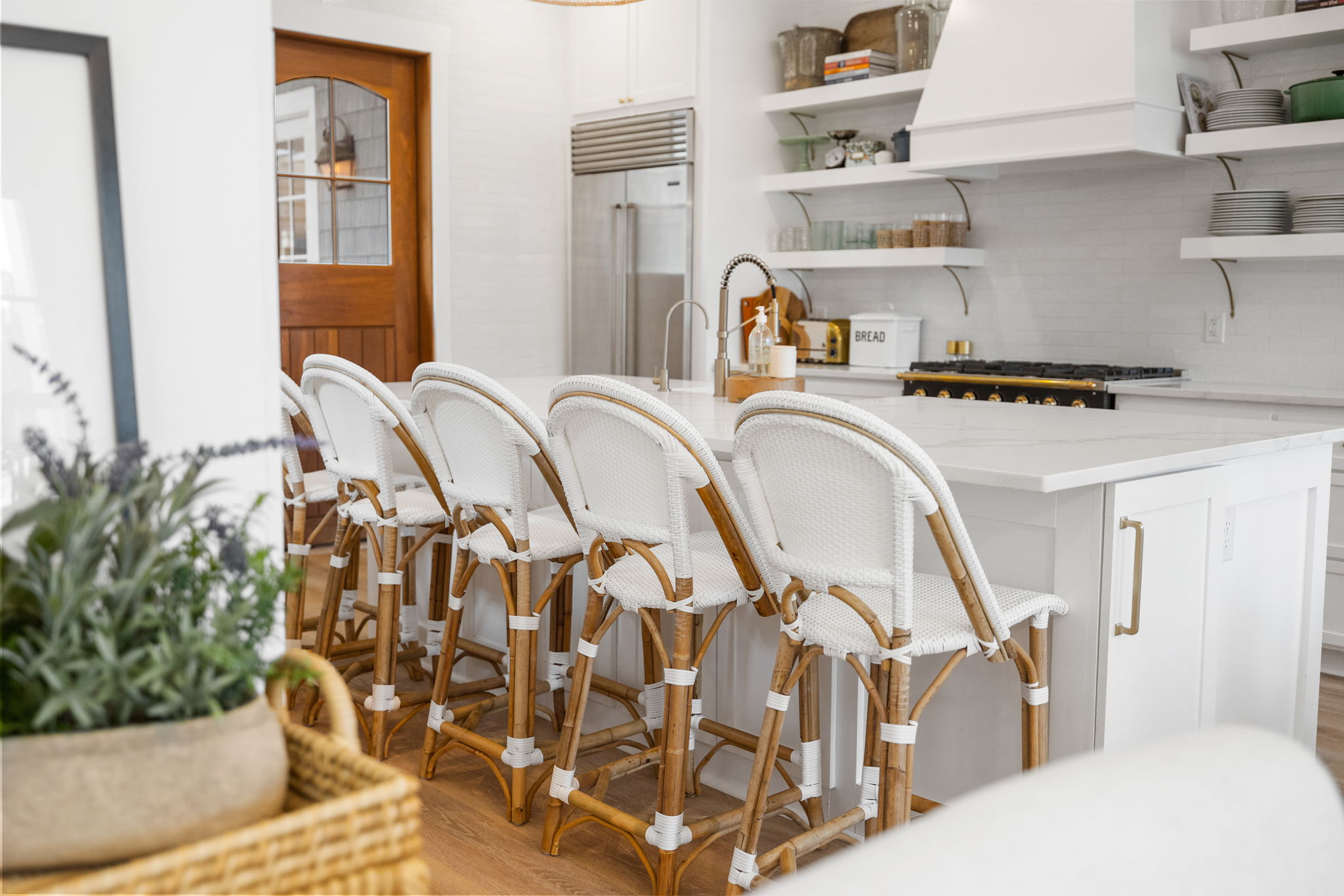
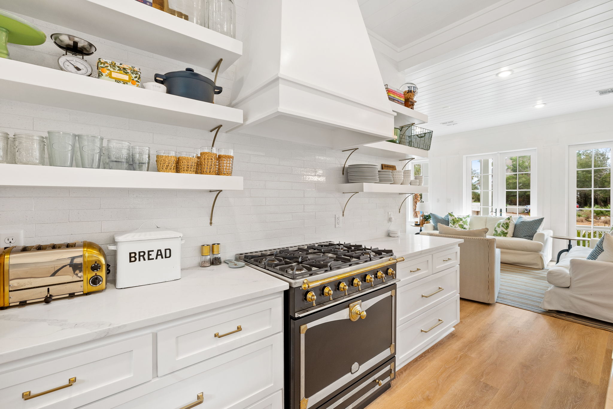
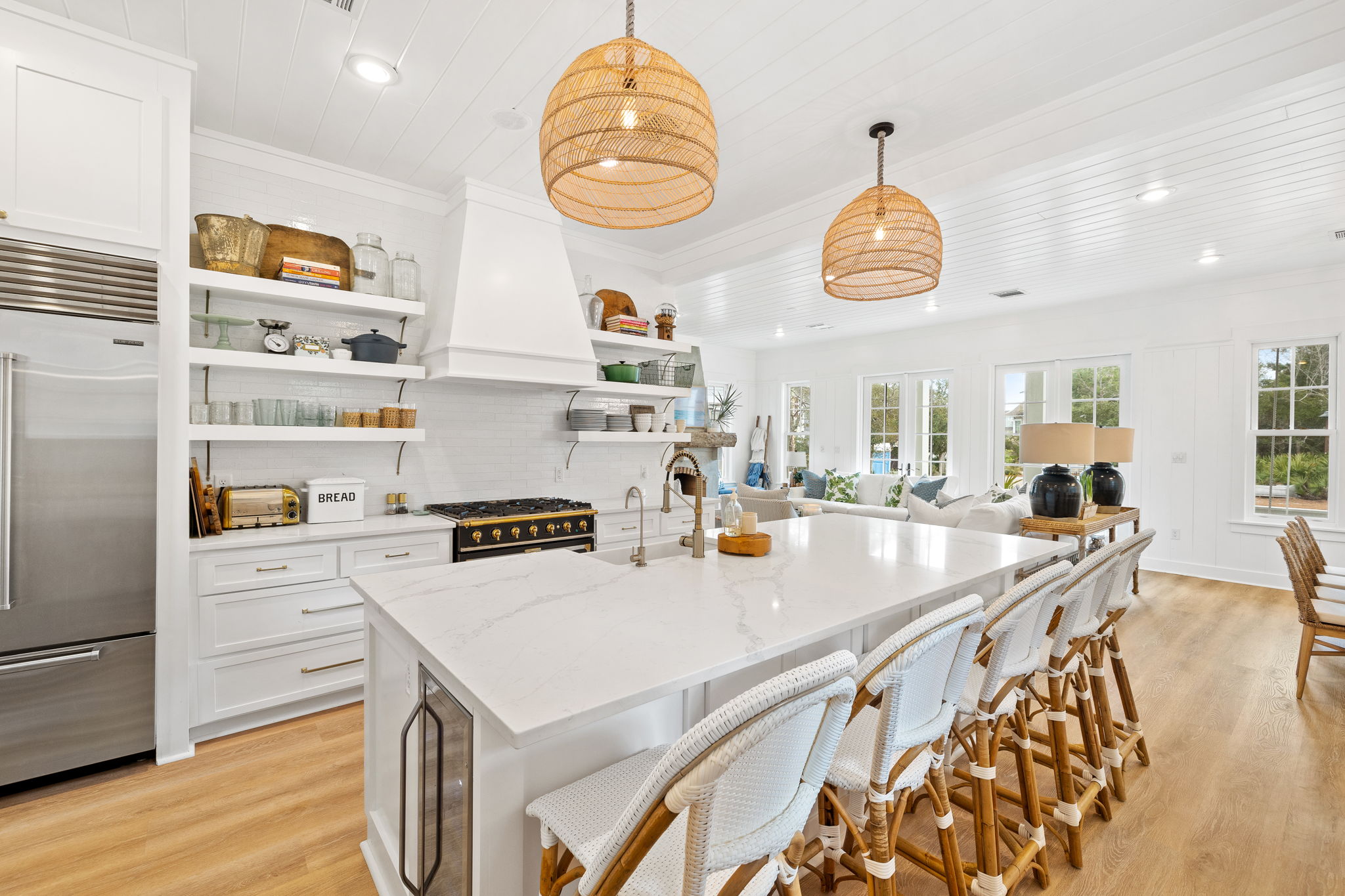
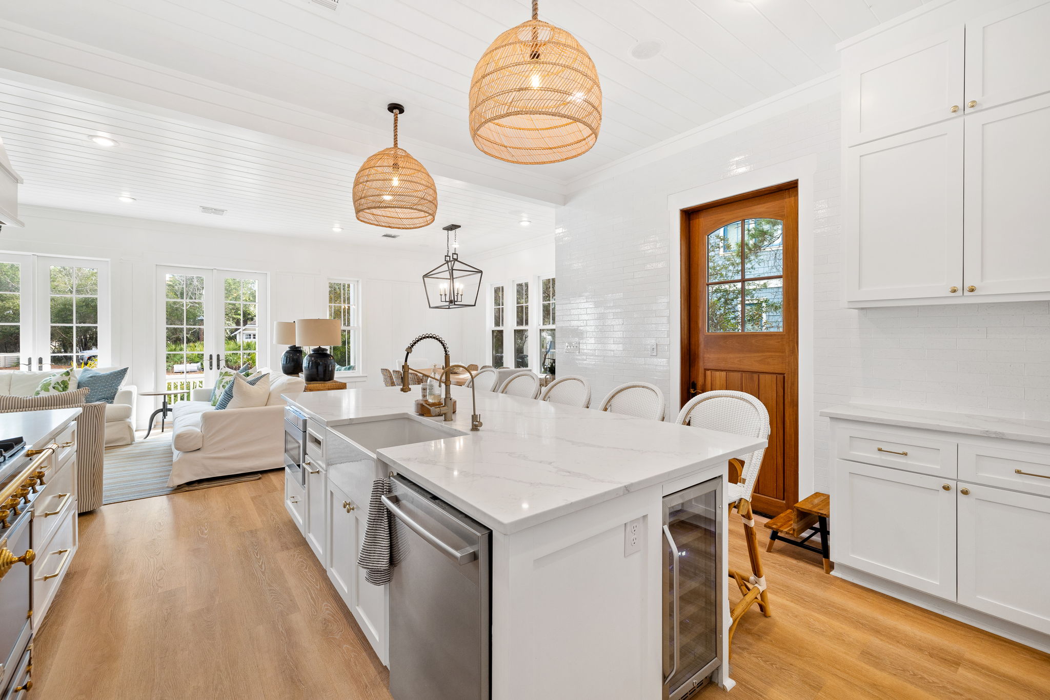
Kitchen After: The first step was to remove the peninsula and once we did, look at how much space we opened up. We were able to get a large island that seats 5! The island includes an ice maker, microwave, wine fridge and under seating cabinets. I always add cabinets under the island! This is such a must to be sure you are using all available space. We opted for open shelves, as I really prefer them to closed cabinets. You keep out what you use regularly and get rid of all the excess junk that hides in the back of cabinets! Plus, it really makes a space feel more open. We added a pantry with inside shelving and drawers, a little coffee bar and some upper and lower cabinets. The rest of the kitchen is drawers, as I prefer those to cabinets for pots, pans and other household items. We added some touches of black with the range and I love the juxtaposition between the coastal rattan touches and the matte black and brass finishes! I truly love this space. We opted for quartz as opposed to marble here, knowing that this would eventually be a second home/rental. Quartz is more durable and you don’t have the stain issues that you do with marble (marble is still my favorite). As always, I had to add a floor to ceiling tile wall- this has become a signature move in our homes and I love the texture that it adds. It also becomes a conversation piece as well!! I’m so happy with how this space turned out. It just seems so much brighter and way more spacious than the before!
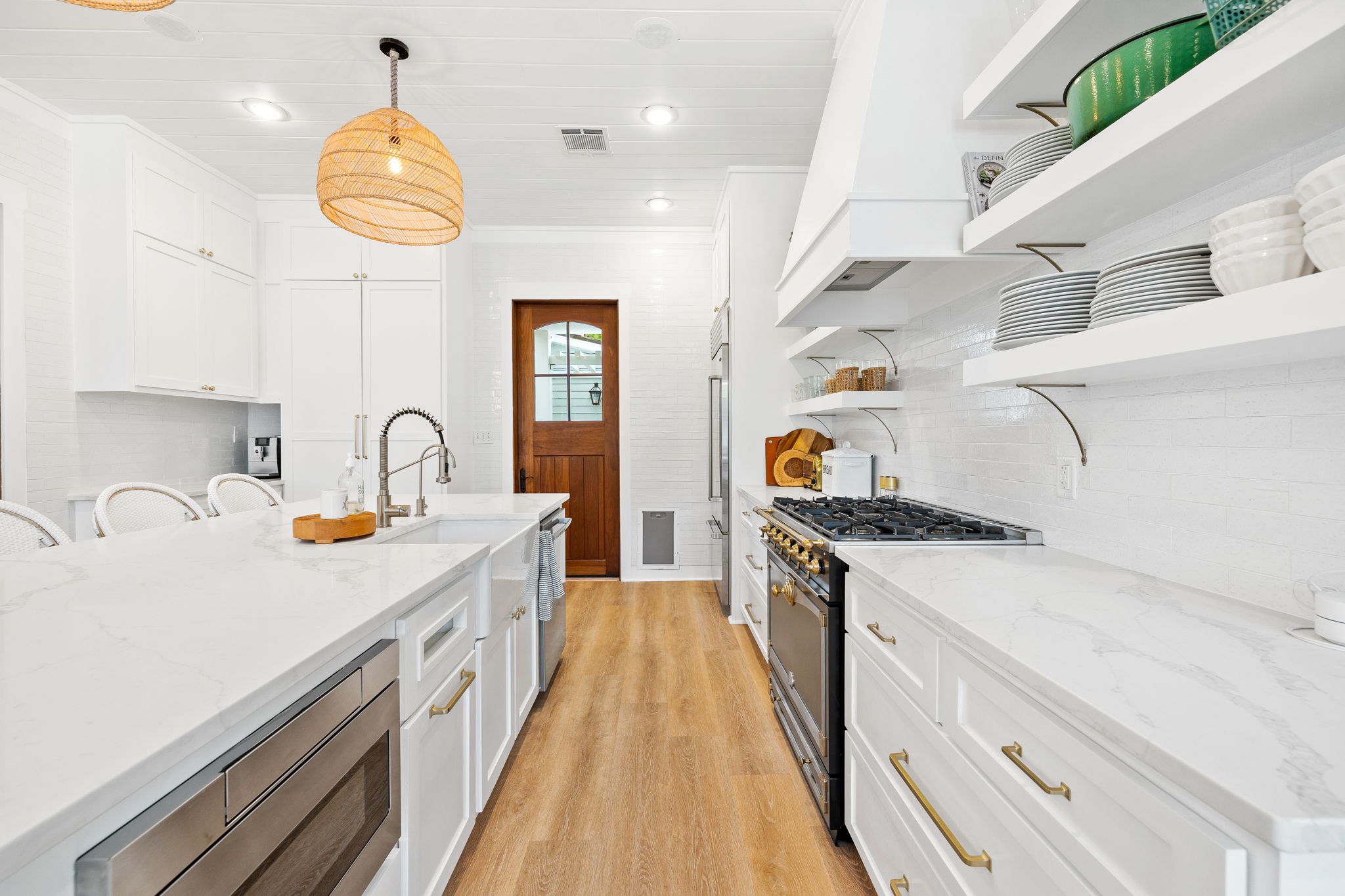
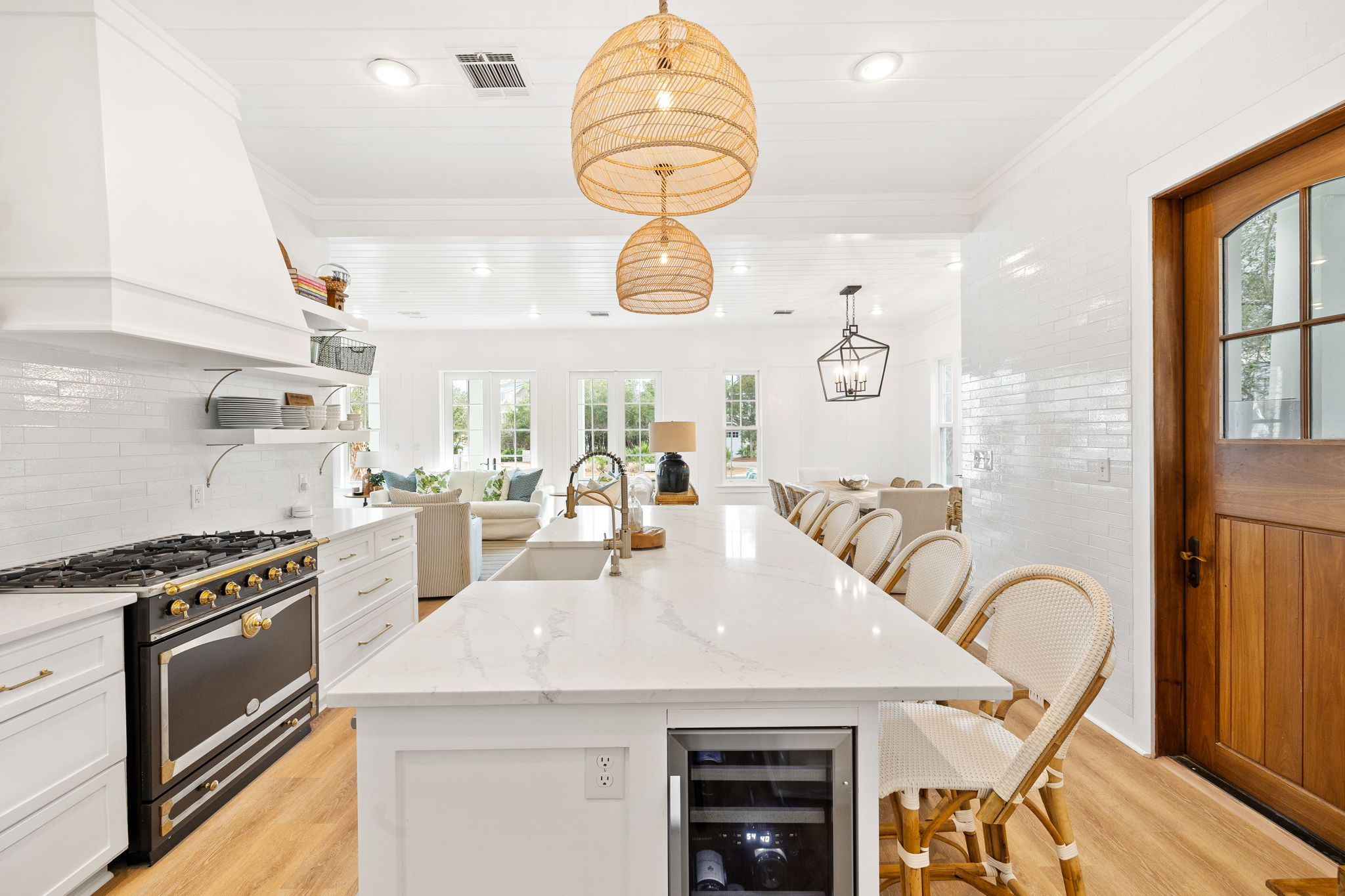
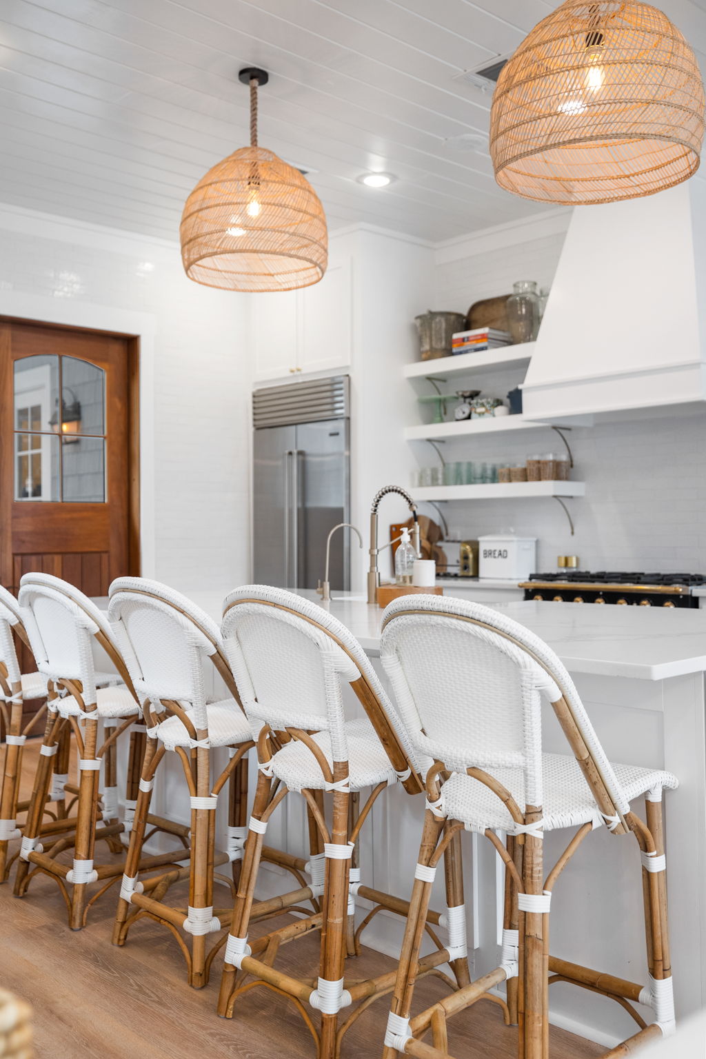
SHOP THE SPACE:
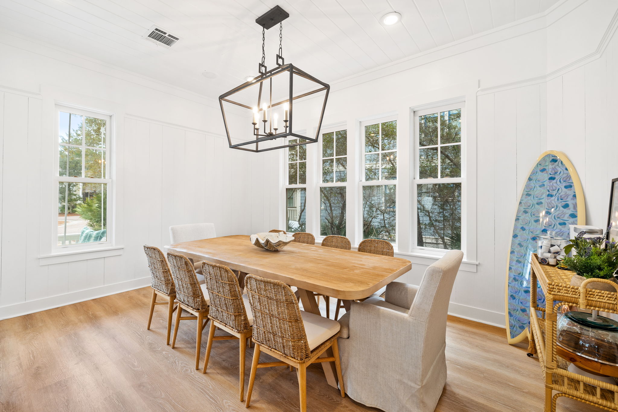
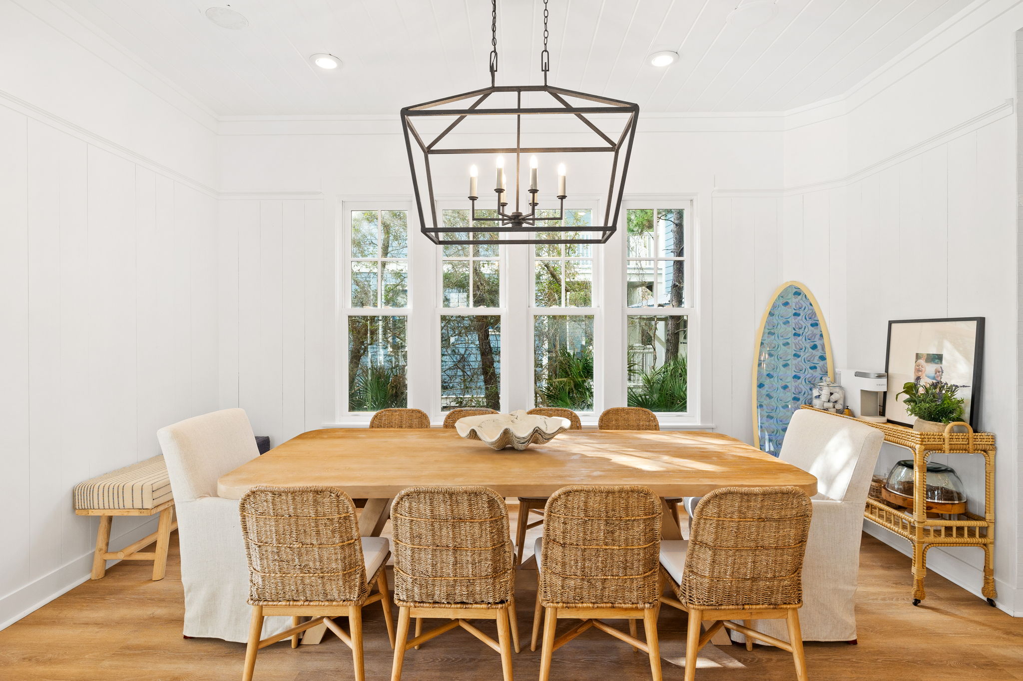
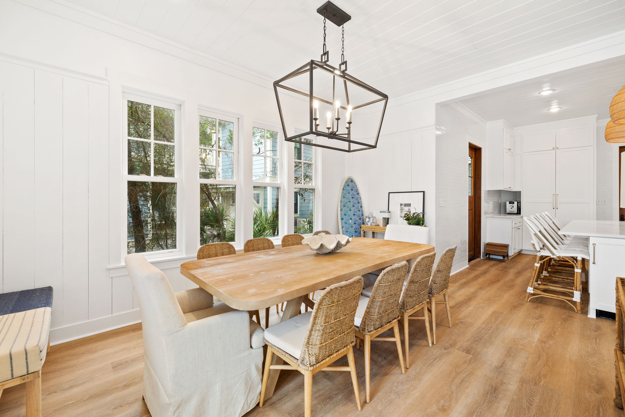
Dining Room Before: Besides the island, this dining area is the only eating spot in the house. You can see there is ample space here that was not being used! Again, we just wanted to brighten it up and make sure the space was used to it’s fullest potential.
Dining Room After: With a larger table and ample seating- 10 chairs, this room is truly an awesome space! Because it opens to the family room and kitchen, you can truly converse and hang while being in all three spaces. I love this aspects of the house. We added a bar cart, which could be used for alcohol, coffee bar, extra glasses, plates, etc. We use it for all of the above! The black lantern style light really pulls in the black touches from the kitchen and helps tie the spaces together.
SHOP THE SPACE:
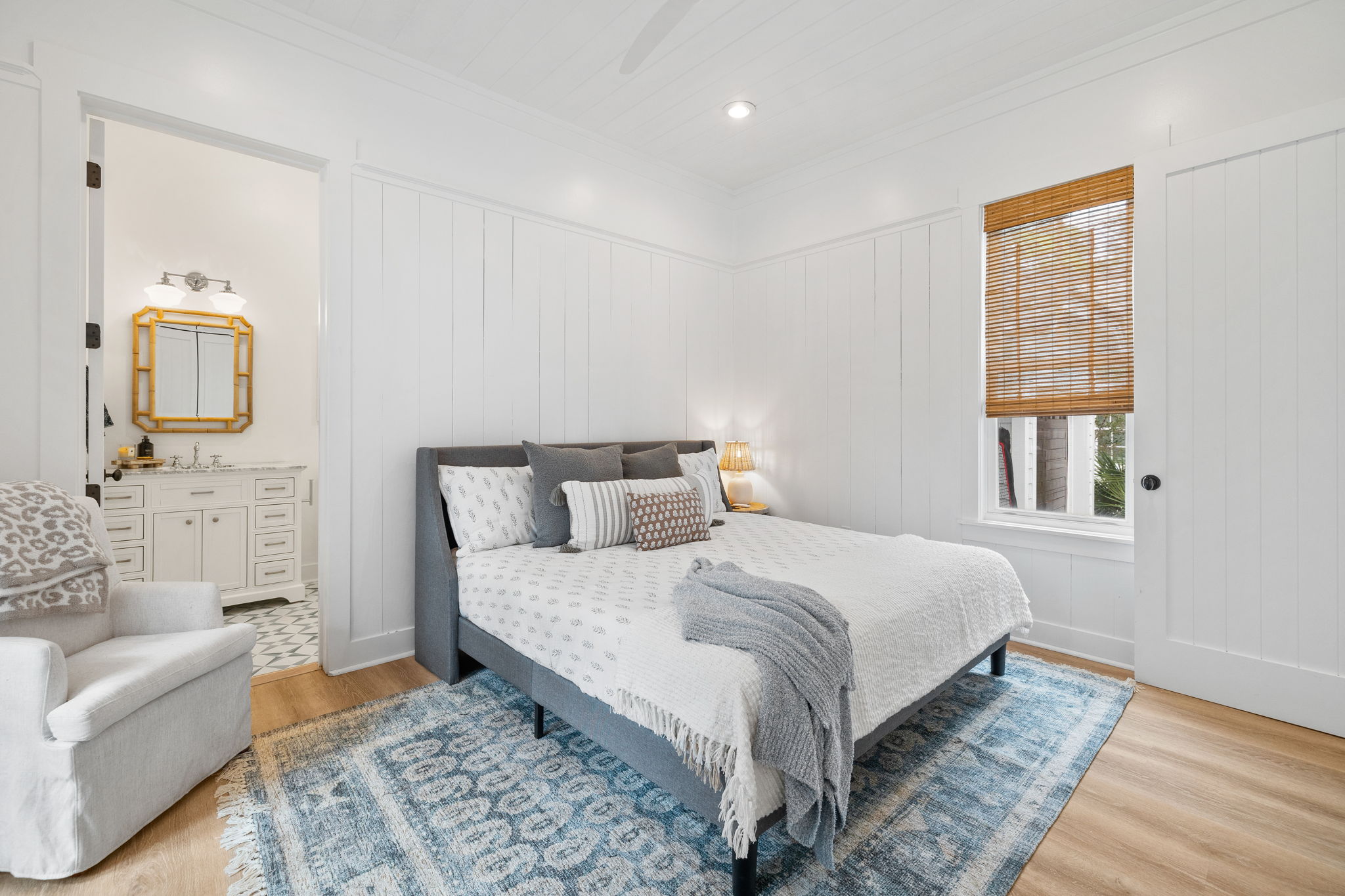
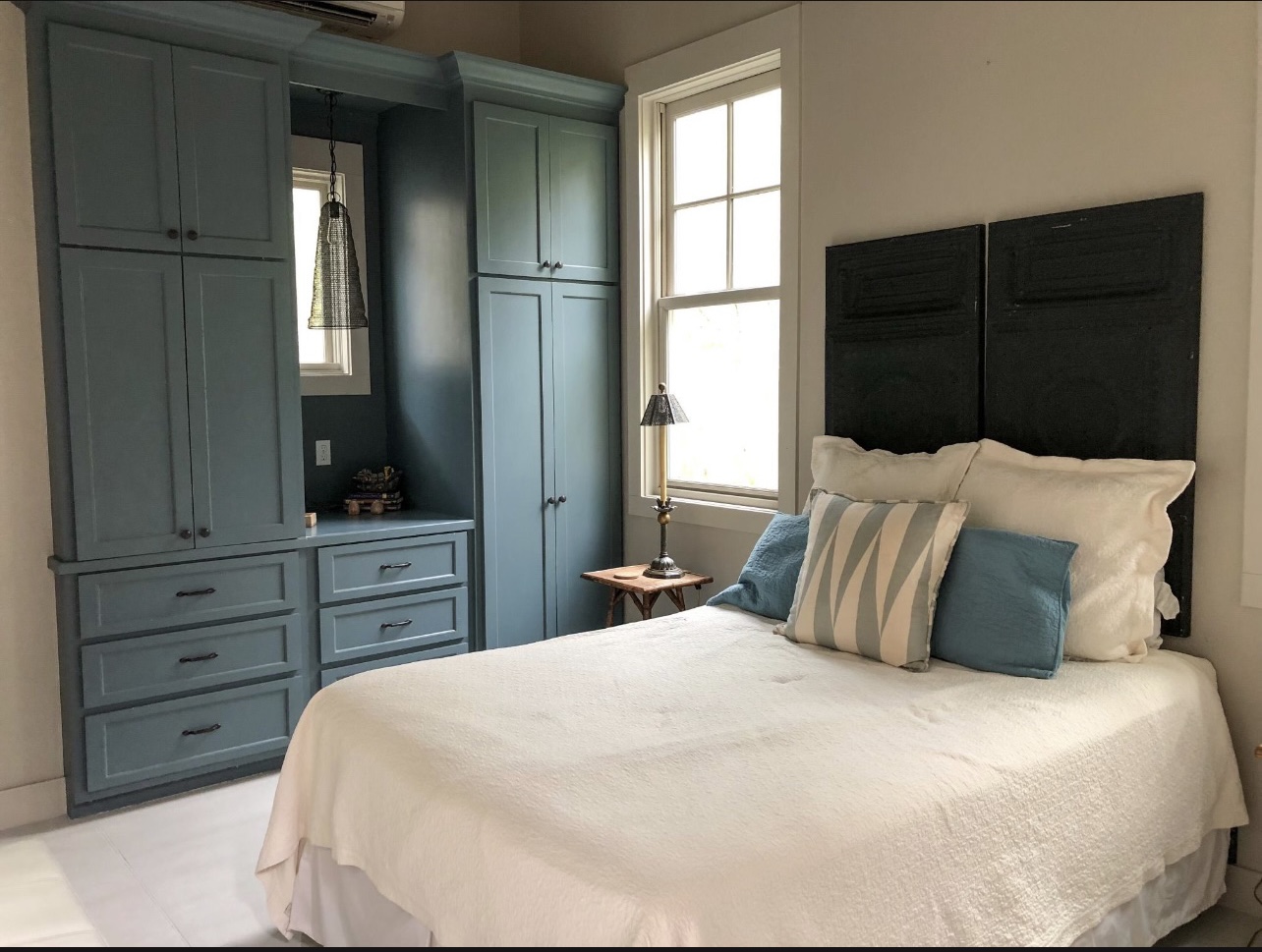
Downstairs Bedroom Before: This room was fine, but again, just super dark like the rest of the house.
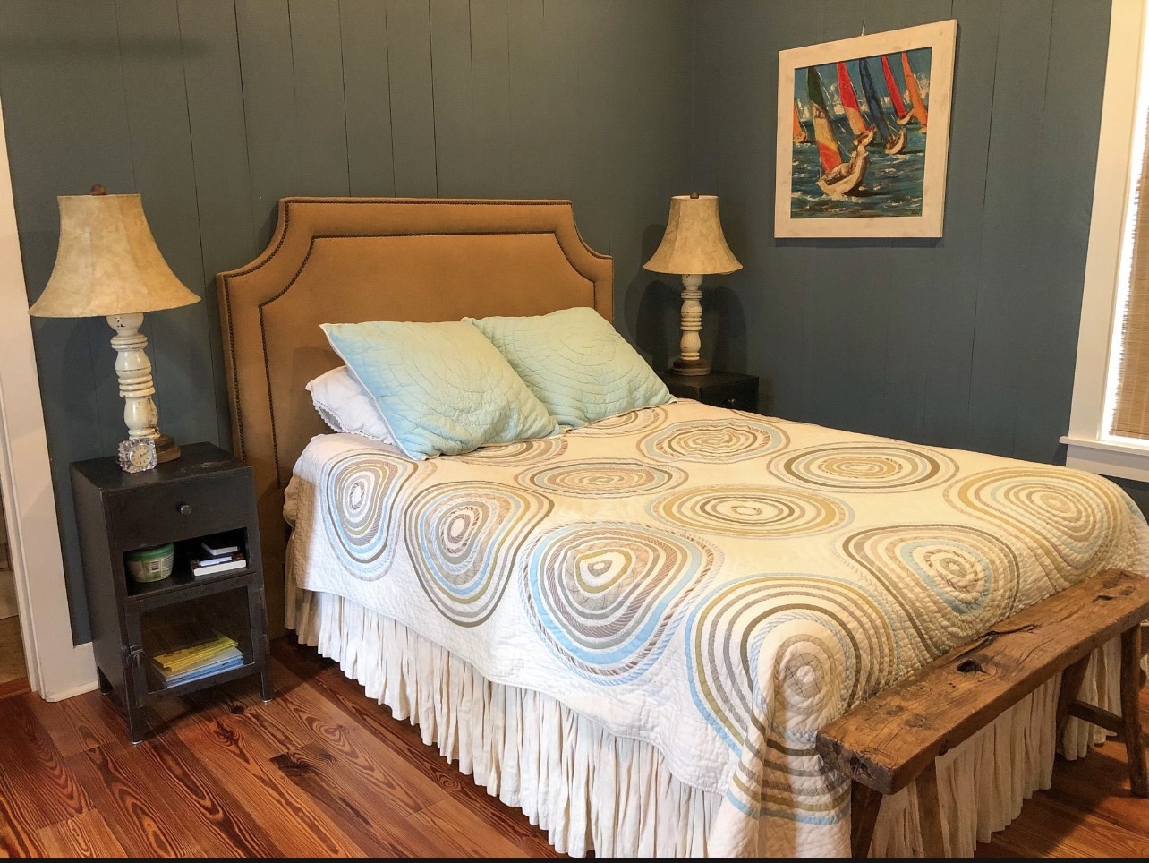
Downstairs Bedroom After: We really wanted to brighten it up, so our guests felt bright and airy in this space. We also added a king bed, as with all rental or second homes, the king beds are typically the main request, so I try put a king size bed in every room that I can. And personally, you know I prefer sleeping in a king, so I try to do that for our guests, too. We love these mattresses and all bedrooms in this house have them! They are THE BEST.
SHOP THE SPACE:
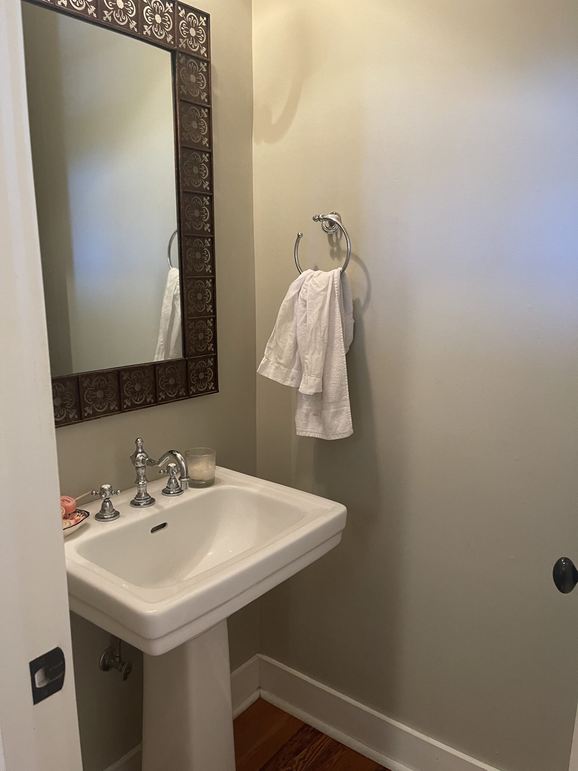
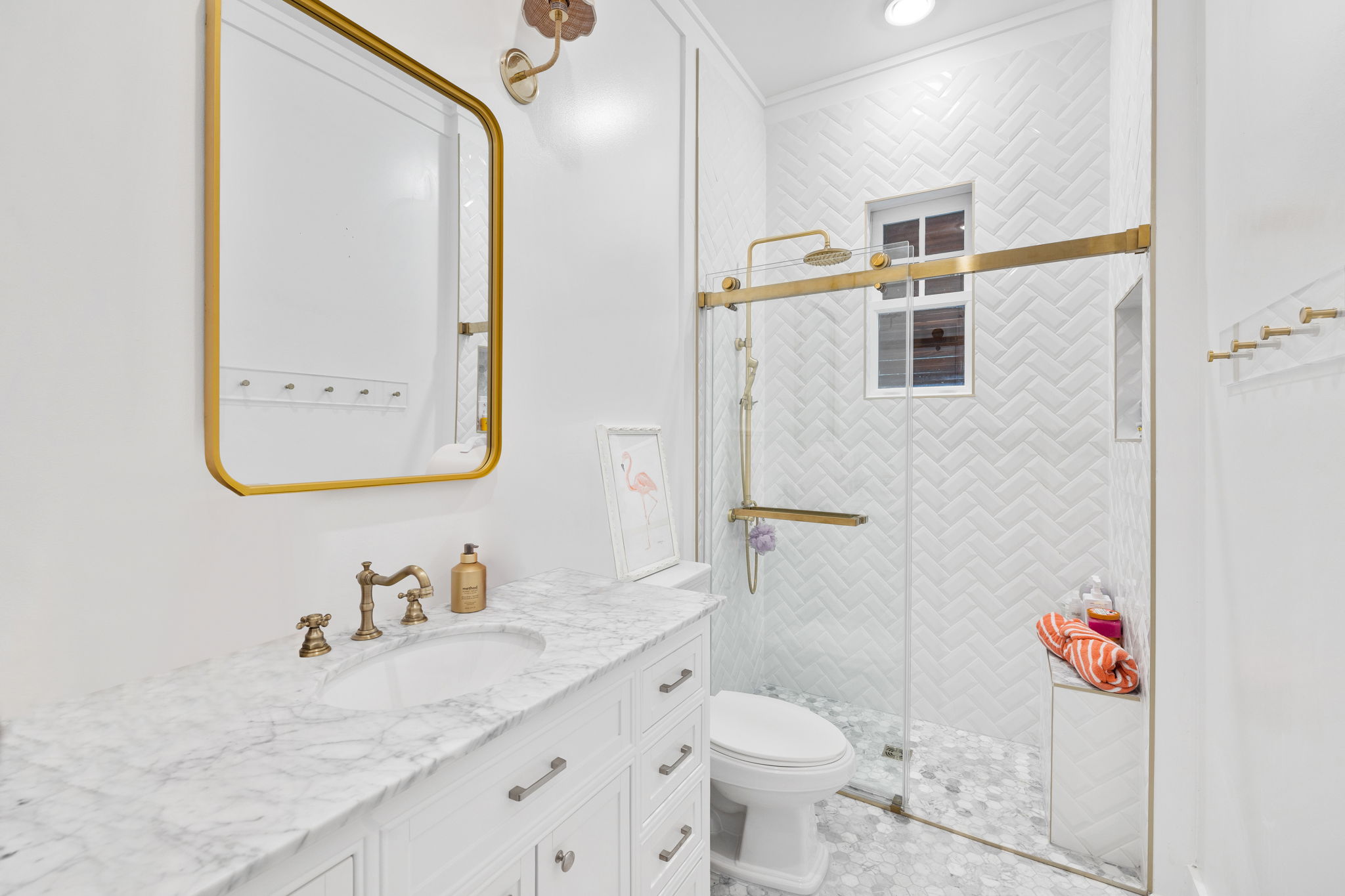
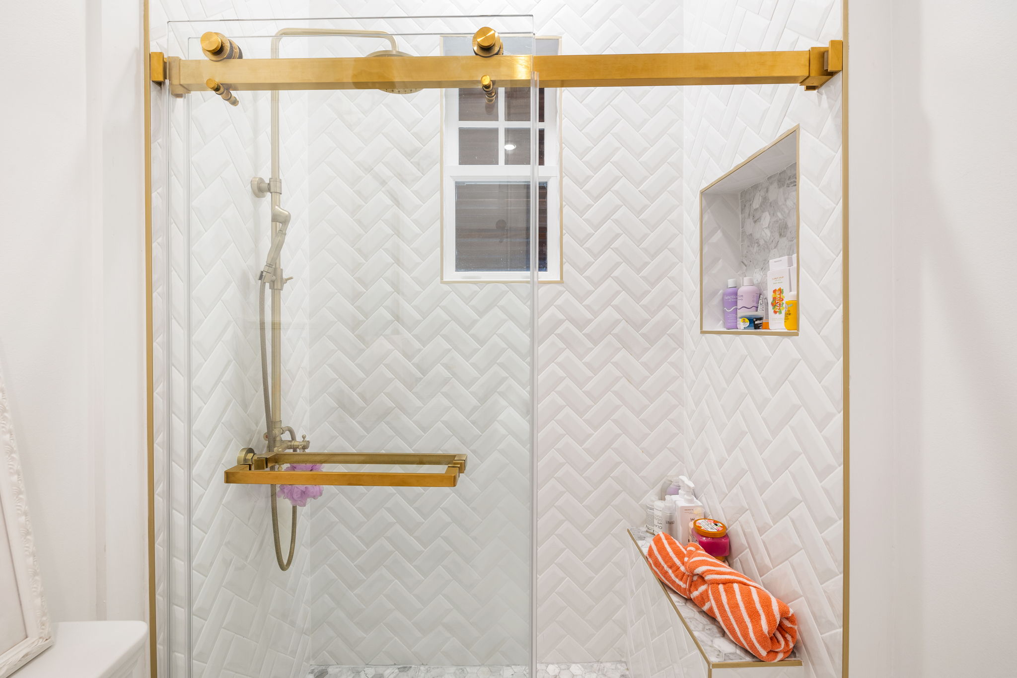
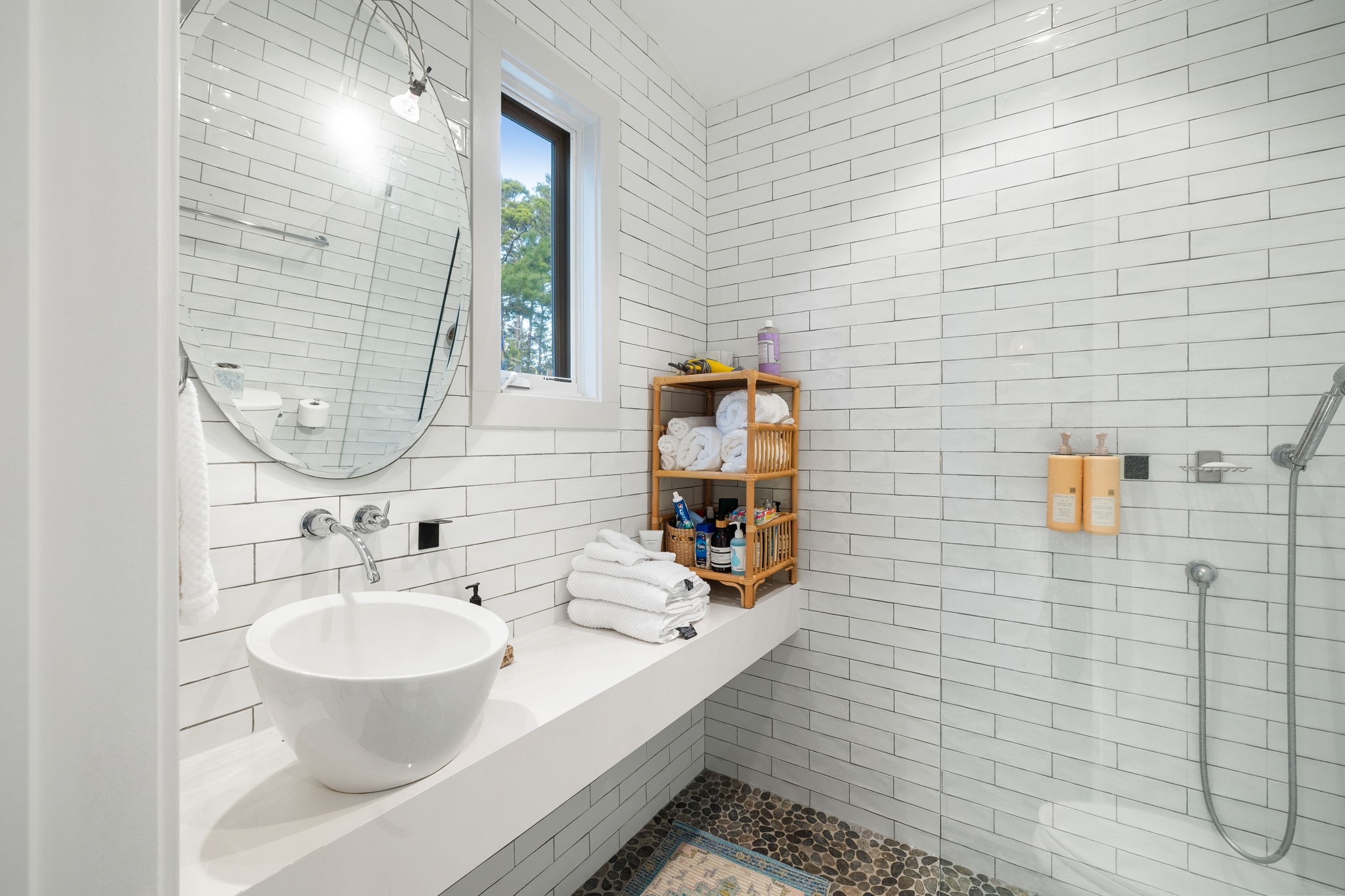
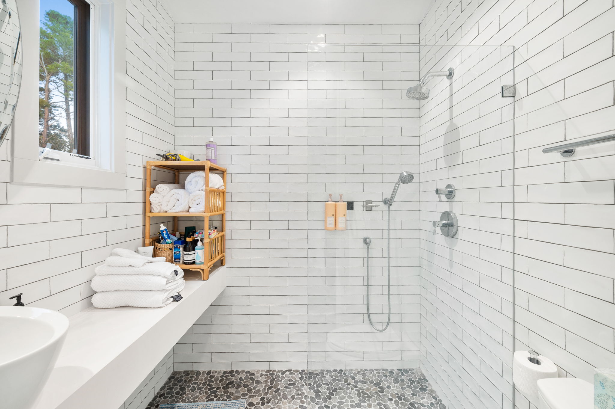
En Suite Bathroom Downstairs Before: This space was pretty functional, just dated and again, it just didn’t give beach house vibes.
En Suite Bathroom Downstairs After: We were really able to brighten this space up with a new vanity, fun lighting and art and mirror and a fun tile. Something I like to do on a regular basis is add a pop of fun with tile. We opted to leave one tub shower in the house. With future rentals, we always think one bathroom needs a tub for kiddos. I always add a shower door to a tub- just way cleaner looking than a shower curtain. We added a fun “hi” in the shower niche and it was just a cute way to add a little character to a bathroom.
SHOP THE SPACE:
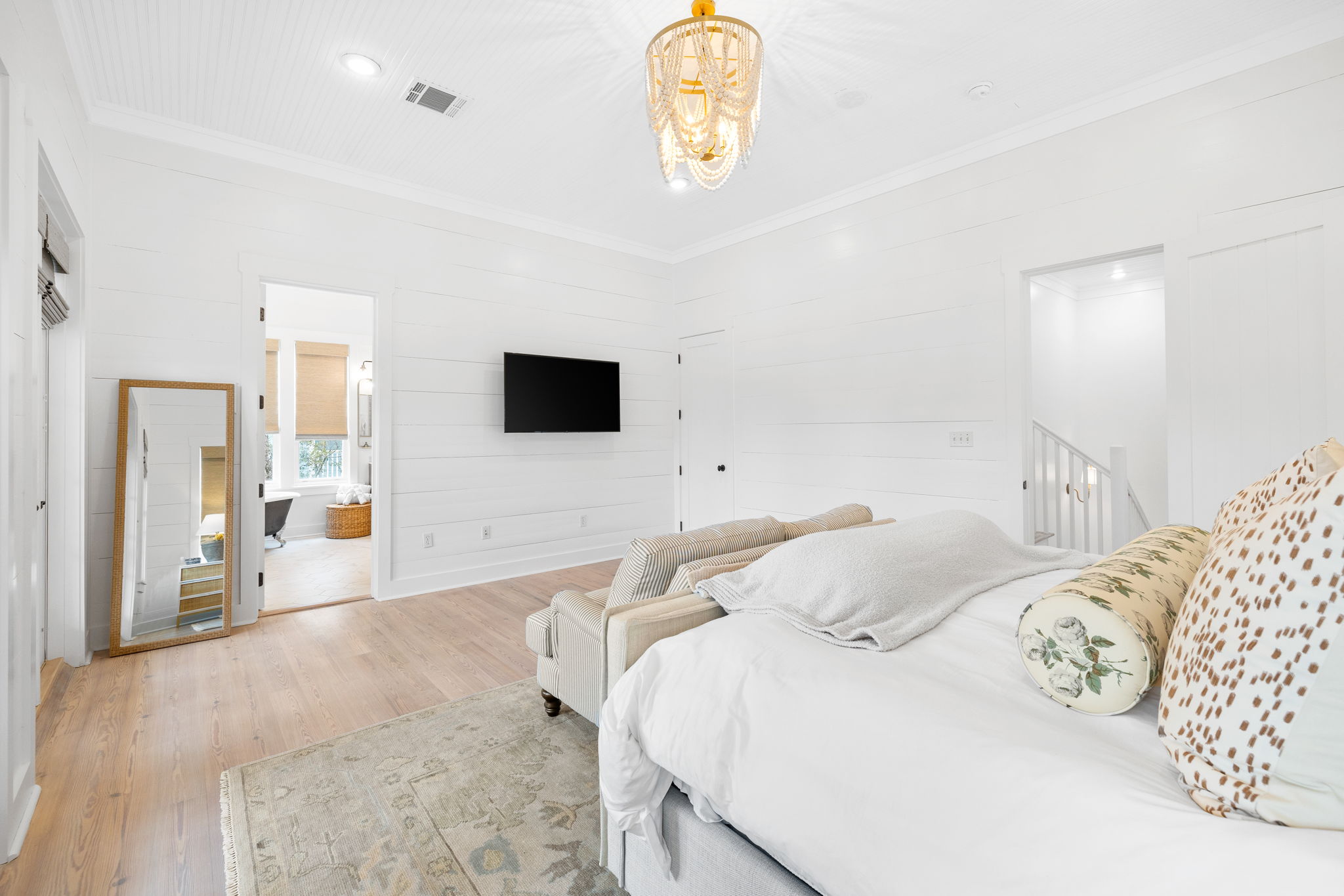
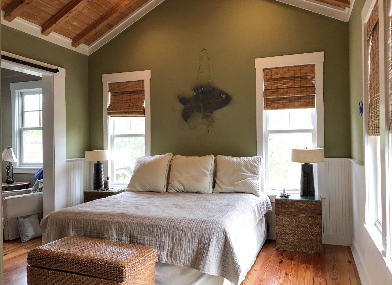
Primary Bedroom Before: Again, this space just felt dark and dreary and needed to brighten up!
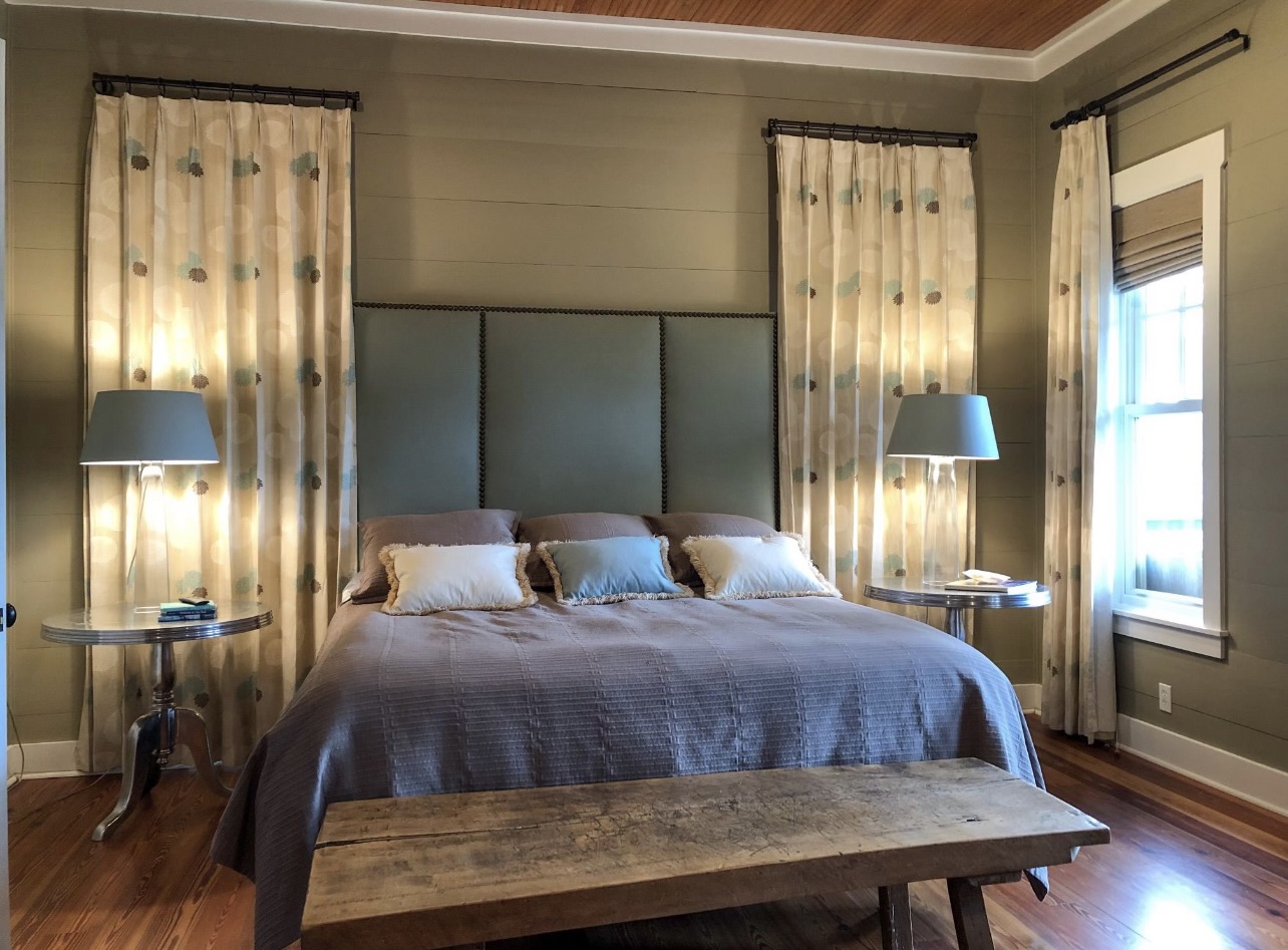
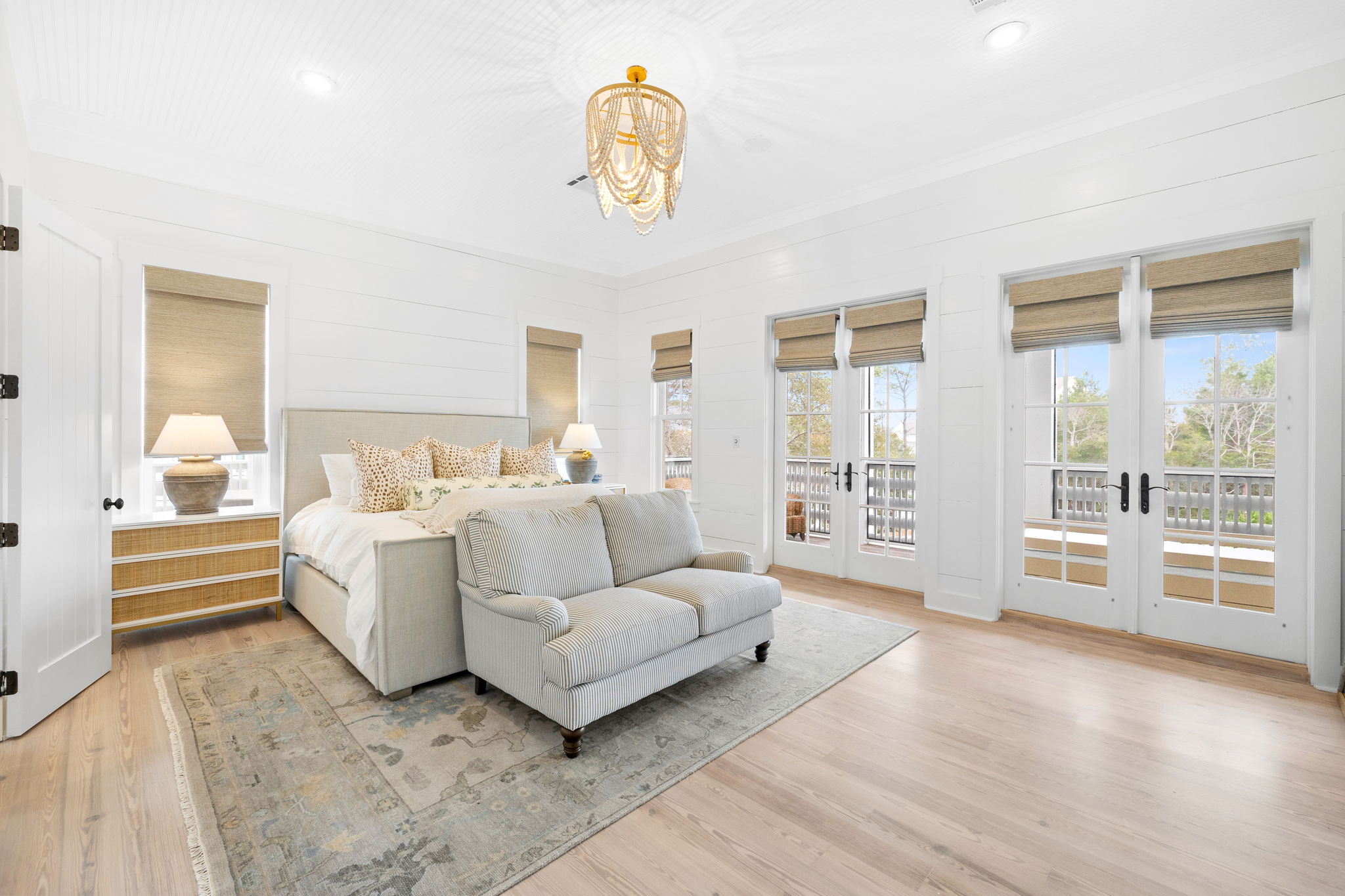
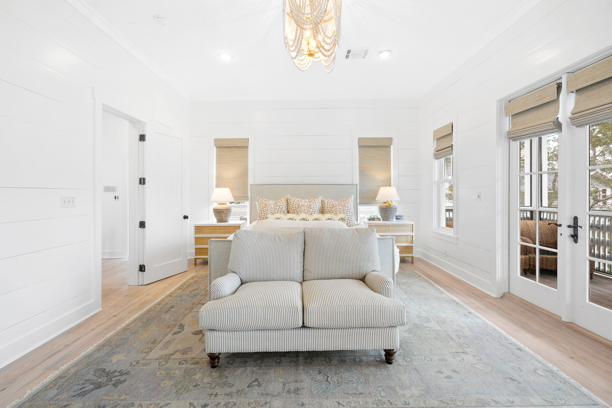
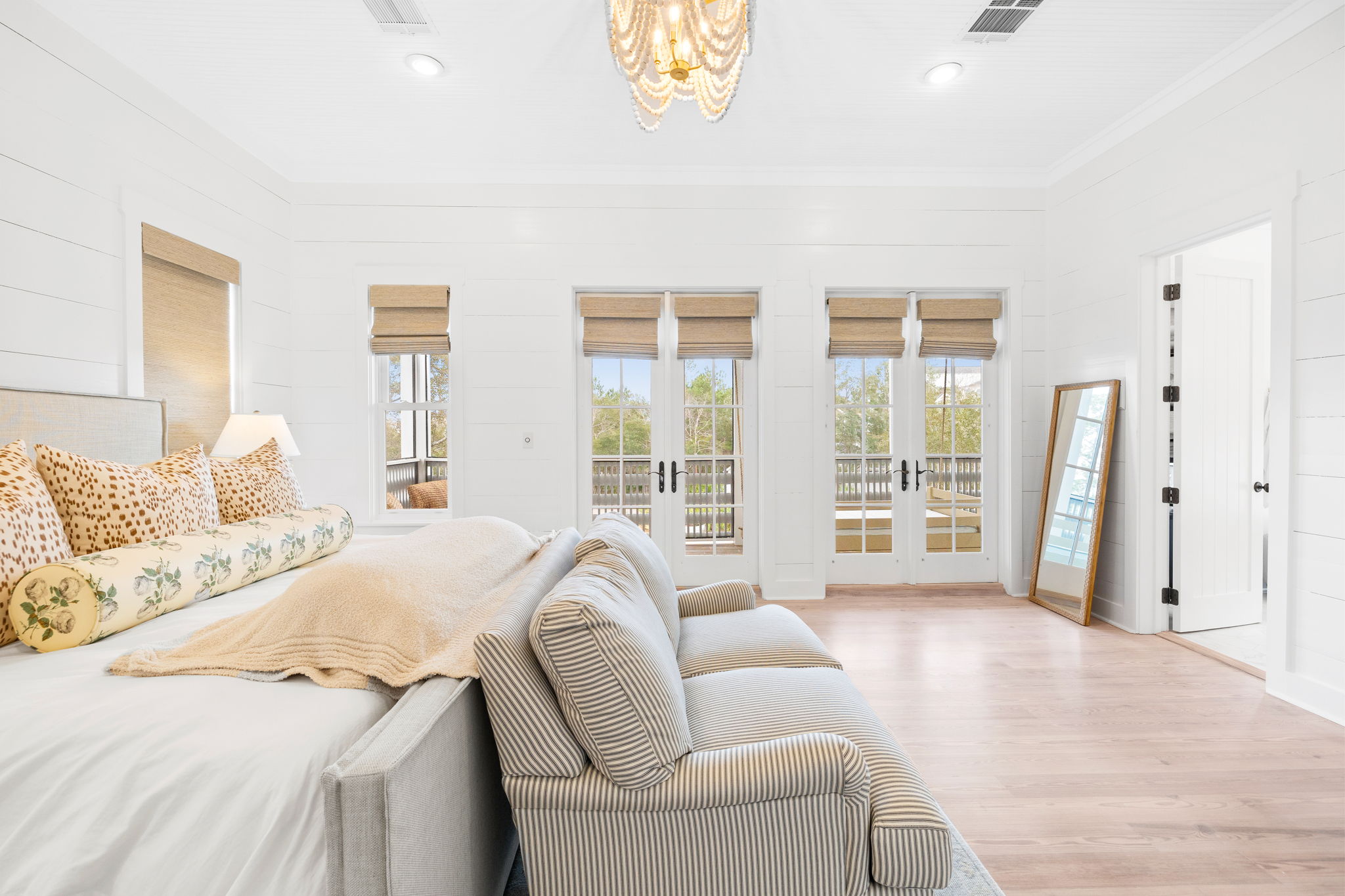
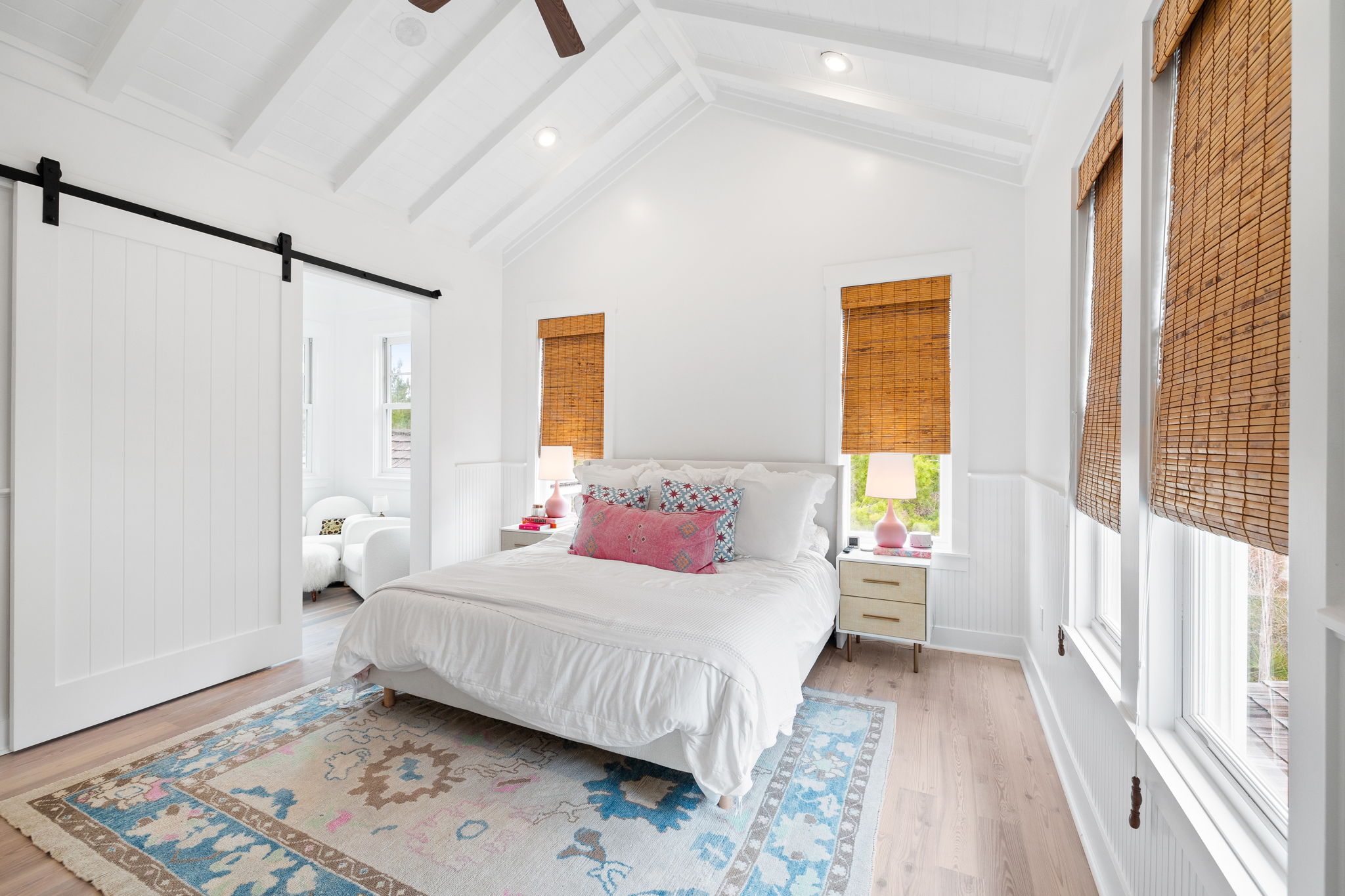
Primary Bedroom After: I love a light and bright bedroom and with this being a beach house, adding white paint, floor to ceiling and taking down the heavy curtains, really changed the vibe in here. The wood paneling is fab in this space and looks even better painted white! We opted for texture with a linen bed, cane nightstands and woven wood shades. All in all, this space feels like an oasis and I truly think anyone would feel this way!
SHOP THE SPACE:
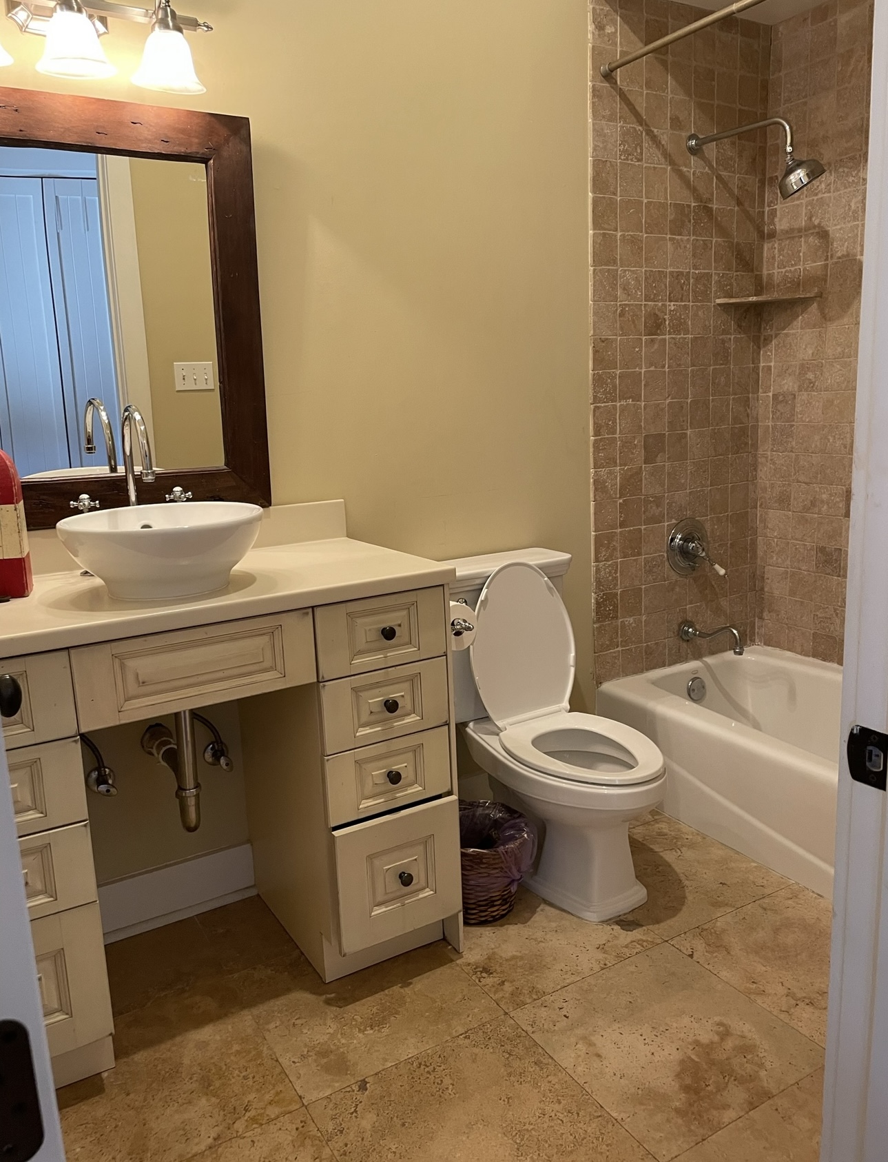
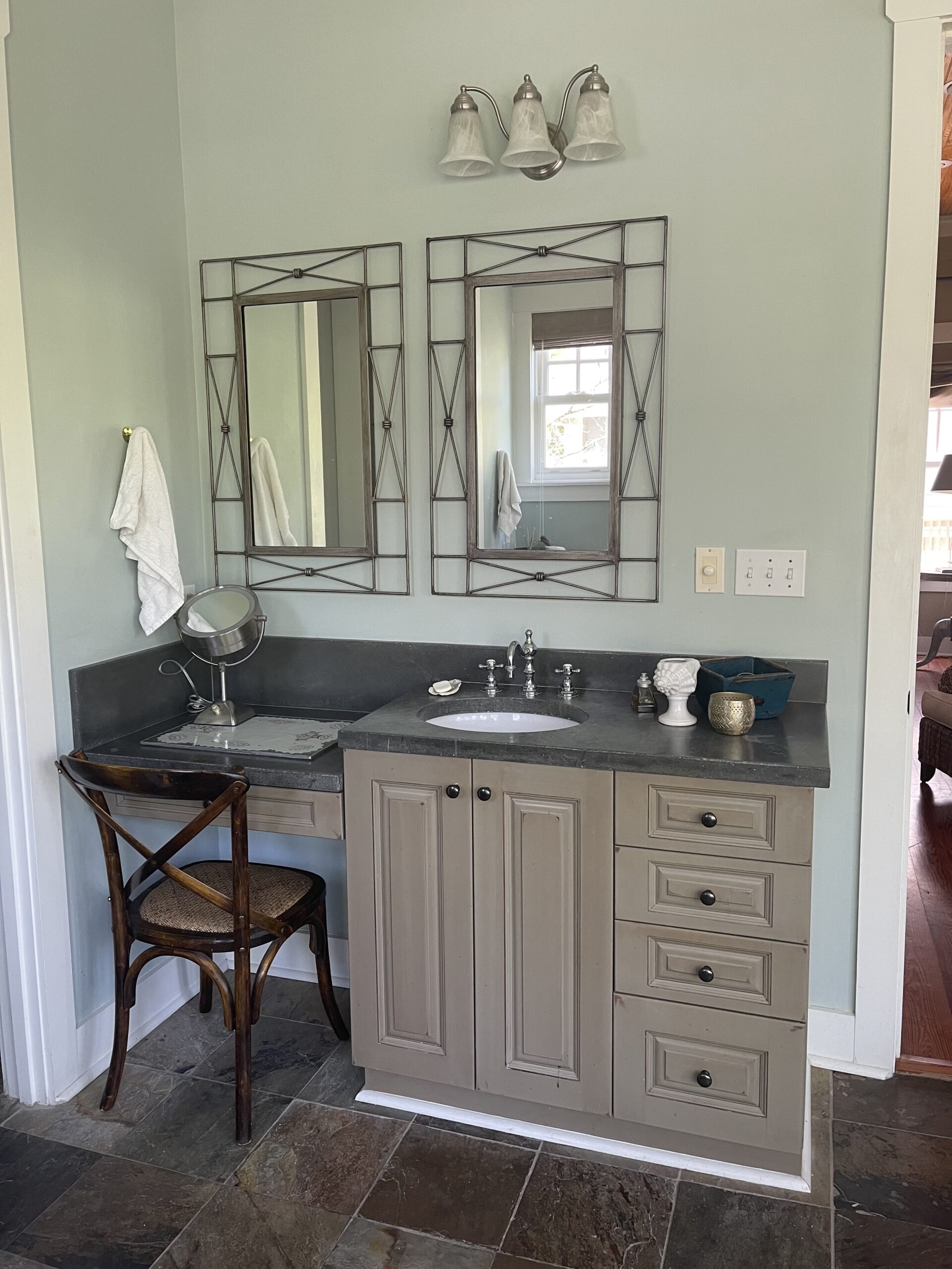
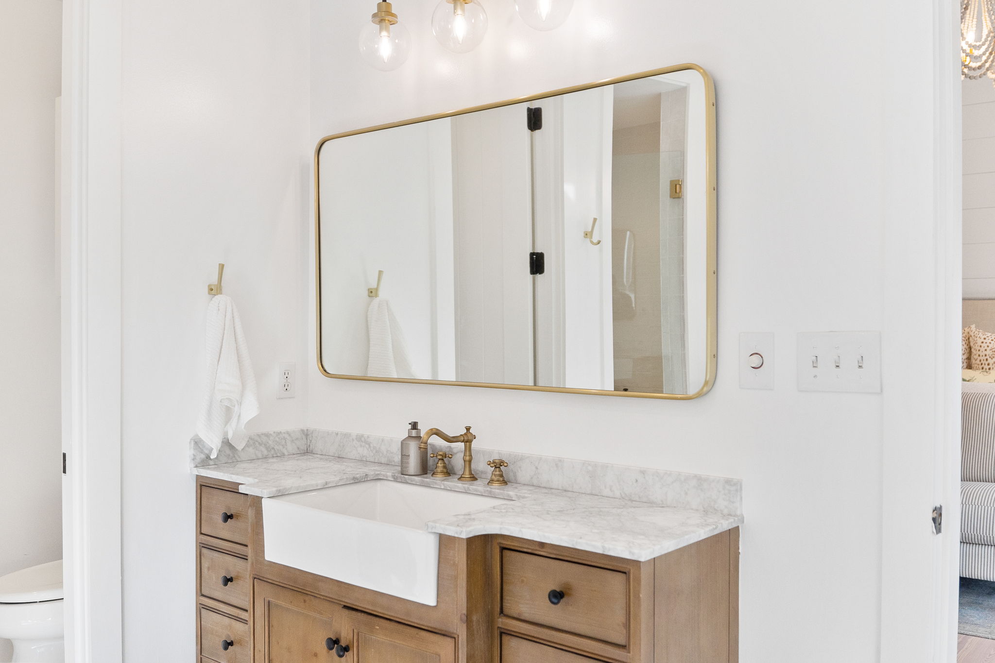
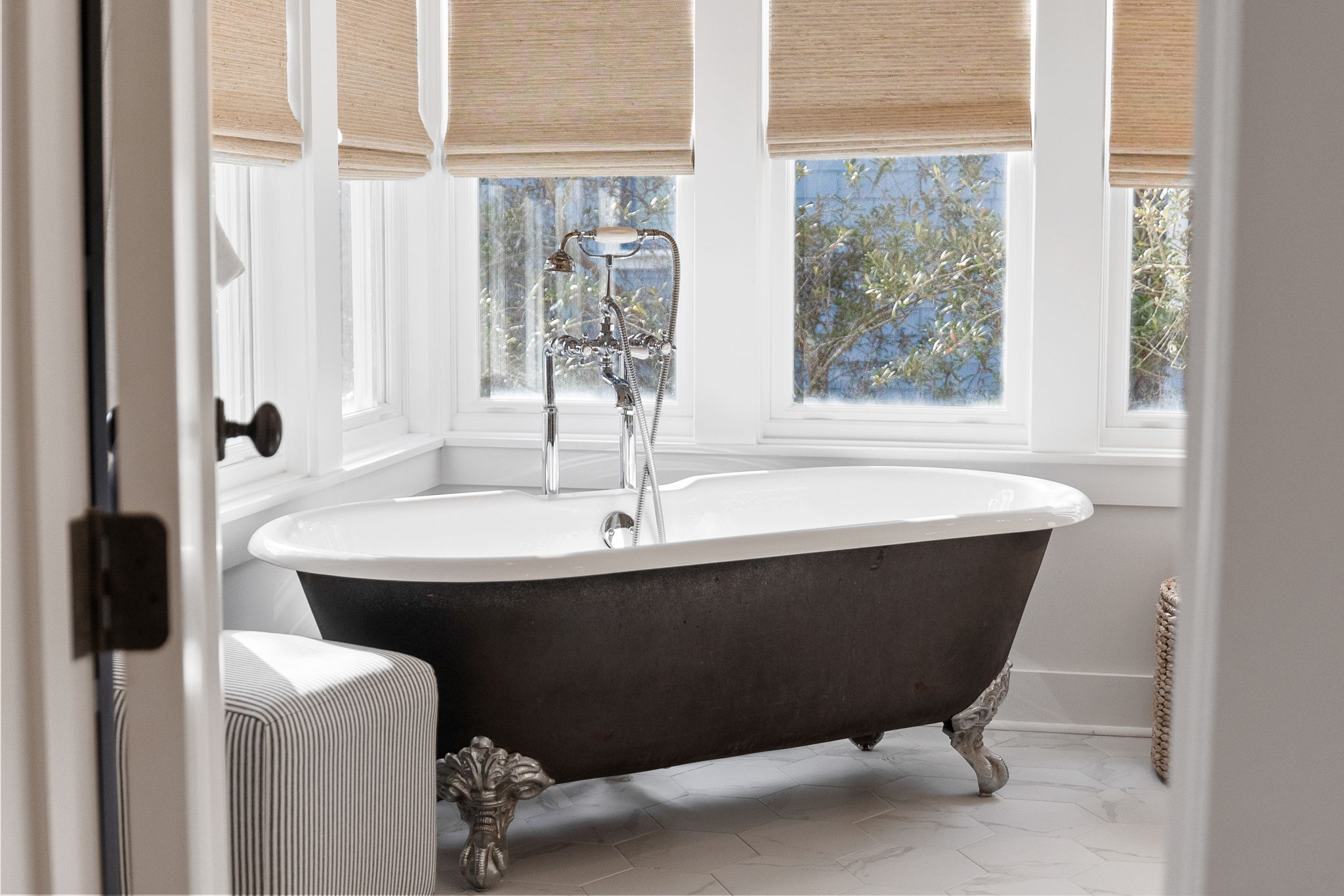
Primary Bathroom Before: Okay, so I am not a slate person in a beach house. I don’t love it in general, but it feels more mountain house to me and I feel like I can get on board with it more in a different location. This space was green and grey with dark floors. And so much of the space was not used efficiently.
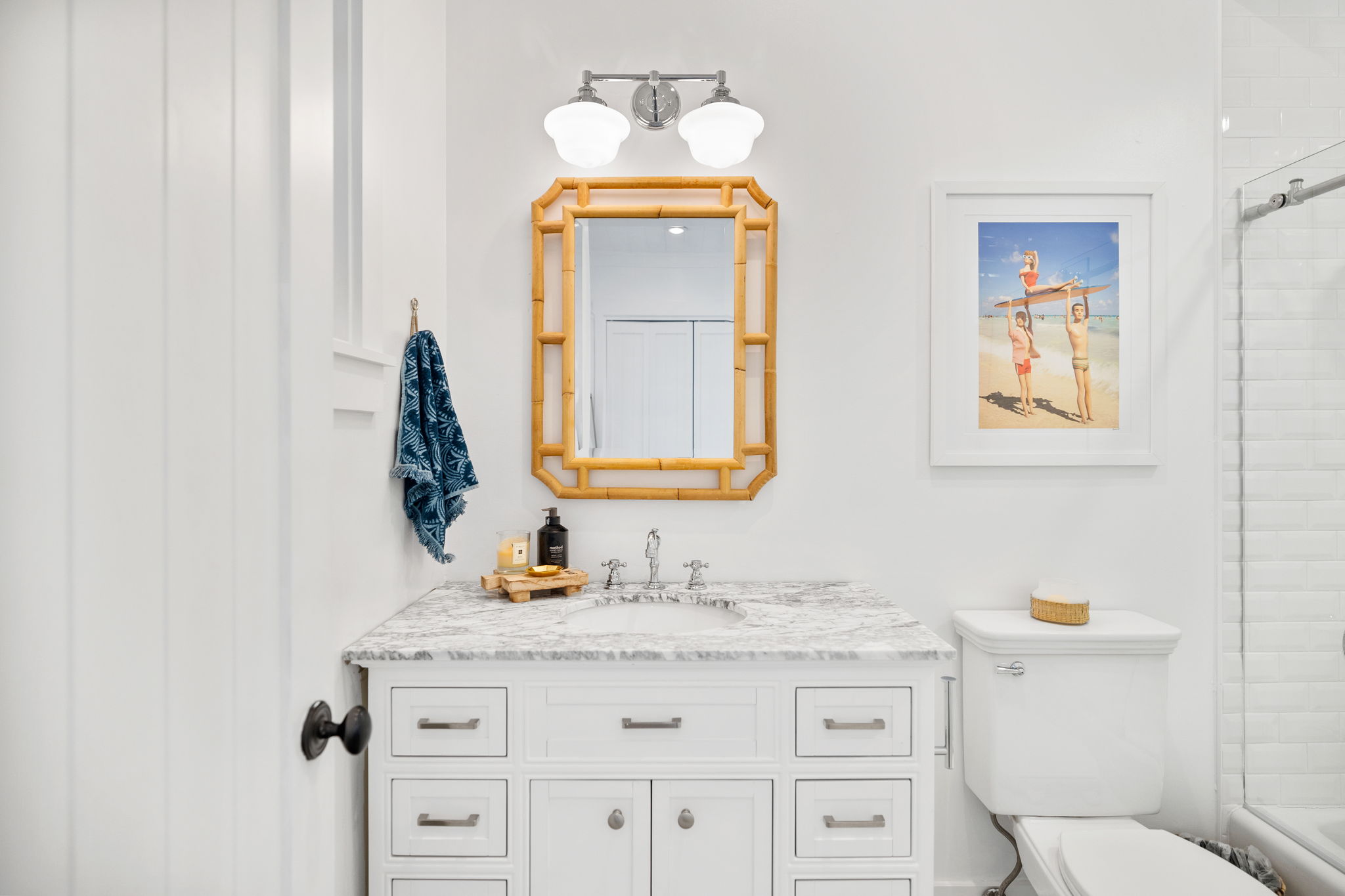
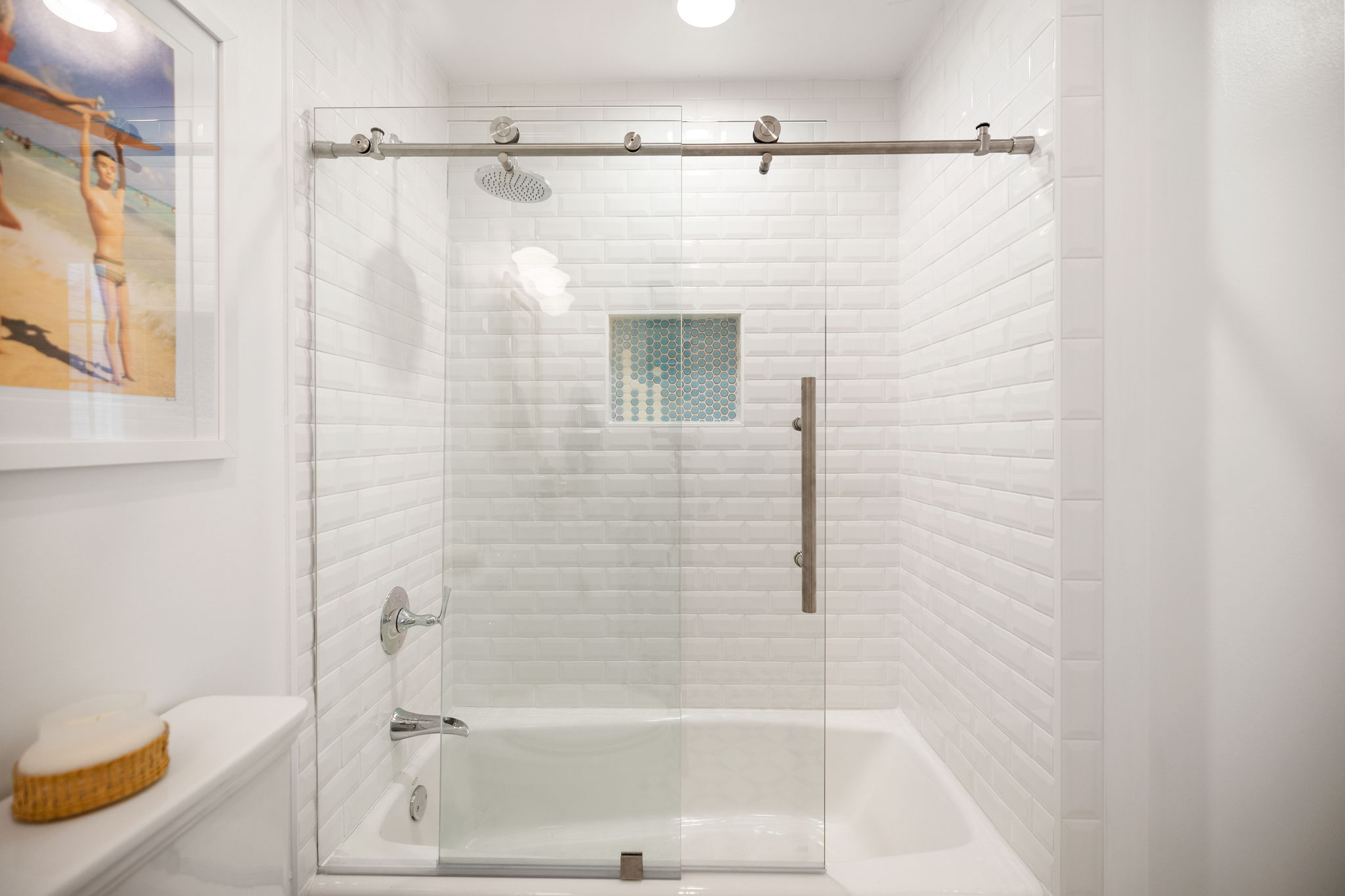
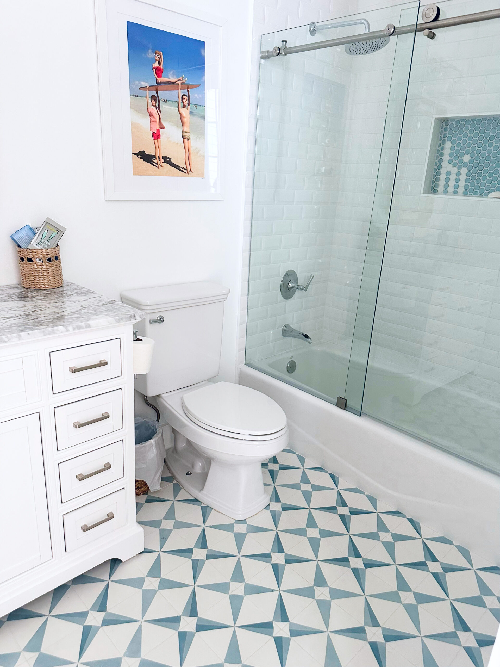
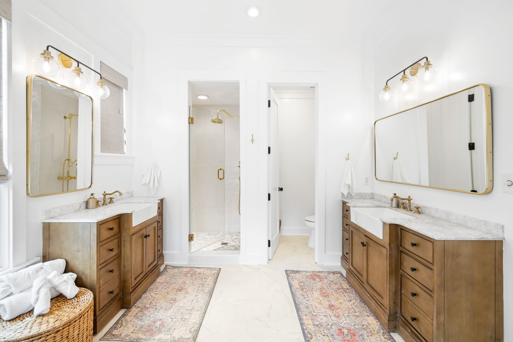
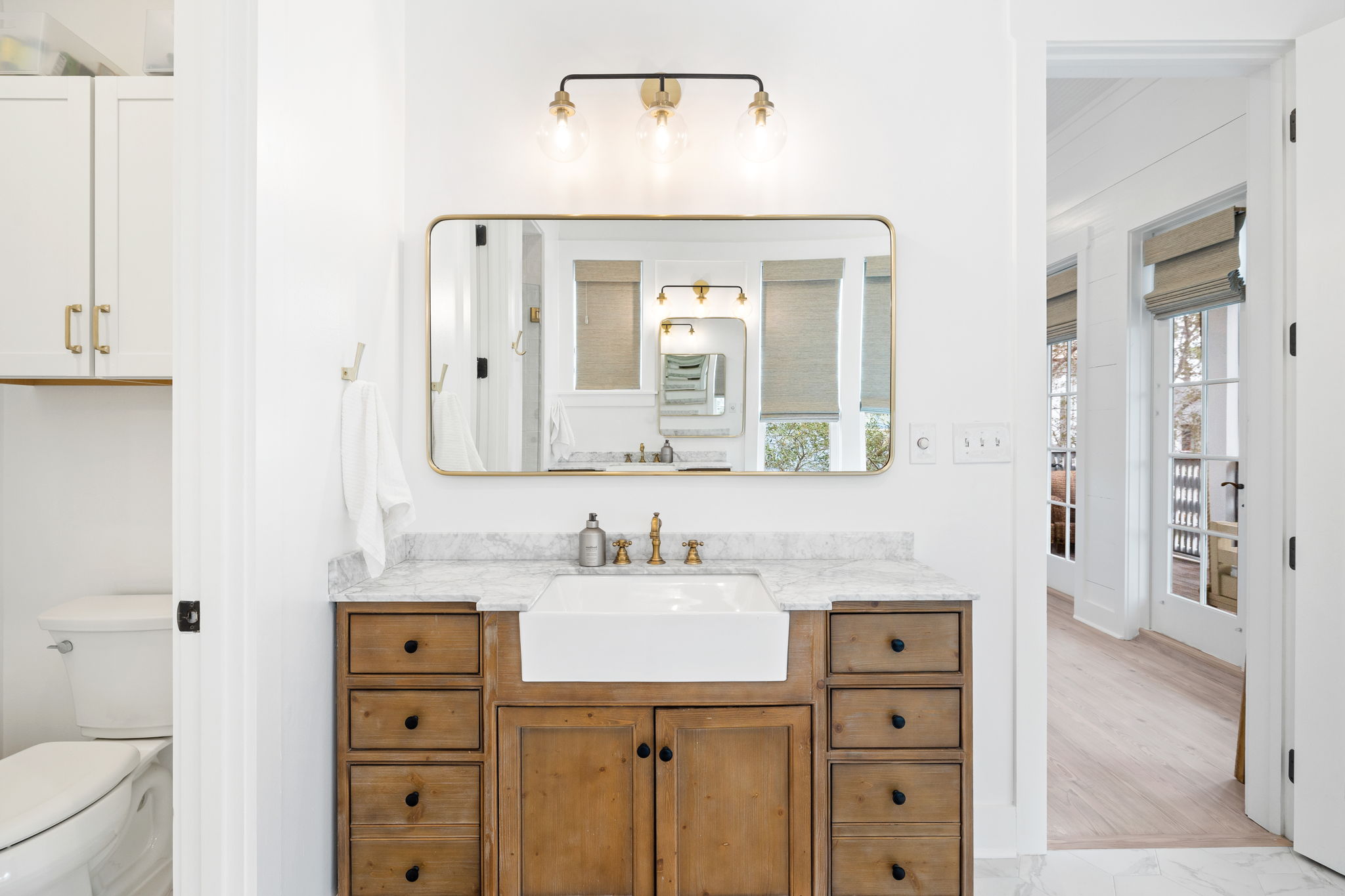
Primary Bathroom After: I opted to bring in some raw wood finishes amongst the white and love these vanities. If you know me, you know I am a huge believer in using pre made vanities if the space allows for it and this bathroom was perfect to use them. Adding this raw wood in here has inspired me a lot for our future home bathrooms and kitchen. We brought in black and brass and you know I love to mix metals. I think brass and black may be my most favorite combo.
SHOP THE SPACE:
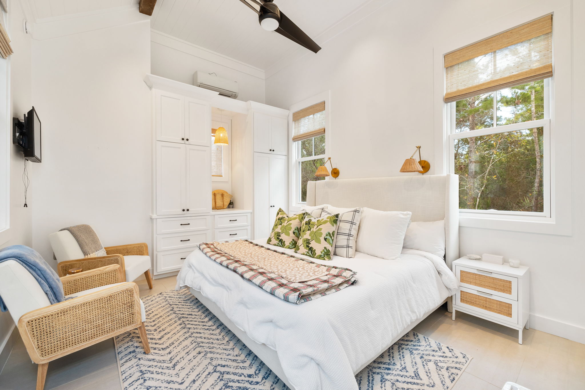
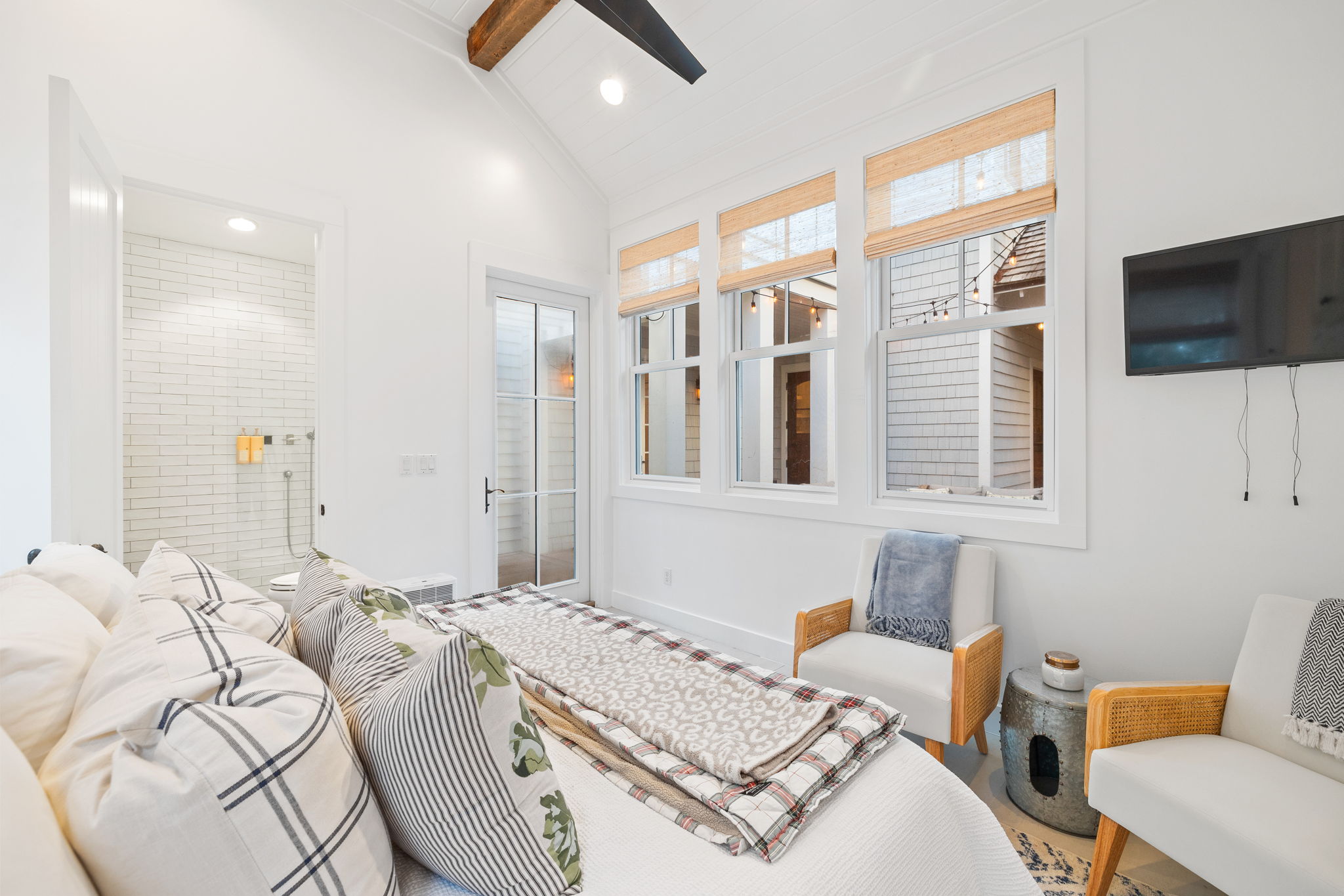
Second Floor Bedroom Before: This room is my favorite. I love the ceilings and man, it had so much potential!
Second Floor Bedroom After: Just brightening up this space with white paint, made SUCH an improvement! We also added texture with a rug and woven shades.
SHOP THE SPACE:
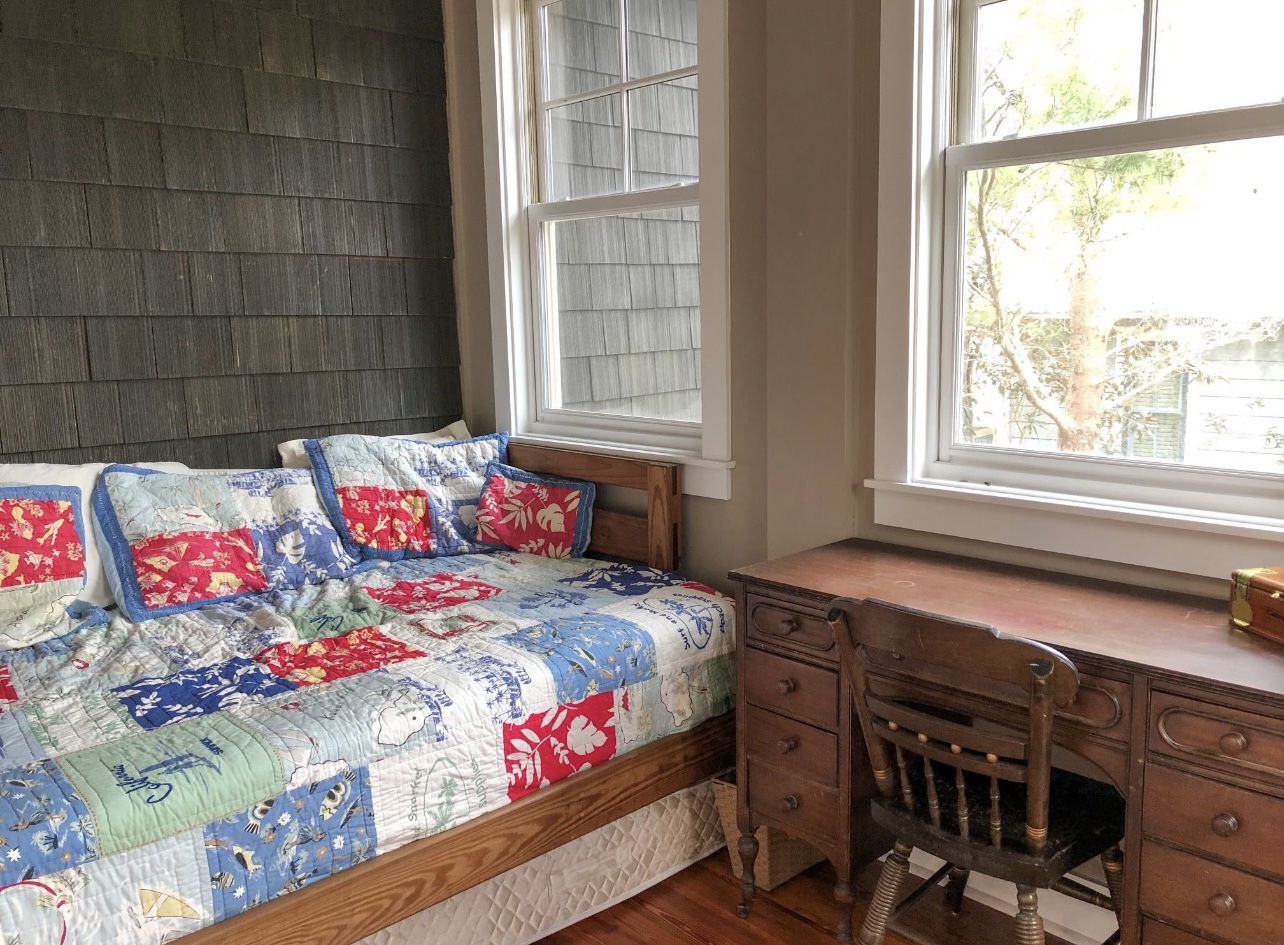
Bunk Room Before: This little space was a porch that the original owners enclosed- you can tell by the wood shingles.
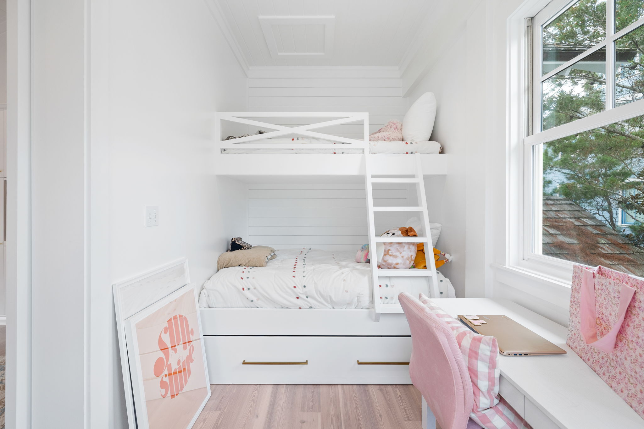
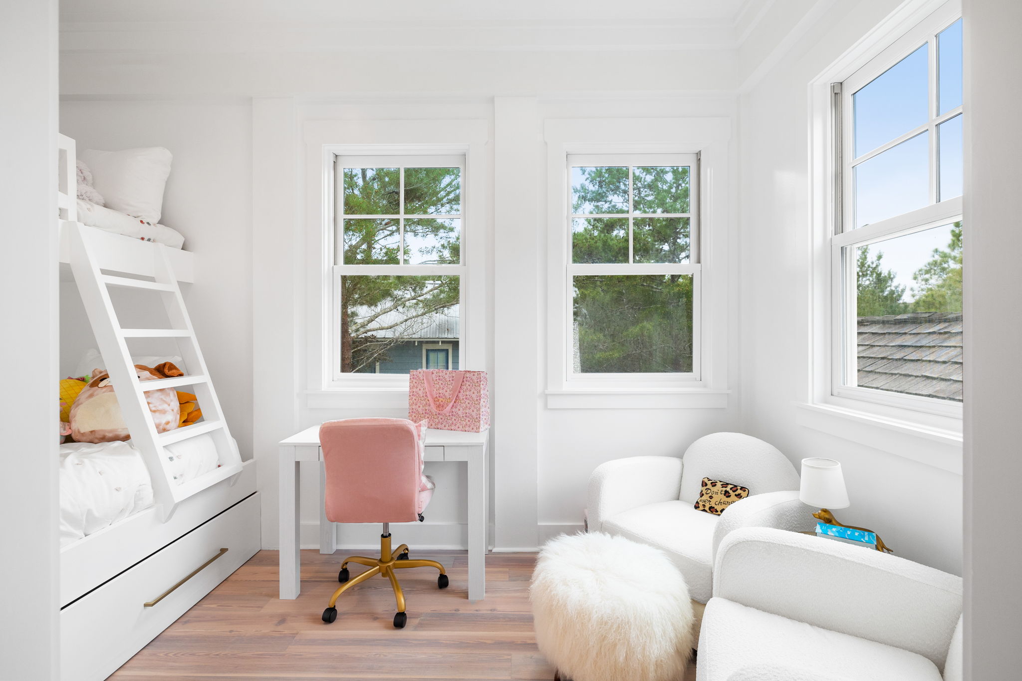
Bunk Room After: We loved the idea of making this a bunk room. It has a twin over full over full trundle bed. We love that this bedroom has this space right off of it. In the future, this room/bunk room would be ideal for a family because mom & dad can take the main room and kids can take the bunk room. You could even add a pack n play if needed. This is such a cool space and definitely a great way to make the space used efficiently! The shiplap is a great addition and looks way more in line with the rest of the house than the wood shingles did!
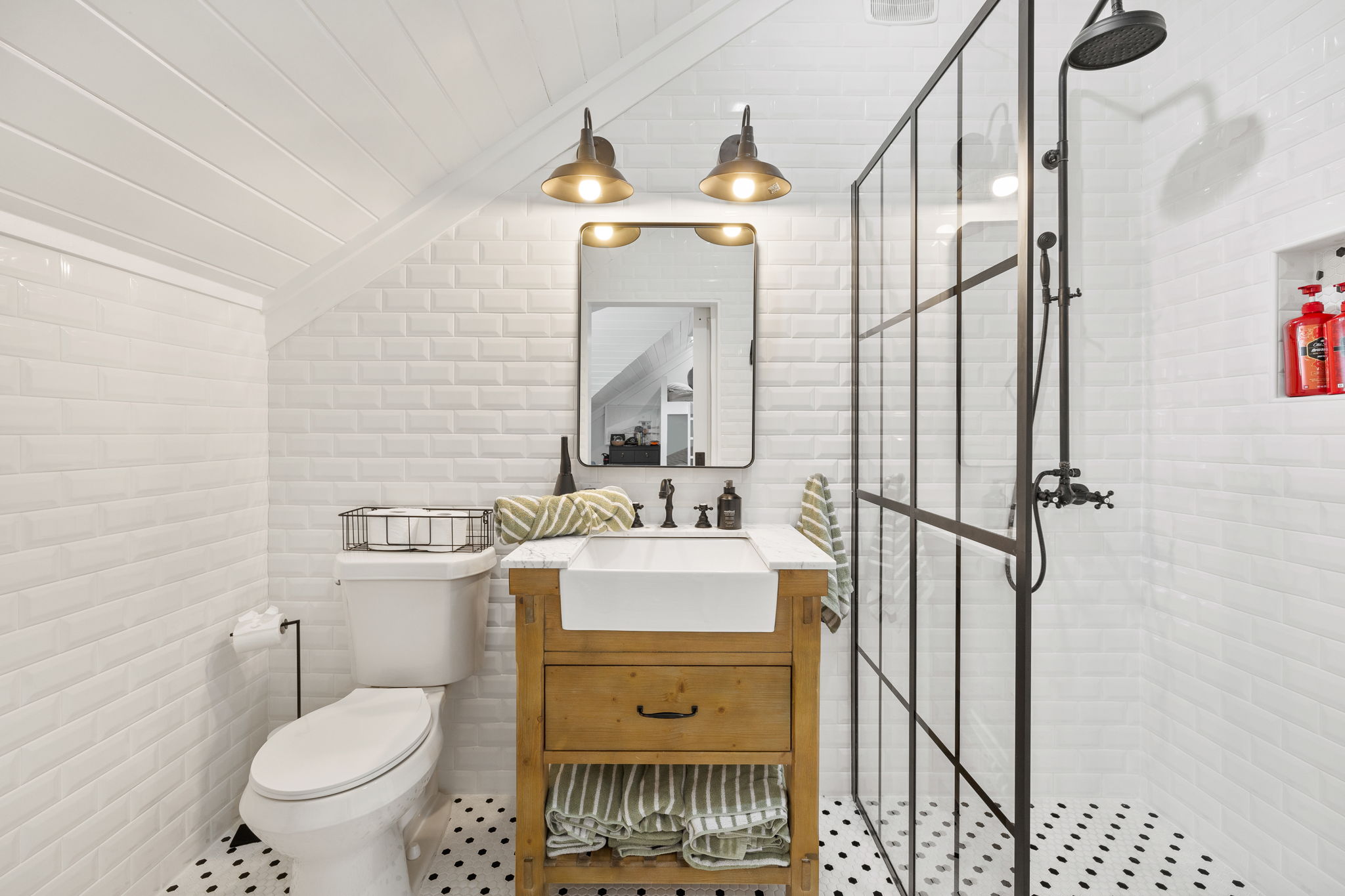
Second Floor Bedroom Bathroom Before: Our goal was just to update this space and remove the tub. We opted to keep a tub in the primary bath and the downstairs bathroom. The rest are stand up showers.
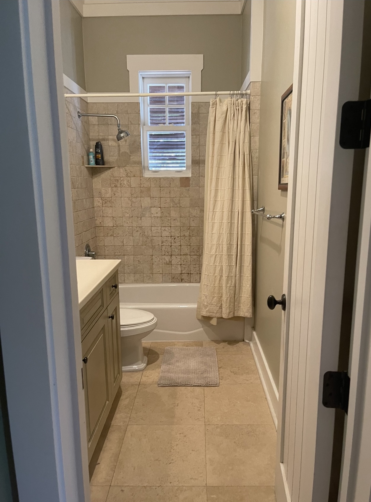
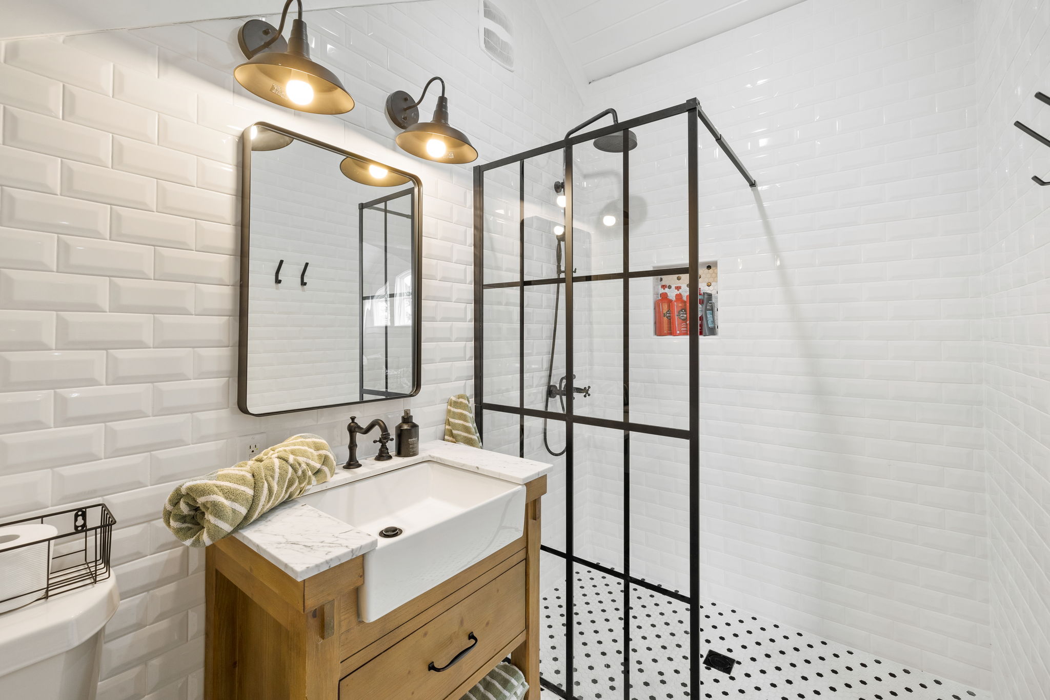
Second Floor Bedroom Bathroom After: Adding a shower and taking out the bathtub is a pretty easy fix and it makes a big impact. In this space, we opted to take the hexagon tile all the way through into the shower. I typically add a little bench- it makes shaving the legs easier! We did a fun herringbone tile up the walls and love how it turned out! All the brass touches are my favorite! It turned out so cute!
SHOP THE SPACE:
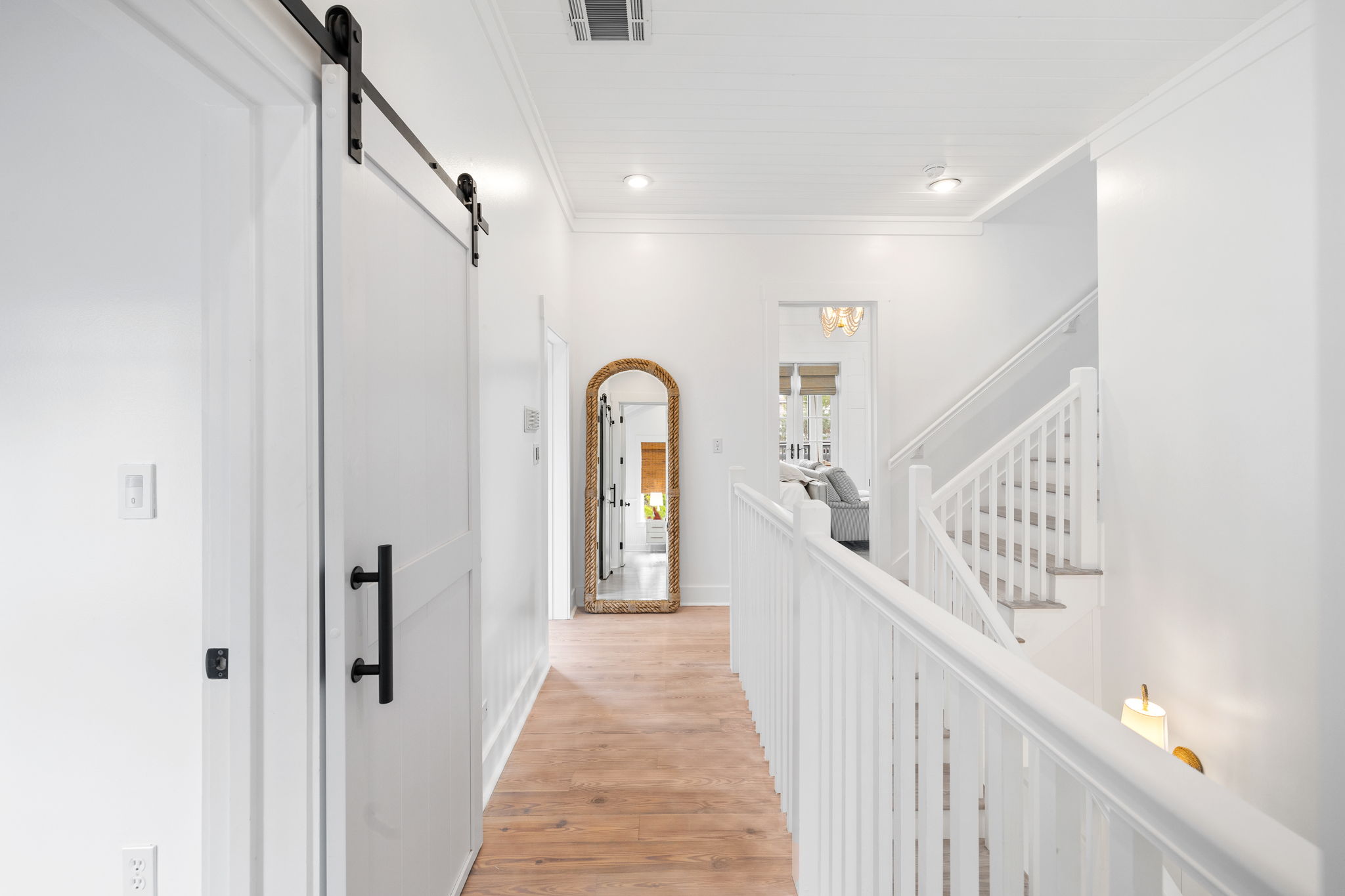
Second Floor Hallway Before: It just needed a little spruce up.
Second Floor Hallway After: We just added a full length mirror here and it makes the hallway seem longer. Plus, everyone can swing by on their way down the stairs to make sure their outfit looks fab…you know what I mean?
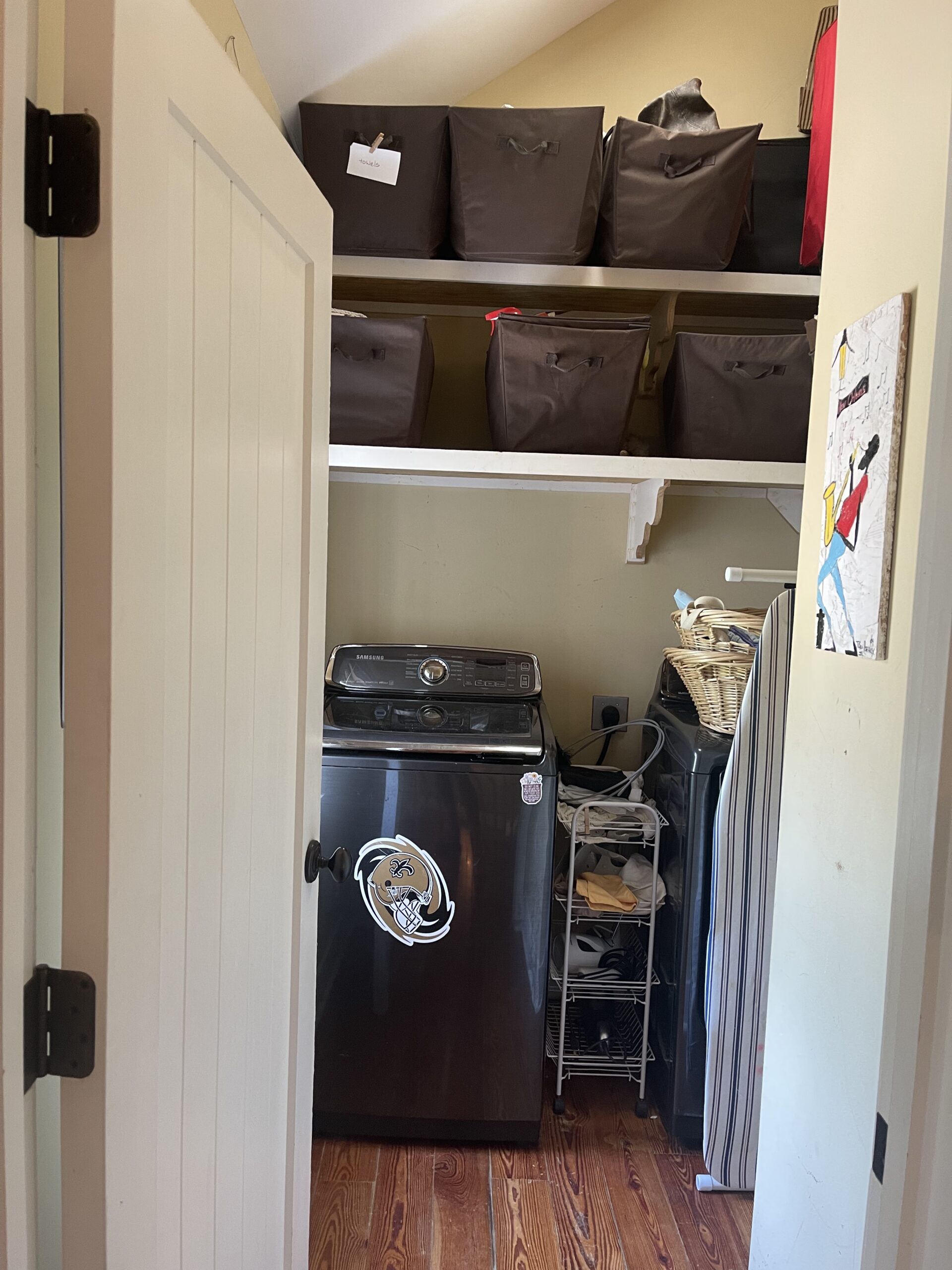
Laundry Room Before: Hello, tiny laundry room! We needed to make this feel larger and more efficient ASAP!
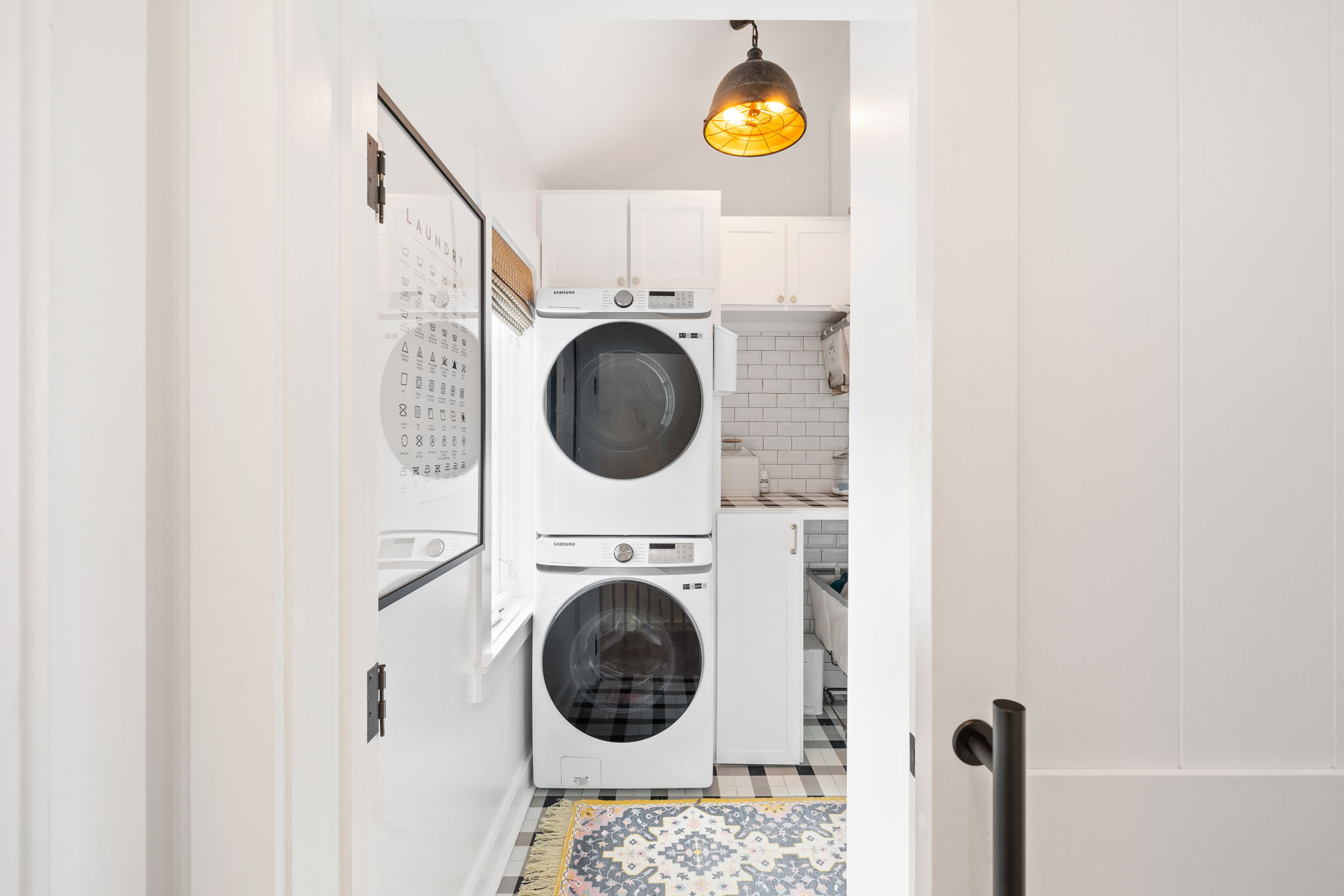
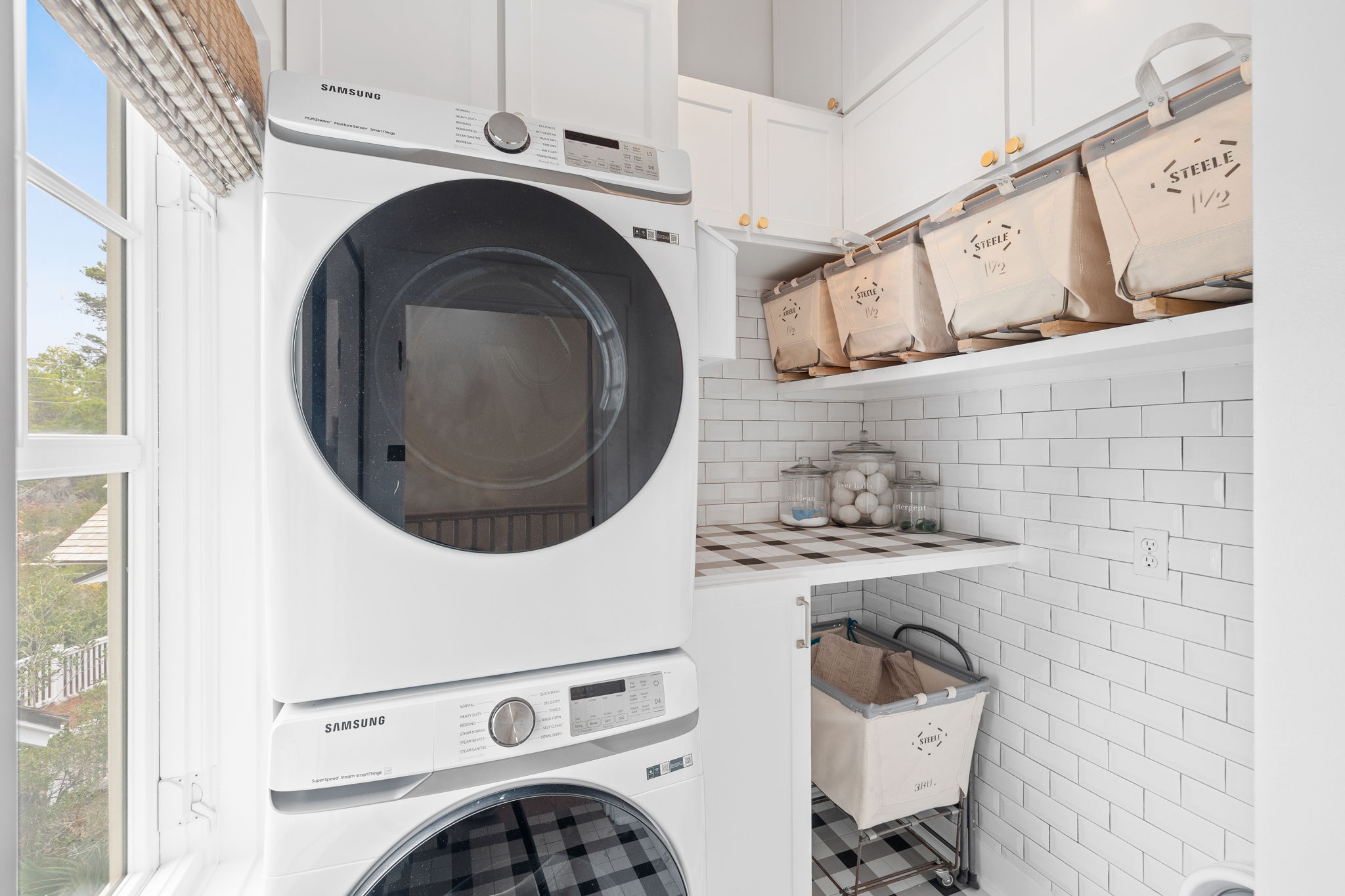
Laundry Room After: We added stacking washer/dryers so that we could have more counter space! Originally I thought about adding a second set, but opted for the folding counter and the place for the hampers, too. Adding the cabinets and shelves just gave us more space for back stock cleaning supplies, towels and anything else! It really became a lot more efficient with just a few small changes! Also, I love the tile in this room. It’s so fun and I opted to bring it up on the counter as well. I love the pop it adds to the counter area! Tiling the wall just added some fun texture and you know that I will tile as many walls as possible. It’s one of my signature moves!
SHOP THE SPACE:
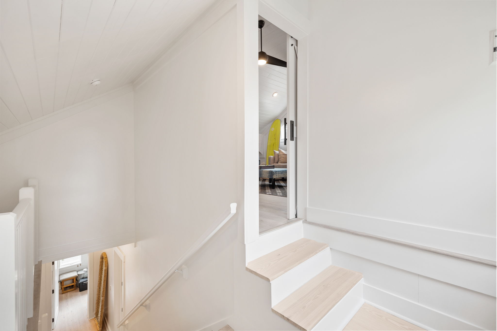
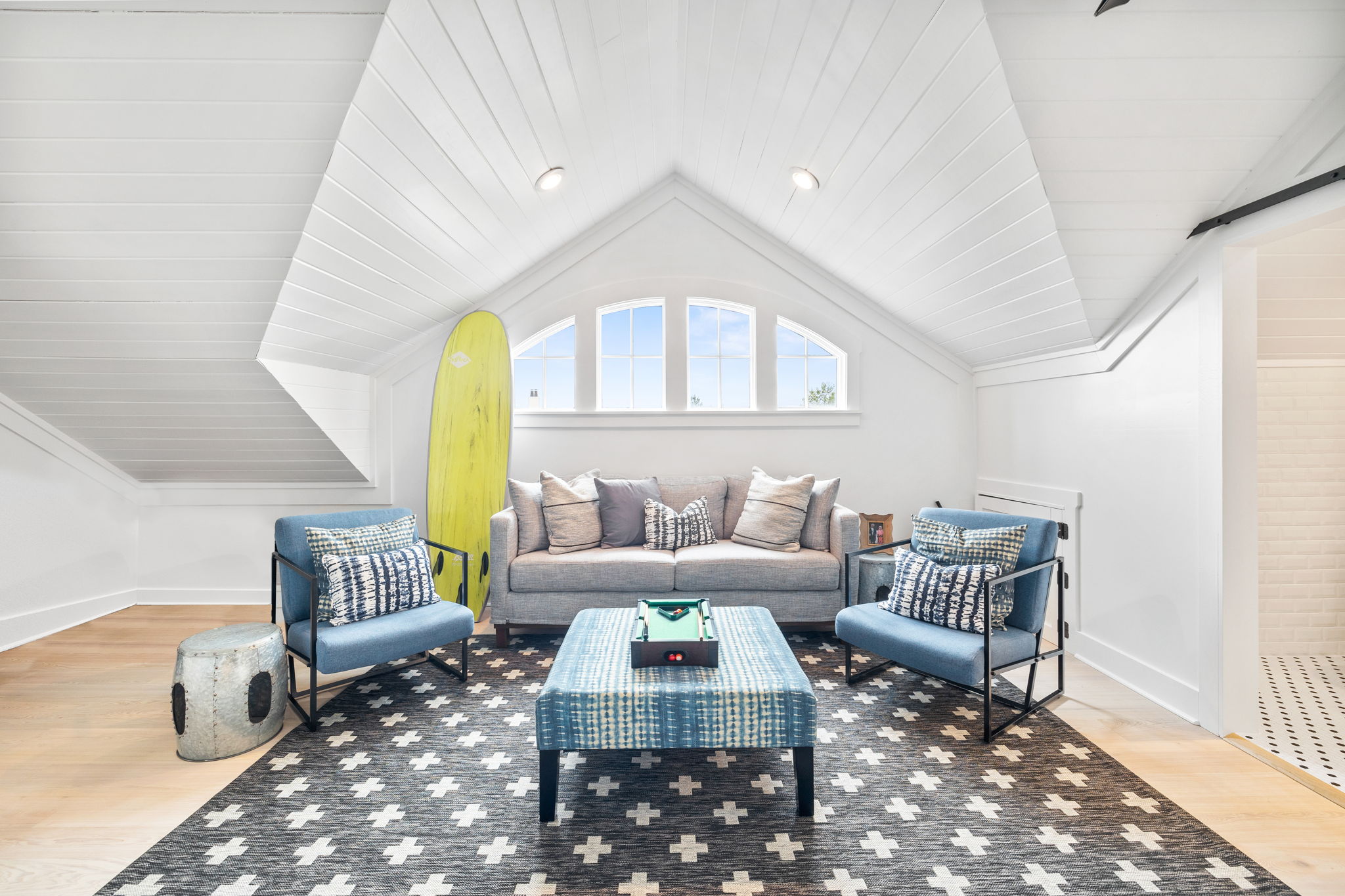
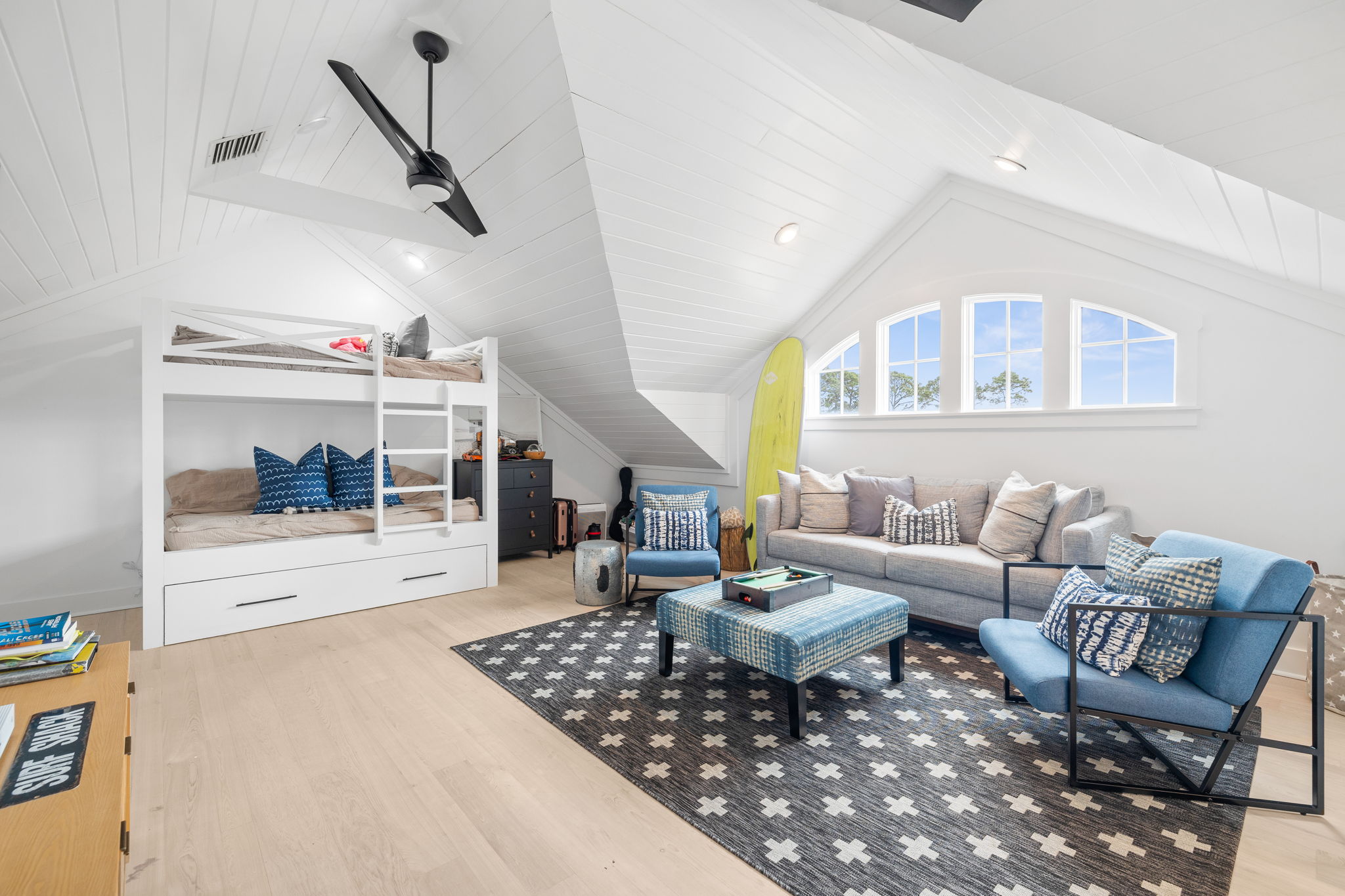
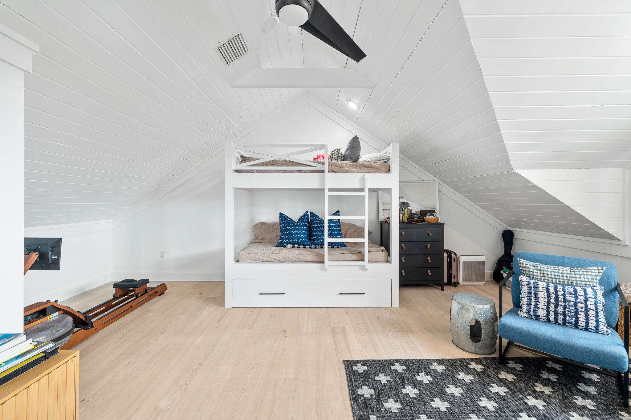
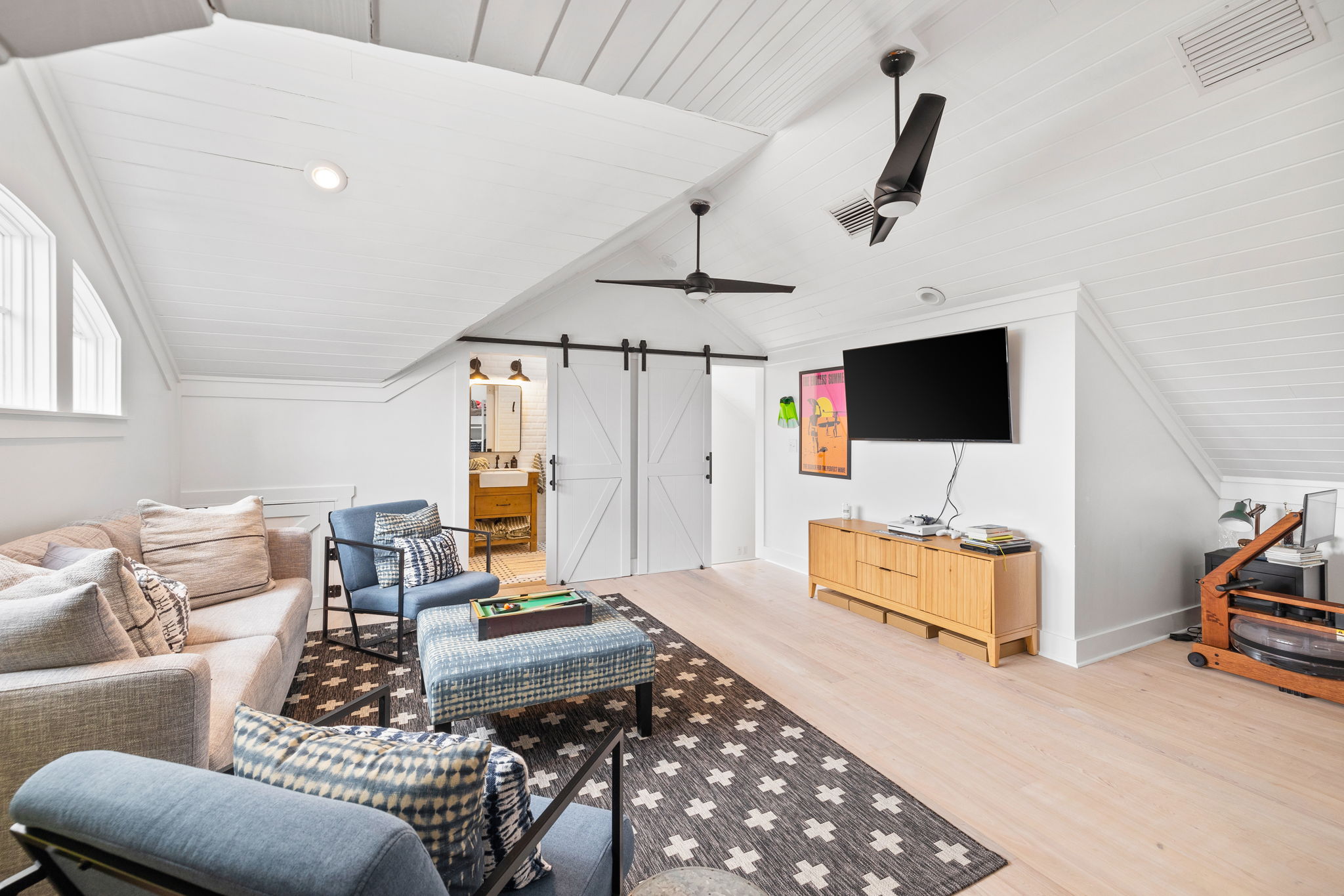
Third Floor Bedroom/Game Room Before: This was an open area that could be used as a tv room.
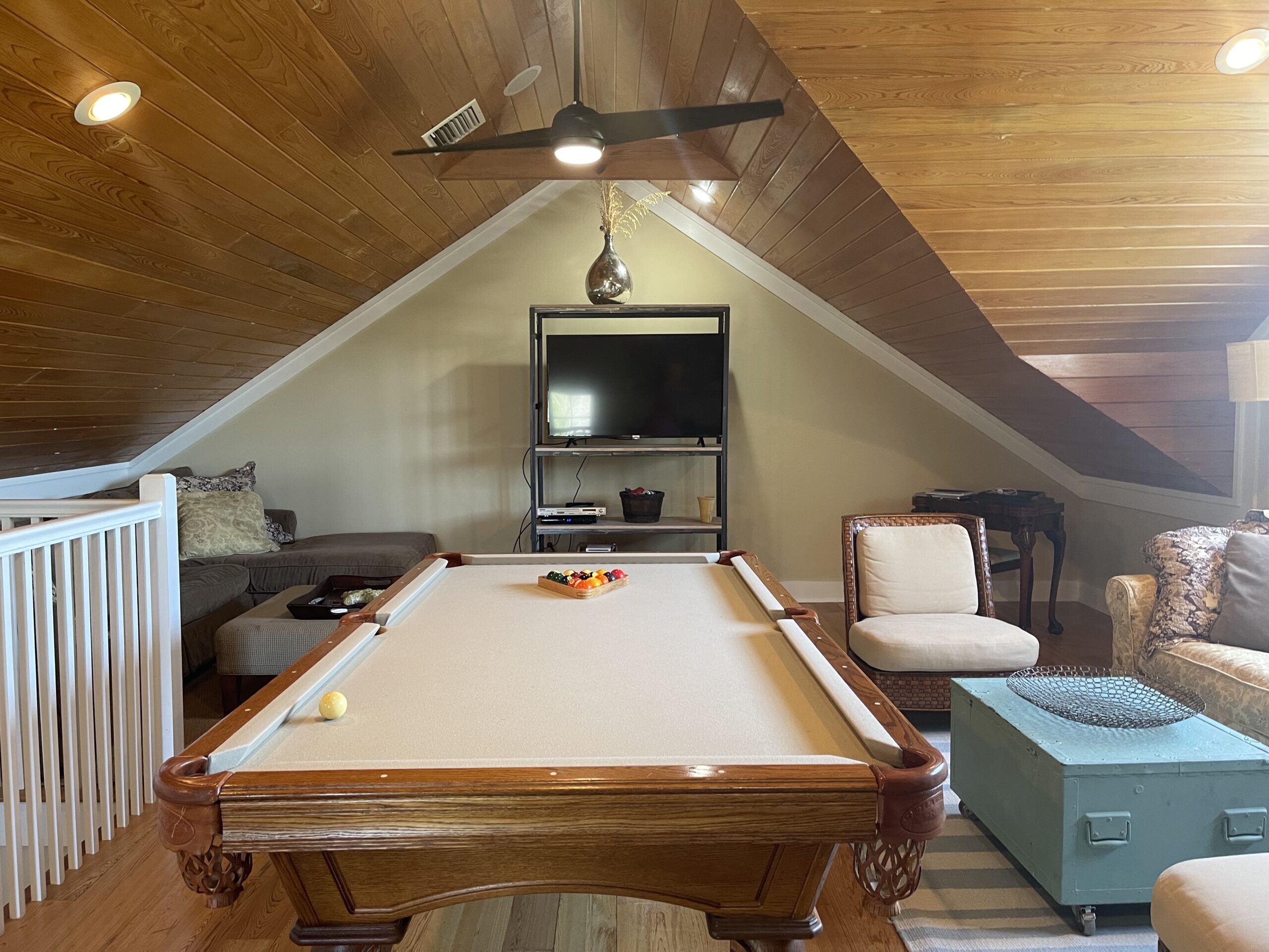
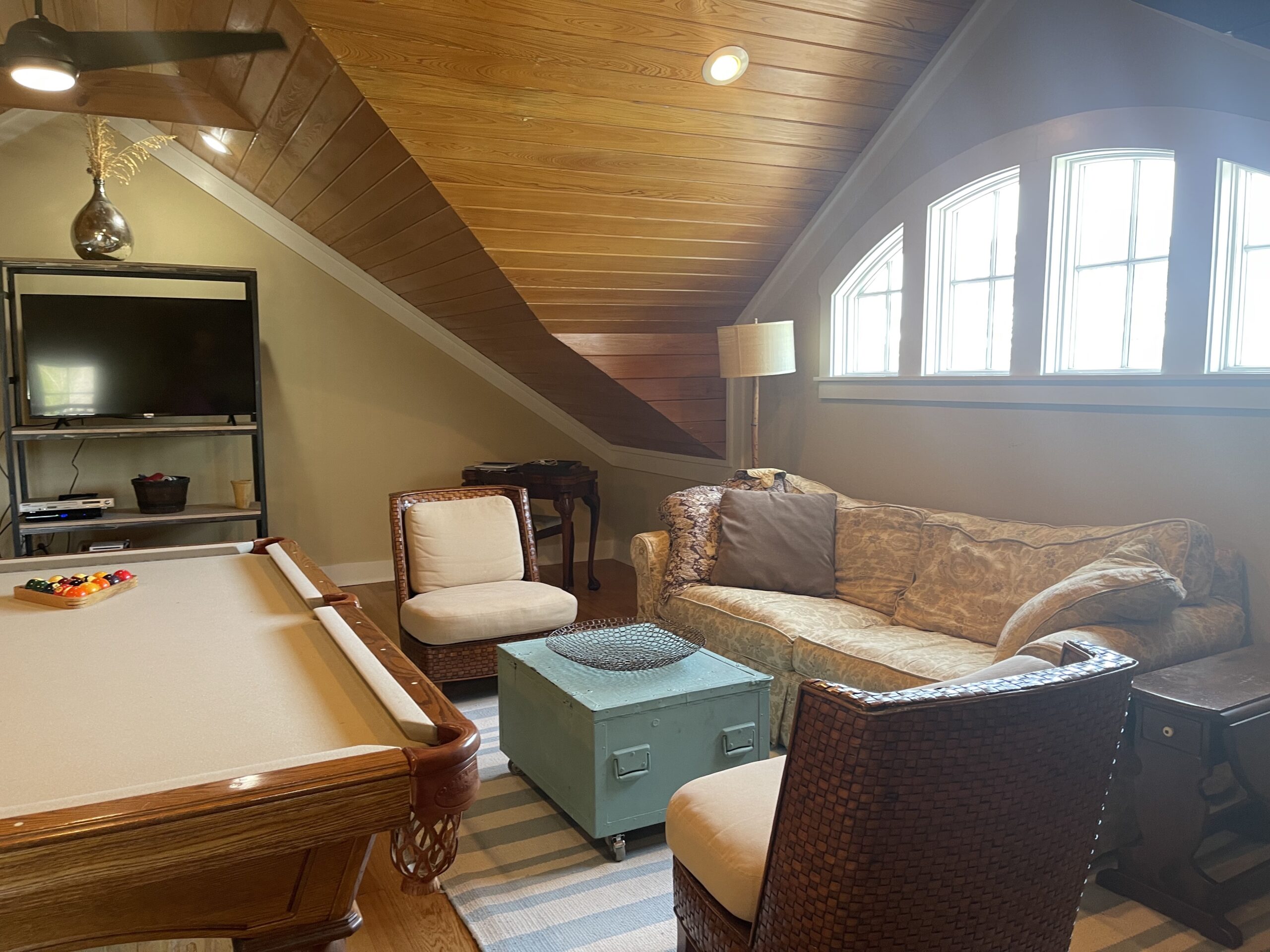
Third Floor Bedroom/Game Room After: We closed off the walls and turned the stairs into the room and added a bathroom where the wet bar used to be. With this space closed off, we were able to make it a TV hangout room, plus bedroom/bunk room. This is Teddy’s current bedroom and where the rower is there is also room for a king bed. So, this is another space that could be used as a family bedroom for future renters. We also toyed with the idea of adding two more twin beds to make it more of a bunk room. It also has twin over twin bunks with a trundle! Ample sleeping space was our goal here! We love how this space turned out! It’s so awesome!!
SHOP THE SPACE:
Third Floor Bedroom/Game Room Wet Bar Before: This wet bar had to go and a bathroom was the plan!
Third Floor Bedroom/Game Room Wet Bar After: I love a wet room vibe, so we took the tile floor to ceiling and ceiling was shiplapped. We added a gridded shower door as an ode to our Texas house and the floor was also the same as Teddy’s Texas house bathroom. Sometimes you just have to stick with what you love! We brought in the raw wood in this space and I truly love how this space turned out. It’s hard to believe it was a wet bar before!
SHOP THE SPACE:
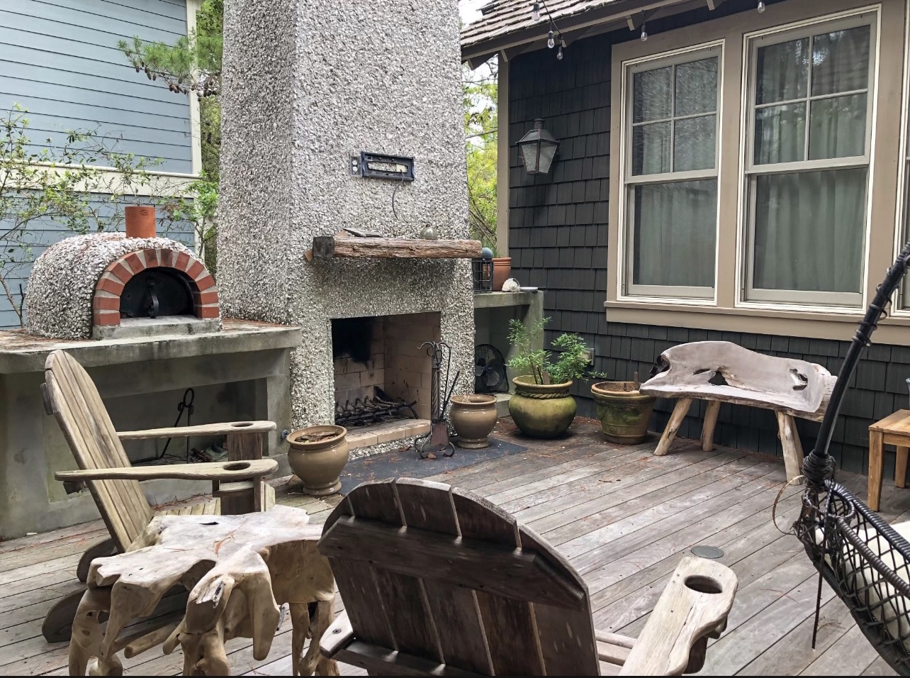
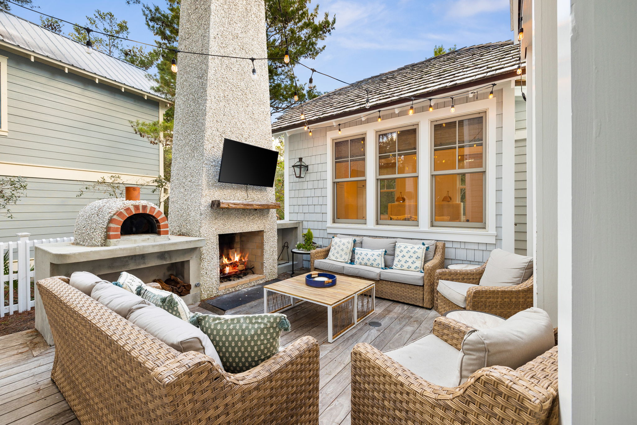
Back Patio Before: This patio was awesome before. Just needed a TV and some better furniture!
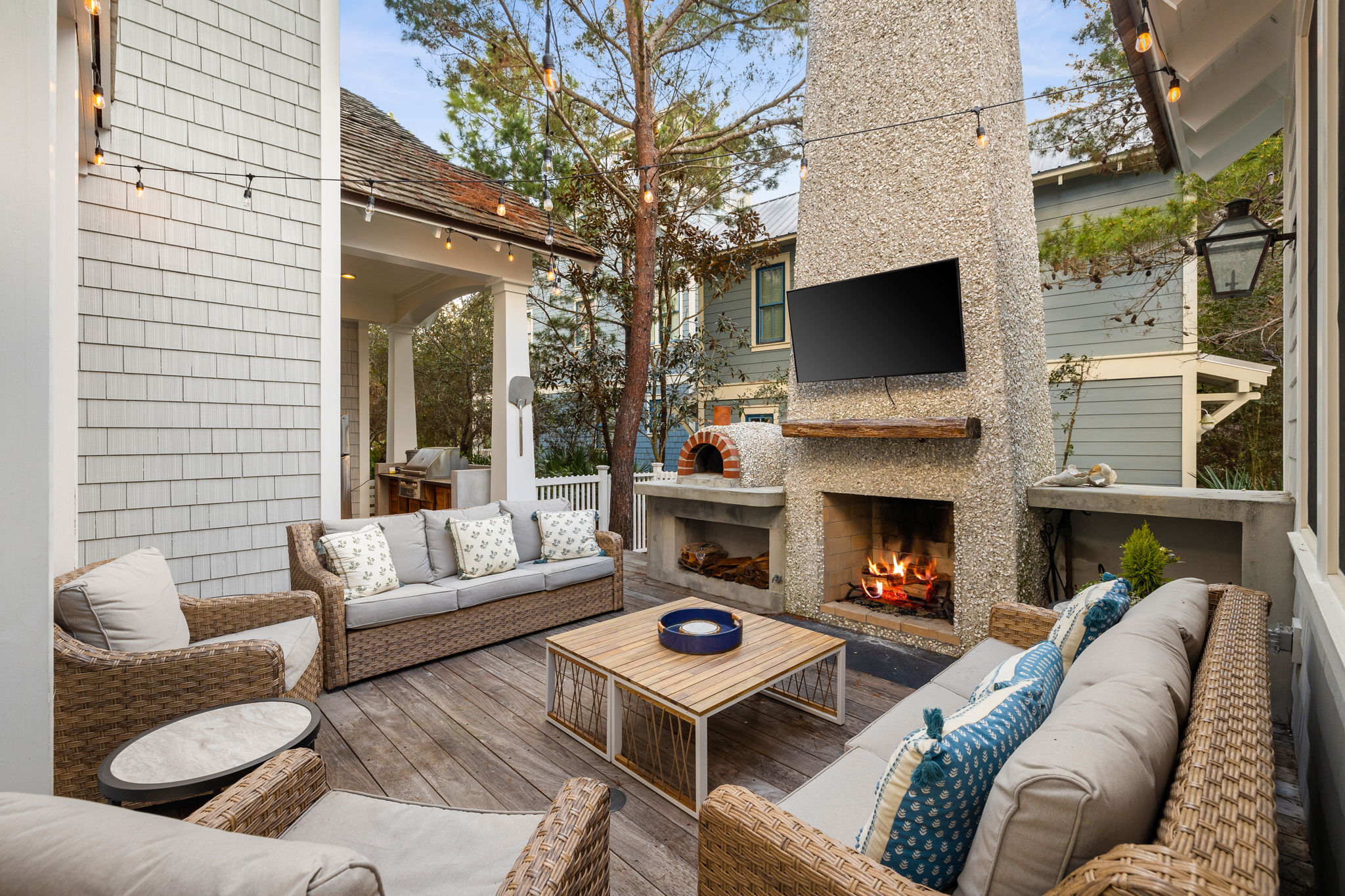
Back Patio After: Added some furniture and a TV and this space looks much more inviting!
SHOP THE SPACE:
Guest House Before: The guest house was added on a few years ago, so it really didn’t need a ton of updating. Mainly just paint and a larger bed. You know how I feel about king beds in a guest room- it’s a must if you can do it!
Guest House After: Just a little paint and some brighter furniture made such a big change! The window treatments and cane chairs added texture, while the rug made the space a little softer.
SHOP THE SPACE:
Guest House Before/After- We did not change this space as it was for the most part on brand for us. Had I have changed anything, it would’ve been the floor, mirror and lighting- all super easy changes, but It works well as is, so we left it! This was the most recent addition to the house, so really didn’t need updating.
So, there you have it! That is our Florida house! In news that my blog readers might not know, we have actually decided to sell this house and move on to another project! While we love this home, we are ready to move on and can’t wait to see where that is…we actually don’t know yet! This home will be amazing as a second home and/or rental for an amazing family. We truly cannot wait to see who ends up buying this one. It has been such an awesome and fun project and as always, I learned a ton along the way. If you are interested is buying this home, shoot me an email so I can put you in contact with our agent (ashley@fancyashley.com) and it comes “rental ready,” which means furnished and with all the bed linens, etc! I’d love to see another one of our homes end up with one of our followers!
I’d love to hear your favorite aspects of the house renovation in the comments! XOXO, Ashley
Did you love this before and after post? See our Texas house before and after HERE!


Long time reader, first time commenter…LOVE the before and after! We’re (slowly) working on updating my husband’s grandparents’ lake house. It pains me to take down some of the parts that made it ‘theirs,’ but it’s got to be done (wood paneling everywhere). What color white did you use? Is the whole house the same color white?
Chantilly Lace by Benjamin Moore- baseboards to ceiling!
WOW! What a beautiful home! You all transformed this house in a HUGE way! Congrats!